
Around the world in 80 brands: Trying Tropicalism in Brazil
September 17, 2024Words by Dalia Jaffar
Globetrotting, it turns out – is not only a great way to travel but a medium through which we can uncover fantastic branding and design elements that are a product of the country from which they hail.
As we’ve seen so far in Japan and Italy, signature branding styles permeate not only the country’s homegrown brands but are exported too – as the world’s biggest conglomerates look abroad for their next campaign aesthetic. Join us as we journey elsewhere in the third iteration of our latest branding series: Around the world in 80 brands.
Welcome to Brazil, the birthplace of Tropicalism
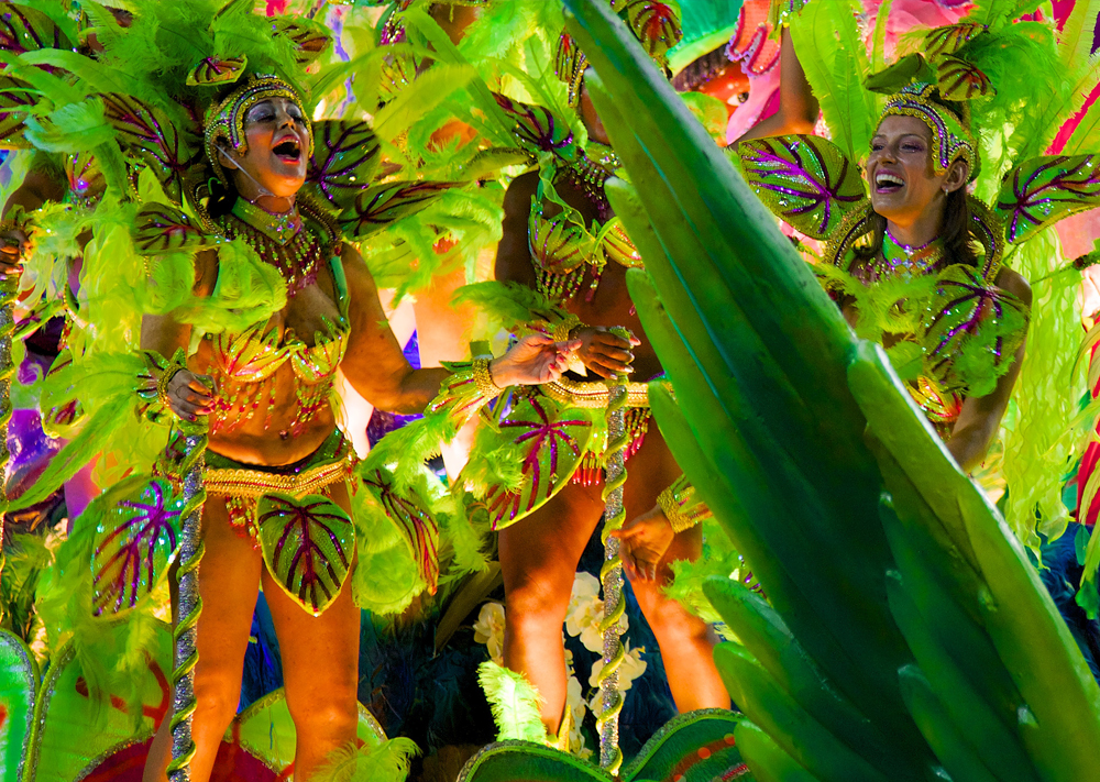
Let’s drop our pin in Brazil. Think Rio de Janeiro – the coastal metropolis shouldered by tropical mountains and bursting with contagious carnival beats. Think San Paulo – the country’s creative hub brimming with art-house cinemas, experimental theatres and art galleries. Today if we were to ask several hundred people to conjure an image of Brazil’s cultural identity, the likelihood would be much of what we imagine, would be similar.
But that wasn’t always the case. Rewind just a dozen decades or so and Brazil was under harsh dictatorship. Military rule meant suppression, especially when it came to culture – zapping the colour and vibrancy out of music, art and film. As a result, the cultural identity of Brazil waned. Mainstream media was unreflective of the bubbling undercurrent of youth, pining for artistic expression and the foreign influence that felt much more modern than what was happening on home soil.
It’s in this context that tropicália was conceived, with its innovative songwriting, new sound, and a big desire to create a new Brazilian identity. Tropicália, also known as tropicalism, or the tropicalist movement, was inspired by modernist poet Oswald de Andrade who published the Manifiesto Antropofágico (Anthropophagic Manifesto), in 1928. To Oswald, the term anthropophagy, despite relating to cannibalism, meant “to feed off foreign culture” and referred to several ideas that would help shape something uniquely Brazilian. In his mind, what is foreign and international must not be ignored but rather absorbed and then transformed into something new: a thriving and expressive local culture.
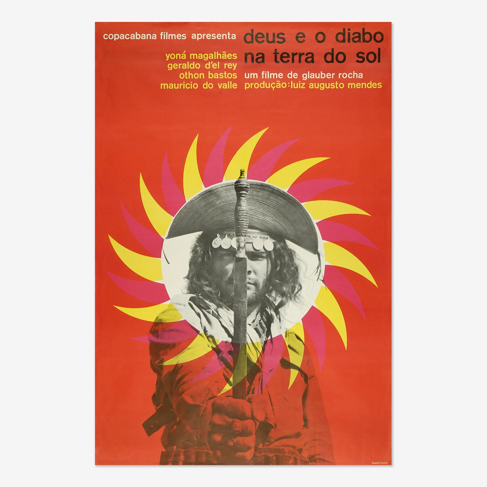
Tropicalism would borrow this concept from Oswald to create a popular movement encompassing rock and roll, psychedelic sounds, Brazilian rhythm and artistic expression. Galvanising people across the country to join behind a manifesto that soon spread far wider than music alone. Psychedelic design and kaleidoscopic colours reached art, revolutionary posters and much more. But the new movement drew disdain from the ruling party. In 1968, its figureheads were arrested and later exiled to London.
By then though it was too late – it couldn’t be quashed. Its life as a libertarian philosophy had ended, and the ideas had detached from the intellectual and become part of connecting people to a new Brazilian identity. It began with music but was soon transferred to poetry, literature, architecture, cinema and of course, graphic design.
Brazilian tropicalism in creative design: then and now
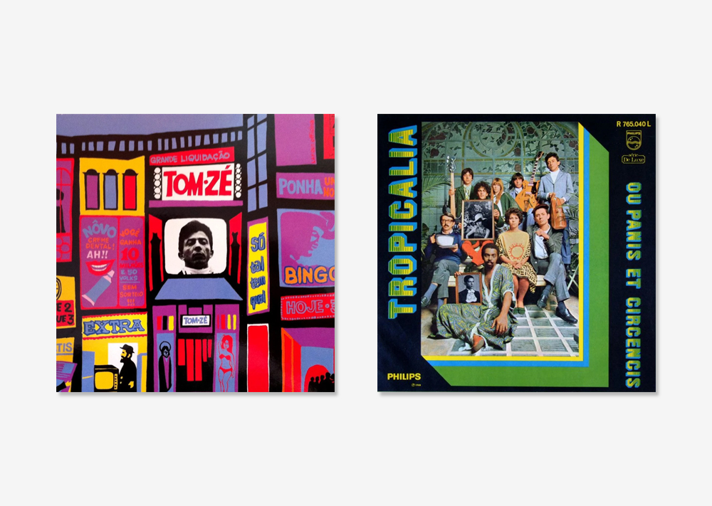
In the world of design, illustrator and designer Rogério Duarte created innumerable album covers with this tropicalist aesthetic in the 60s and 70s. His work would soon be adopted outside of music paraphernalia too, as the unmistakable style caught wind capturing the new and empowered Brazilian culture.
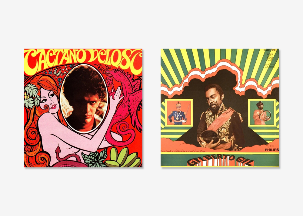
Its design characteristics are eclectic and vibrant, often incorporating bold, tropical colours, organic shapes and a mix of Indigenous, Afro-Brazilian and European motifs. Reflecting Brazil’s diverse cultural heritage while embracing experimental, avant-garde aesthetics too. Staying true to its founding purpose too, Tropicalism is also never devoid of poignancy and message. Its deeper meaning contrasted with the lightness of the design. It’s a combination of the local and the global, creating an expressive, dynamic, and often surreal design style, evoking a sense of liberation, rebellion and celebration of Brazil’s unique identity.
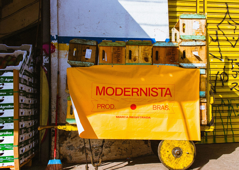
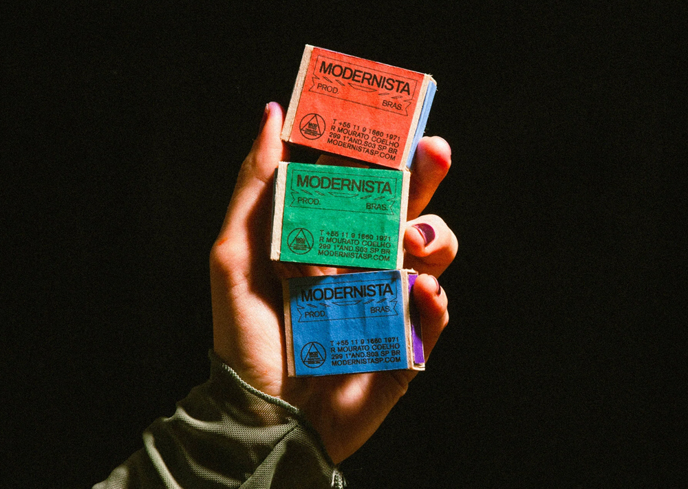
Fast forward to today, and that bold mix is still a cornerstone of design direction picked up by Brazilian brands too. Take Modernista, a local production company that had previously rooted its visual identity in Bauhausian design before wanting to pivot to one that felt more acutely linked to its home nation. Plant, a multidisciplinary design studio based between Reykjavik and São Paulo was tasked with the rebrand and felt instinctively that a move to Tropicalism would be the right one.
The result is branding that leans heavily on Brazilian vernacular design, taking the forms, colours and symbols of products such as ‘Groselha Vitaminada Milany’ (a popular Gooseberry syrup soft drink) and ‘Bala Chita Abacaxi’ (a typical Pineapple candy) and reimagining them in the context of a production studio. By pouring over the intricate details of the design, from typeface to low-fi camera production, the team managed to marry together the authentic feel of Tropicalism. A fusion between what’s already there and the influence of external forces, unified under the vividity of colour and shape.
Today’s brands distilling a bit of Brazilian into their advertising
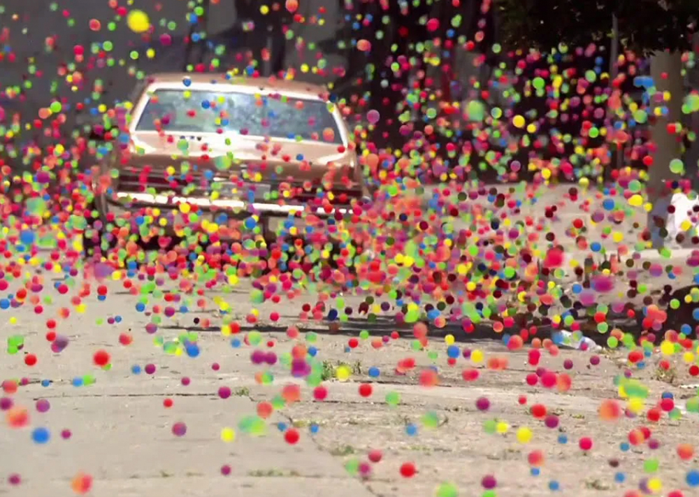
When looking at the campaigns that most brilliantly capture colour and contrast, one cannot begin anywhere else than with SONY’s iconic bouncing balls advert. Set on the steep slopes of San Francisco the scene is one etched into memory, as a deluge of bright bouncy balls veer through the streets. It’s Tropicalism of course for its use of magnificent colour, but more than that.
The startling contrast of seeing everyday American suburbia being suddenly covered in colour breaks the norm. It makes us stand up and pay attention, just as those original Tropicalism album covers intended to. As a marketing campaign, it didn’t just showcase a product; it set a new benchmark in advertising. By blending art and marketing seamlessly, it demonstrated the power of creativity and the impact of genuine, heartfelt storytelling. Testament to how the blend of creativity, authenticity, and emotional resonance can be truly extraordinary. All brought together under the tagline, “colour like no other.” Exactly as Tropicalism would synergise several influencers to create a style like no other.
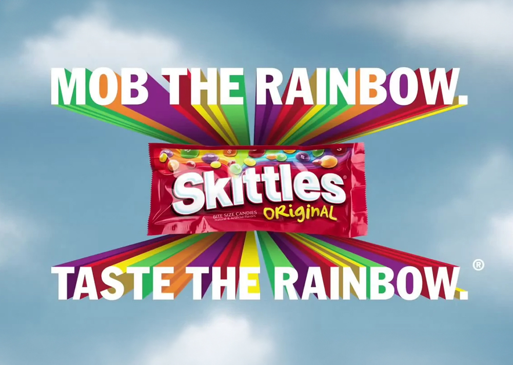
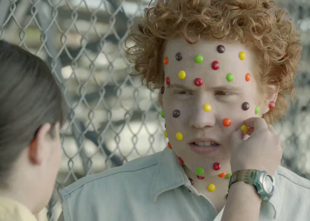
Skittles is another brand that chose to adopt the essence of Tropicalism in its design direction. “Taste the Rainbow” and the subsequent “Touch the Rainbow” marketing campaigns are built entirely on colour. How could they not be, given the nature of the product but somehow, it’s not gimmicky. By alluding to the rainbow and using it as a construct within every output of their advertising, the audience is reminded of something bigger, something more emotive. After the rain comes the rainbow. It’s the pot of gold, the promise of sunshine.
The brand distils emotions of hope and happiness into an advert that is in essence about munching on tiny little sweets and yet we are made to feel more. That is Tropicalism – lure with colour, and then stir with a message. Contrasting the lightness of a creative with something more powerful than it might look on the surface.
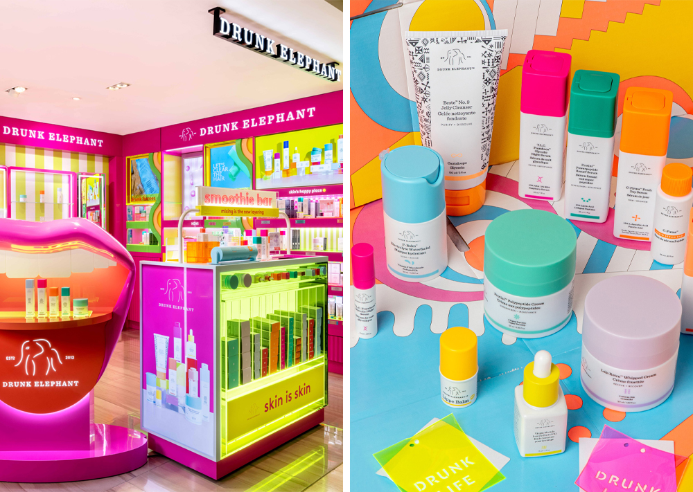
Then there’s the skincare brand Drunk Elephant. A relative newcomer to the swamped beauty market, the team would have known that to have any chance of brand recall, they’d need to be disruptive. So, in a sea of subdued design and darker sultry packaging intended to attract the high-earning consumer, Drunk Elephant’s popping palette and straightforward approach stand out. Across all touchpoints, from the packaging to the social posts, colour and shape flood through the visual identity. The brand name, signified by a simple elephant outline logo, is tongue-in-cheek, veering almost on random until that is you uncover the brand message.
As with all of the aforementioned brands using Tropicalism as their design device, there’s hidden purpose and poignancy. Drunk Elephant has mastered the art of storytelling, using narratives to connect with their audience on a deeper level. Their founder has been open about her struggles with skin issues, which inspired her to create a brand that prioritises skin health. By sharing her own journey, the result is a relatable and authentic brand story that resonates with consumers. Allowing Drunk Elephant to position itself as a brand that understands the frustrations and insecurities of its customers, offering them solutions backed by science.
Infusing Glorious’ brands with a kaleidoscope of colour and contrast
As you might imagine, branding a business with bold colours and iconography hailing from Brazil is always a joyous project to work on. That was exactly the case when HarperCollins approached us to design the new imprint for HarperNorth – a dedicated editorial, marketing and publicity function rooted in the north of England. Already the context of their brief fit the mood of Tropicalism. By breaking the mould – being set up outside the main UK publishing hub of London – HarperCollins aimed to nurture and grow northern writing talent and bring the best voices to the widest national and international audiences.
After digesting the brief, we immersed ourselves in the world of publishing, looking at intended audiences, and familiarising ourselves with competitor imprints. Following a thorough creative concept stage with the client and our design team, we set upon a strong, bold and unique symbol, one that alludes to the north’s industrious and illustrious past. It is also visually aligned with the HarperCollins imprint – and whereas that alludes to fire and water – our imprint alludes to the industrial nature of the north and the network of waterways. Fixing on a spectrum of bright, popping colours belonging to Tropicalism we were able to ensure that whatever book spine the imprint landed on, it would have an impressive impact.

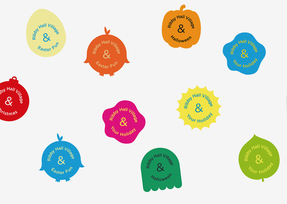
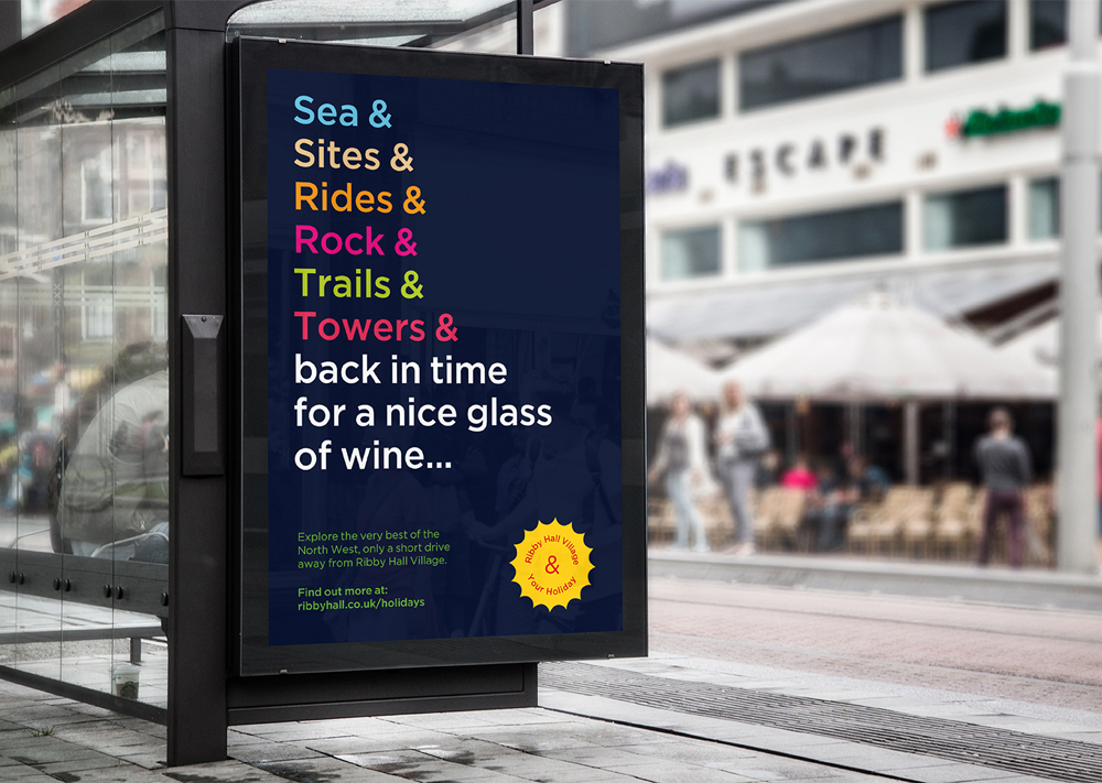
Ribby Hall Village was another client where we felt the creative direction could only be rooted in Tropicalism. The brief was to create a concept that could capture all the facets of the business and apply them to a variety of seasonal highlights when bookings spike. To make, for example, the Spa Hotel as relevant to wedding guests as it is to half-term holidays, or to ignite the summer trip excitement in children as much as in the overworked parents.
Using a language convention to communicate Ribby Hall’s myriad of activities and accommodations, by repeating ‘& & &’ we felt we would be able to inject plenty of personality and charm. It had endless possibilities to craft creative copy around seasonal peaks and be suited to the more omnipresent brand awareness campaigns too. Setting the messaging against captivating photography, we were able to distil the magic of a stay at Ribby Hall Village into a campaign with year-long longevity. Using primary colour tones akin to those of the Tropicalism movement, along with a dynamic typeface, we delivered a campaign creative that could spur as much excitement in a six-year-old as it could in a spa-seeking sixty-year-old. By marrying together influences from across the entire plethora of the brand’s audiences, we added duality to the design just like those that harken back to Tropicalism.
So then – if our guide to Tropicalism and the bright bold beats of Brazil has left you yearning for colour and contrast, loaded with message and meaning then we’re here to help. From rebrands to website design, to full-scale marketing strategy and delivery – let us help you bring out the Brazil in your branding.
But before that – here are our top tips on tuning into Tropicalism to get you started:
1. Colour, colour and more colour. This is a no-brainer of course, given we’ve woven the importance of vivid colour throughout the last several hundred words. But it is that Think contrast, yellow with blue, pink with green, a brand palette that really does stand out amongst the crowd. Remember the Drunk Elephant packaging in a sea of sameness? That’s what you’re going for.
2. Absorb a myriad of influences. Tropicalism was born from the idea that what is foreign and international must not be ignored but rather absorbed and then transformed into something new. When it comes to your graphic design style, amalgamate influences from different sources, join them together and create something entirely unique. That is the essence of Tropicalism.
3. Remember the importance of storytelling. Hidden message and meaning are a vital part of Tropicalism branding. A design could look beautiful in its aesthetic but without context and storytelling, it’ll never truly be a part of the movement. Establish your why first and build a brand narrative with meaning, then whatever brightly coloured design you settle on, you know you’re hitting the Tropicalism brief.
What to bring your next branding project to life? Get in touch.
Mailing List
Sign up to our mailing list to receive all the latest news.
Check out our privacy policy for the full story on how we protect & manage your submitted data.