
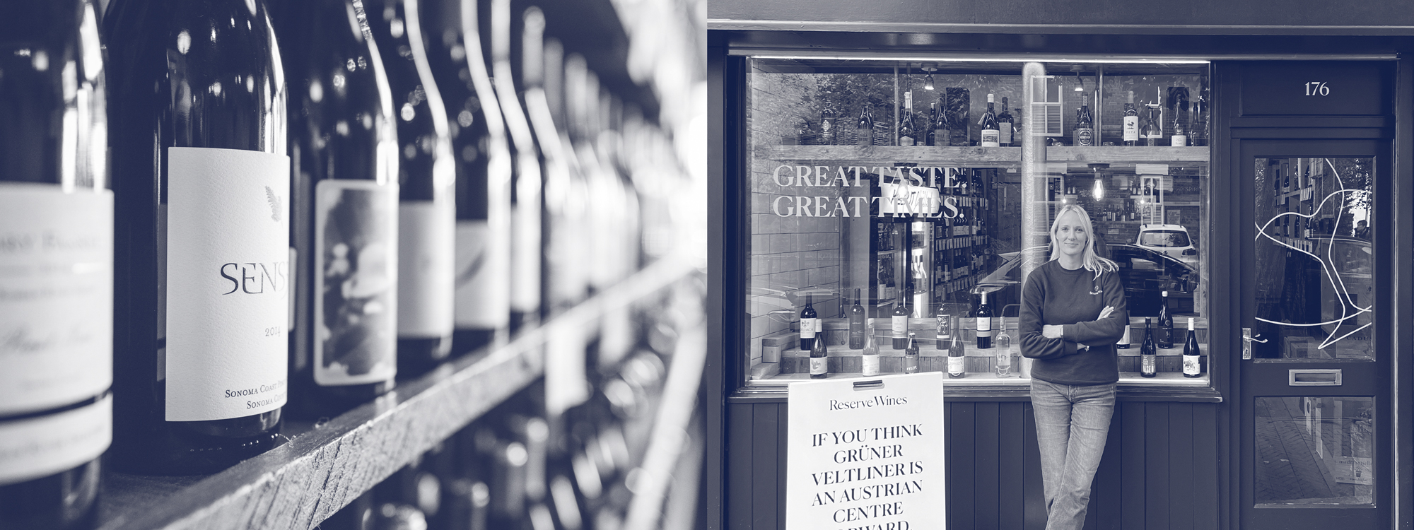
Reserve Wines
How do you re-establish an independent wine merchant as UK-wide category leaders?
By creating a new visual and verbal identity that gives consistency at every touch-point, but allows room for the brand’s personality to flourish, cutting through a competitive market.
Background
Reserve Wines are an award-winning, independent wine merchant with the philosophy that great wine should be accessible to everyone. First opening in 2003 in West Didsbury, they have used their wine expertise to build a loyal customer base across the North West. But it wasn’t always like this. In fact, Reserve Wines was born when owner Kate visited a wine shop and was made to feel uncomfortable for her (then) lack of knowledge surrounding wine.
This inspired Kate to go forth and carve a new path for selling wine. One that was inclusive, friendly and aimed at nurturing people’s growing curiosity, instead of belittling it. With a specific focus on keeping it simple and fun, Kate and her team set out to create a comfortable space for customers to ask questions and get advice from a small, friendly team of experts – making good wine and good times accessible for everyone.
Over the last 19 years, Kate and her staff have been exceptionally friendly and engaging, pulling in more and more business each year. Reserve Wines quickly became the go-to with local wine-drinkers, for its down-to-earth personality and helpfulness. Since the shop opened, demand for approachable and trustworthy wine experts has soared, resulting in four further wine shops opening (of which three are drink-in wine bars), as well as a growing online business.
The Brief
Reserve Wines enlisted the help of Glorious for a brand refresh that would better tell their authentic story. Ahead of a chain-wide makeover and their expansion from Manchester into the rest of the nation – they also needed a specific focus on digital assets.
Reserve Wines wanted to cut through the noise of an overly saturated and competitive market with a refreshed, future-proof and consolidated look and feel. They desired to appeal to a larger audience by making the brand more memorable and fun, in an effort to inspire the next generation of wine connoisseurs and better reflect their values. Happy with their existing name and ethos, Glorious set out to provide Reserve Wines with a well-needed brand identity refresh that encapsulated the empowerment and adventure of their wonderful world of wine.
Our Response
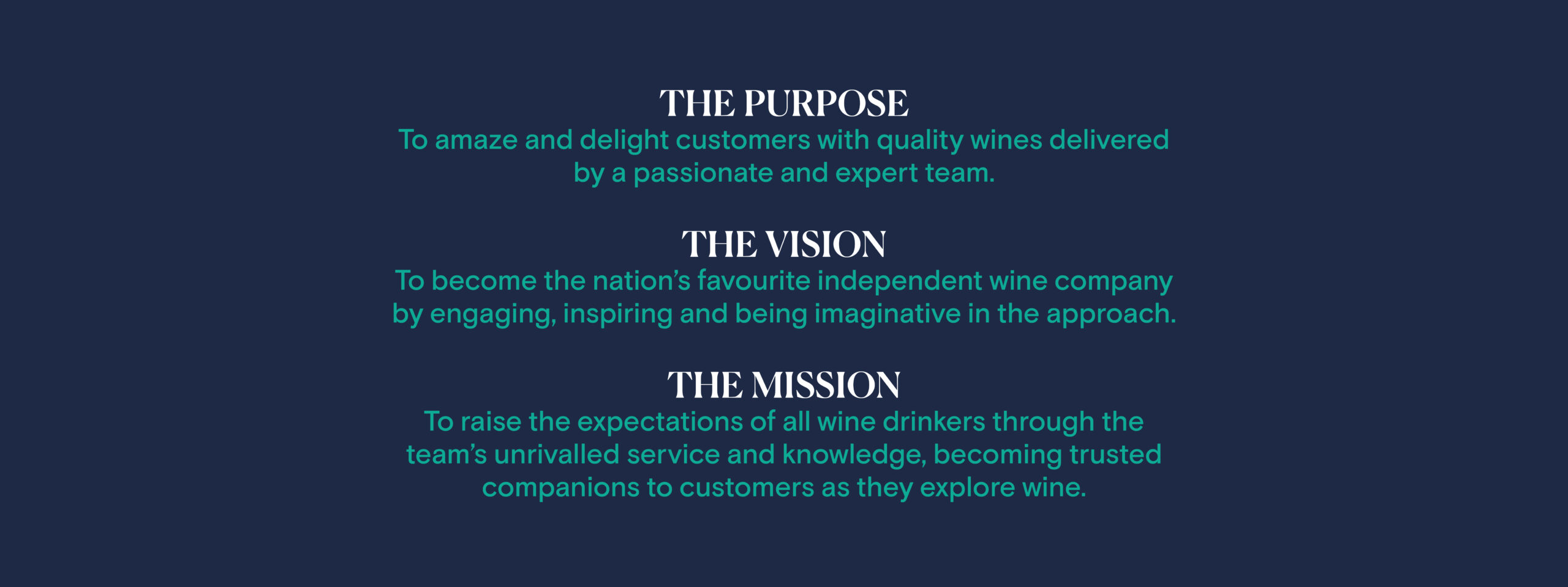
To kick things off, a series of brand workshops allowed us to delve deeper into the brand and first re-define the Reserve Wines brand platform, condensing the essence of the company into three simple statements.
In addition to redefining the brand platform, repositioning their values and brand positioning to realign with what they stand for as a brand, we developed and brought to life a series of five brand personas that would help us to better understand the customers’ values, beliefs, attitudes and behaviours, underpinning any future creative development.
To ensure we maintained the integrity of the visual and verbal identity, we prioritised consistency – we believe, the single most crucial factor when it comes to presenting a defined and coherent brand. So when tasked with producing assets, be it social, physical, or communications, all involved could be steered by the new and improved brand guidelines.
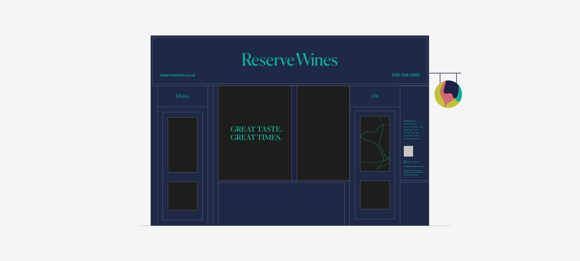
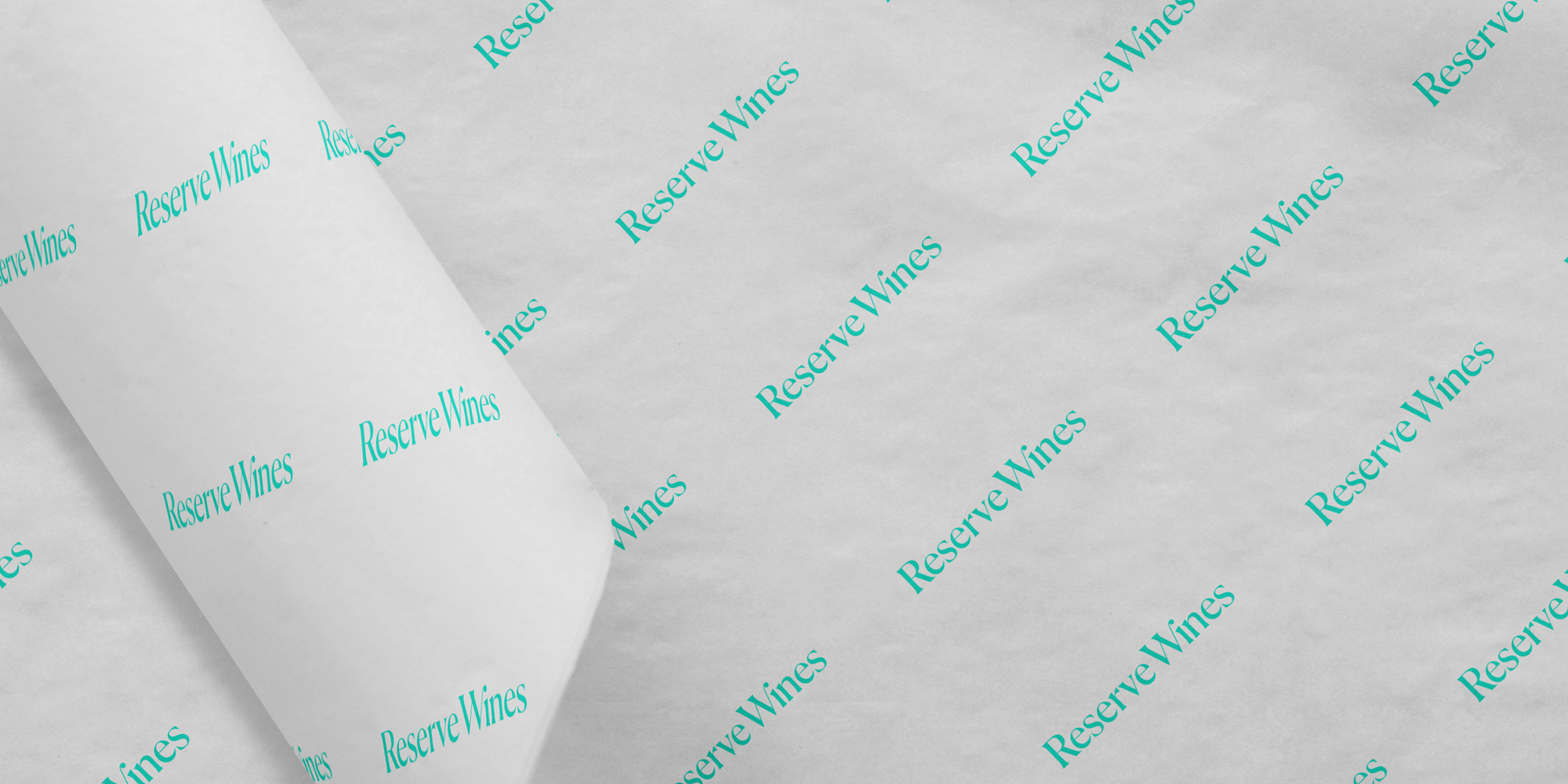
The master wordmark and symbol have been configured to ensure they are unique, to benefit brand recognition and boost brand awareness.
We also created a master wordmark in two colours, and a symbol in both solid colours and as a linear option. Both versions equally represent the organisation and allow the client flexibility while remaining within the brand guidelines. The linear versions also aid with single-colour reproduction in print communications.
We created the Reserve Wines avatar for use as the ‘shorthand’ of the master wordmark and symbol, specifically created for implementation on the brands’ social channels.

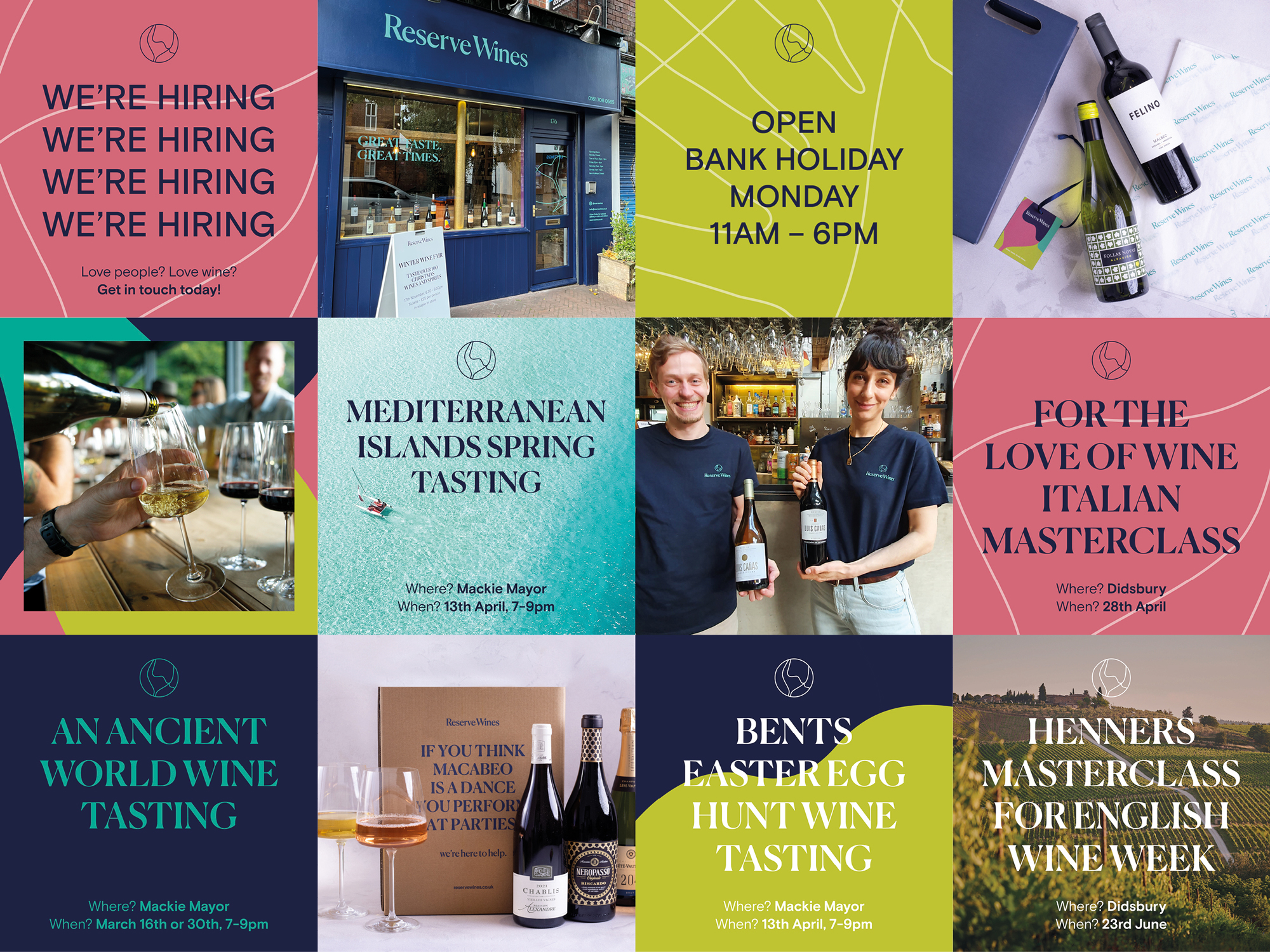
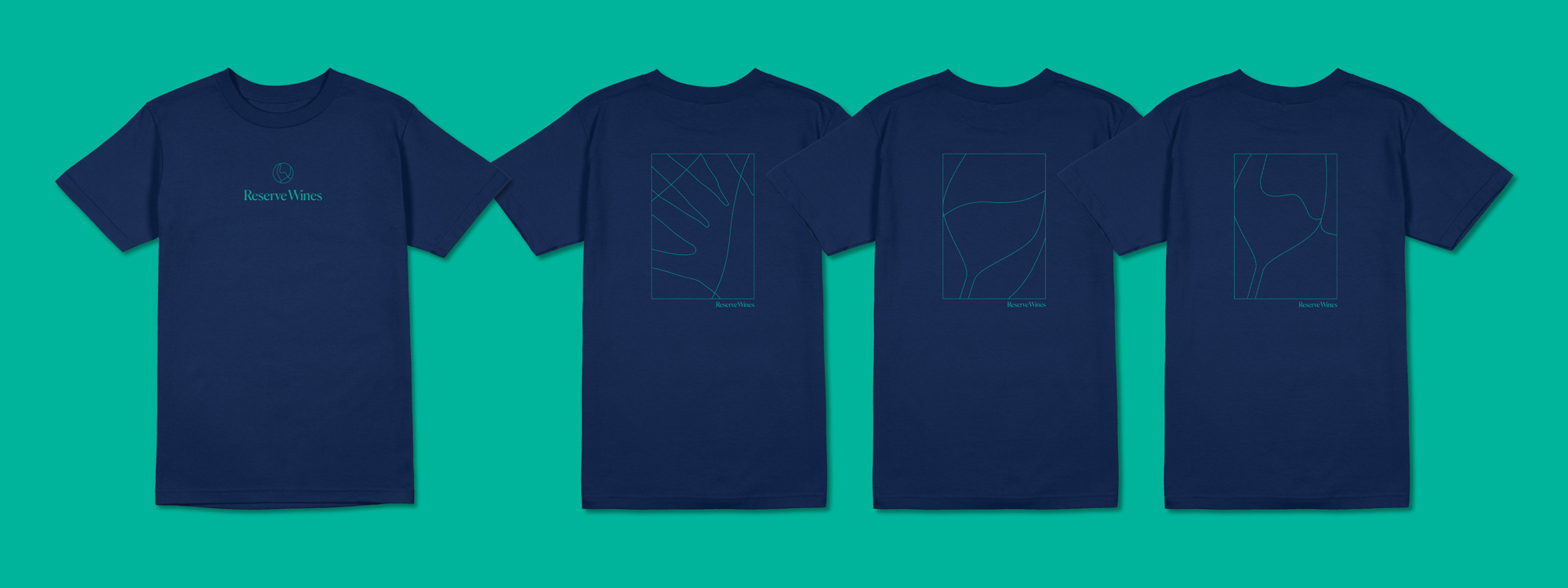
Colour plays an essential role in any visual identity toolkit. So, to ensure adequate flexibility, we devised a primary colour palette for Reserve Wines consisting of four colours; RW Turquoise and RW Dark Blue being the primary palette, and RW Lime and RW Pink being secondary. These bright and bold colours set a positive and optimistic visual tone for the brand. They were incorporated across all assets, including the suite of brand illustrations we created, designed to promote the concept of bringing wine and people together.
To ensure consistency throughout the clients’ communications and content, we adopted a typographic style that will be distinct and increase visual recognition. The visual appearance is light and airy. This approach is more inviting for the reader and also visually presents a more modern and considered brand identity.
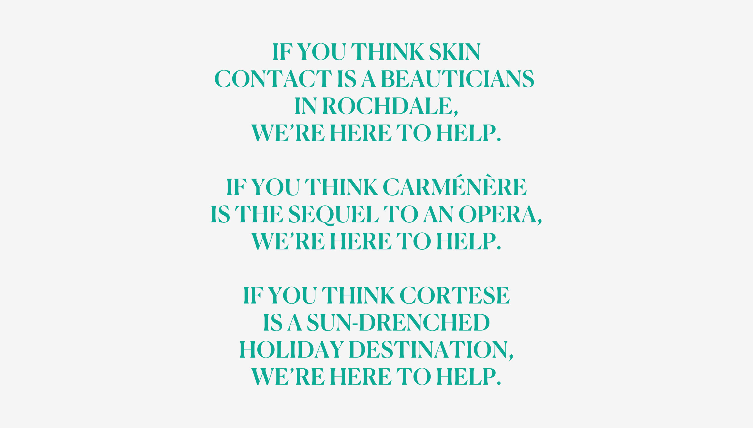
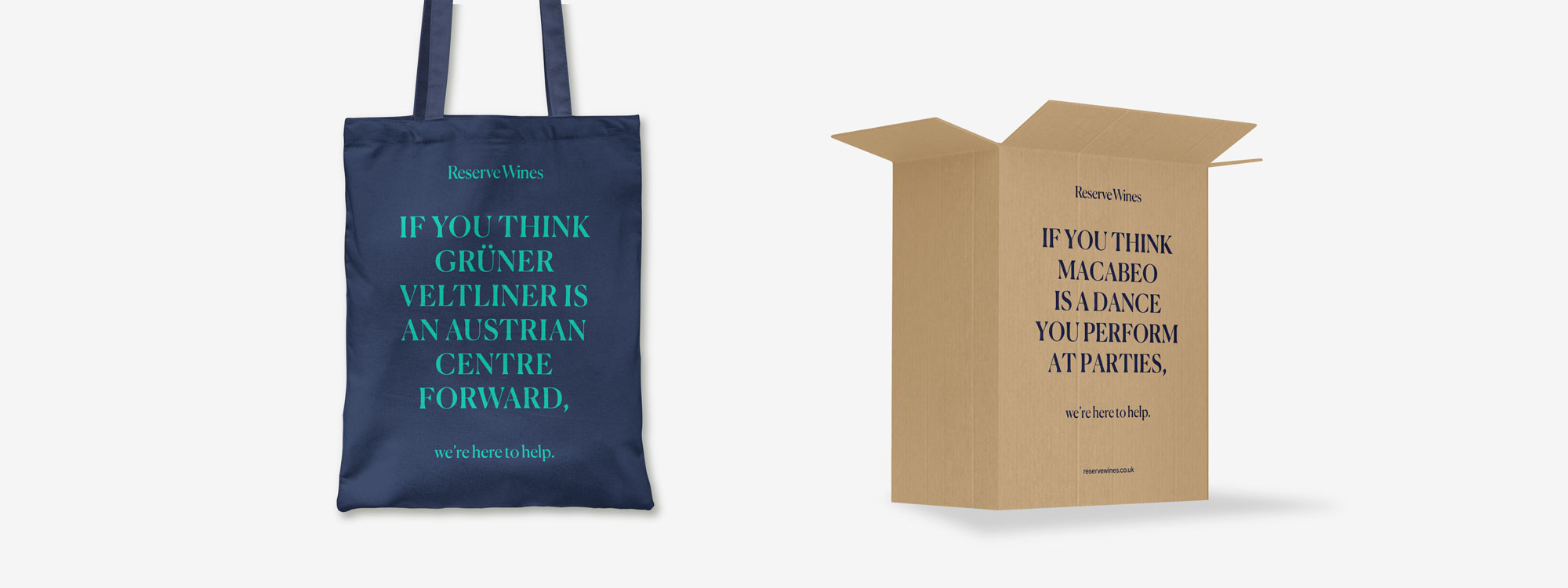
We created a ToV that focuses on what RW can deliver for their customers, keeping it interesting, authentic and engaging. The use of first-person helps to create a more approachable and relatable tone of voice for potential customers allowing them to feel like they’re in direct conversation with the brand, enhancing trust.
We created a series of social assets for the client to help them fortify a strong presence online. The assets consisted of photography and typography posts with witty taglines using the brand colour palette, helping to further convey the brand’s fun-loving and approachable nature. We utilised the primary brand fonts within the post design, using one to represent events and one for promotions.
Lastly, we updated the Reserve Wines’ physical merchandise and uniforms to bring them in line with the new visual identity. This included the employee dress, packaging, labels and tote bags. The new designs of these physical assets help express personality while keeping cohesion at the forefront of the brand, clearly differentiating them from the competition.
The Outcome
The outcome was a fun, memorable visual identity that instils longevity in the Reserve Wine brand, preparing them for future growth ventures and better reflecting the company values, to allow them to inspire the current and next generation of laid back wine drinkers.
“We really enjoyed working with Glorious on our rebrand. Ours was a comprehensive overhaul – the first time we’d revisited the brand in 18 years, so a big step. We were keen to take a risk and do something totally fresh. The kick-off workshop Glorious led was hugely valuable in helping us think about the bigger picture of where we wanted to go next. The team were great listeners and very responsive to feedback. It was clear how much they cared about our project and that was reflected in some really strong creative and a fun process overall. We’re delighted with the result. The customer response has been great, it’s energised and elevated our business.”
Marketing Manager
Interested in Glorious Thinking?
If you like what we did for Reserve Wines we could do something for you.
Mark Ross

Mailing List
Sign up to our mailing list to receive all the latest news.
Check out our privacy policy for the full story on how we protect & manage your submitted data.