
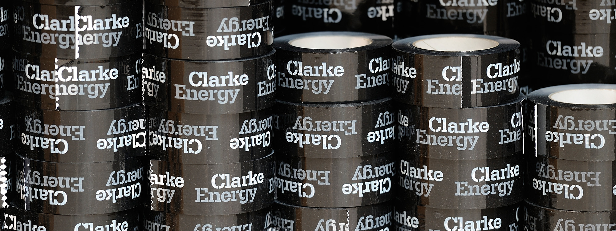
Clarke Energy
How do you add power to a successful international energy company?
You rebrand the company at every customer touch point across 16 countries and cultures.
The Brief
Clarke Energy is one of the UK’s international success stories, with over 1000 employees and a presence in sixteen countries across the globe. Our task was to carry out a global rebrand that reflected the size, stature and ethos of the company.
Our Response
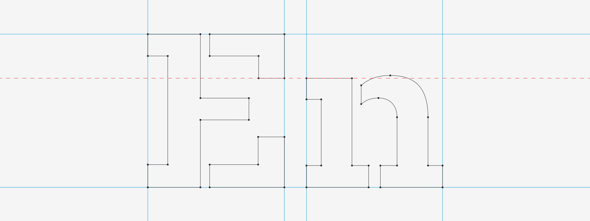
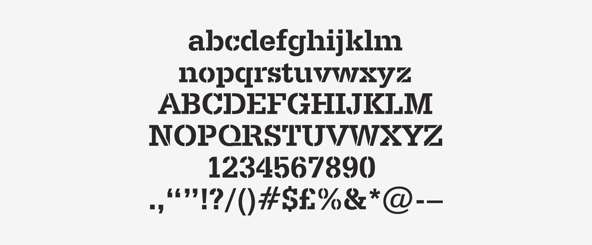
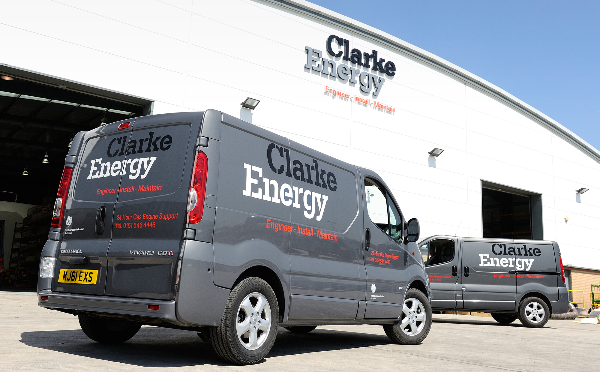
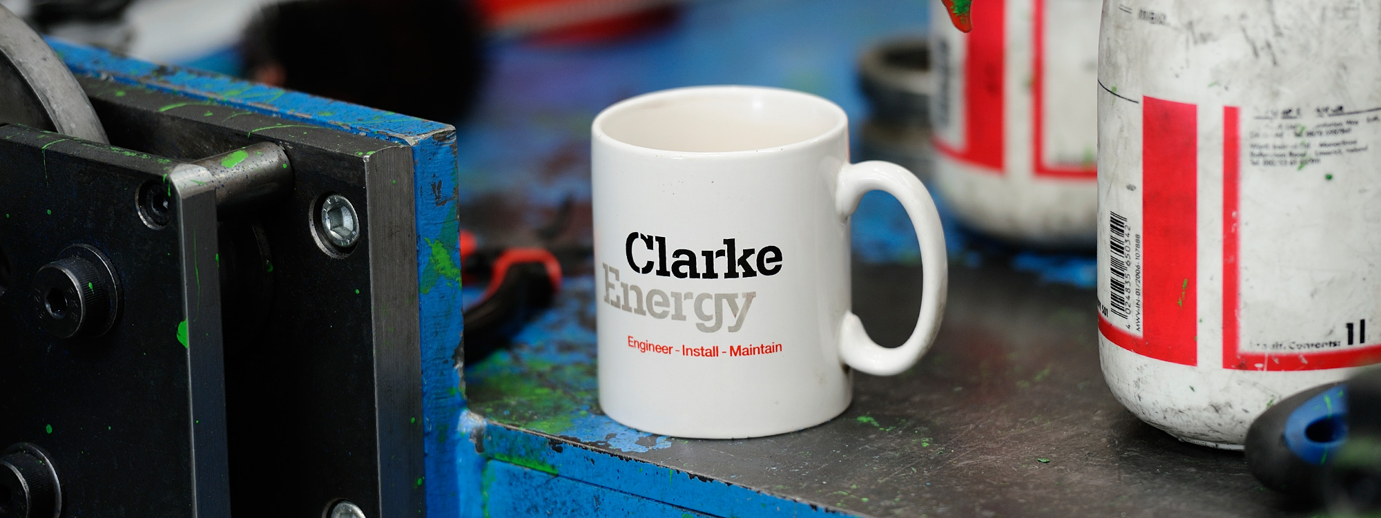
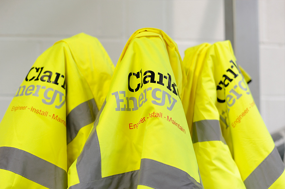
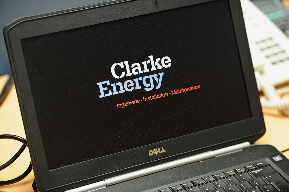
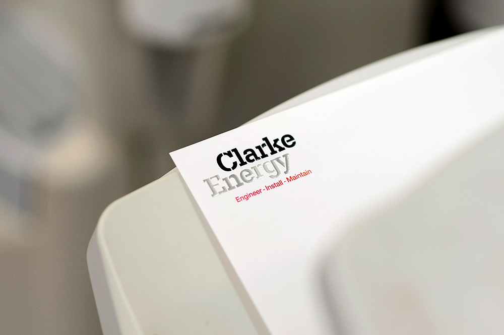
We developed brand identity concepts that reflected Clarke Energy’s corporate ethos of ‘a no-nonsense company that gets the job done’. The concepts were researched across 200 of their senior and middle management. The selected brand identity is based on a bespoke, stencil typeface, developed by the agency, that conveys the qualities of strength, authority, reliability and integrity.
Bespoke Typeface
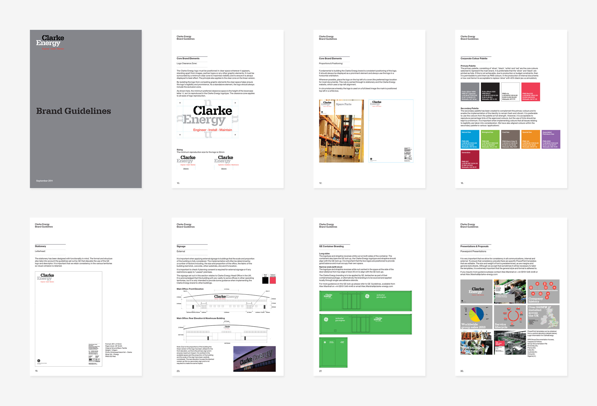
Brand Guidelines
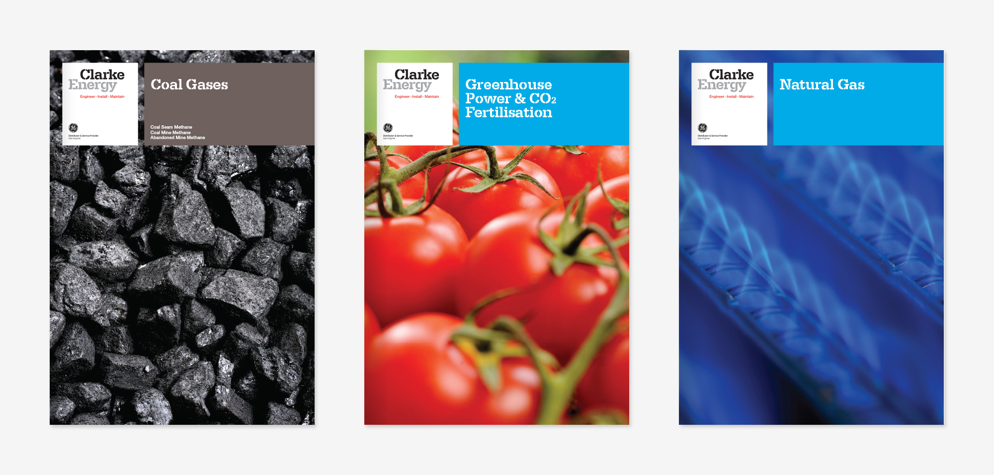
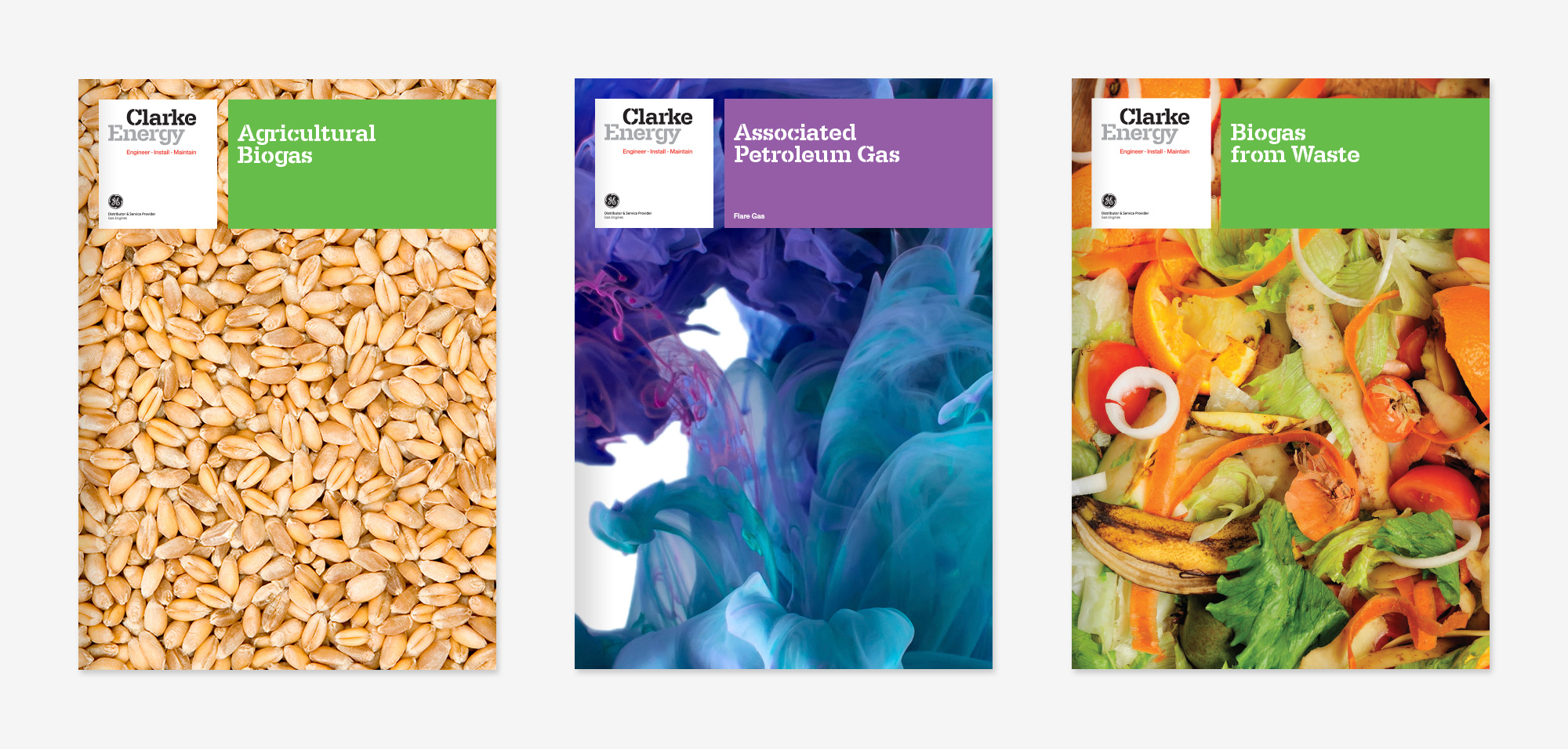
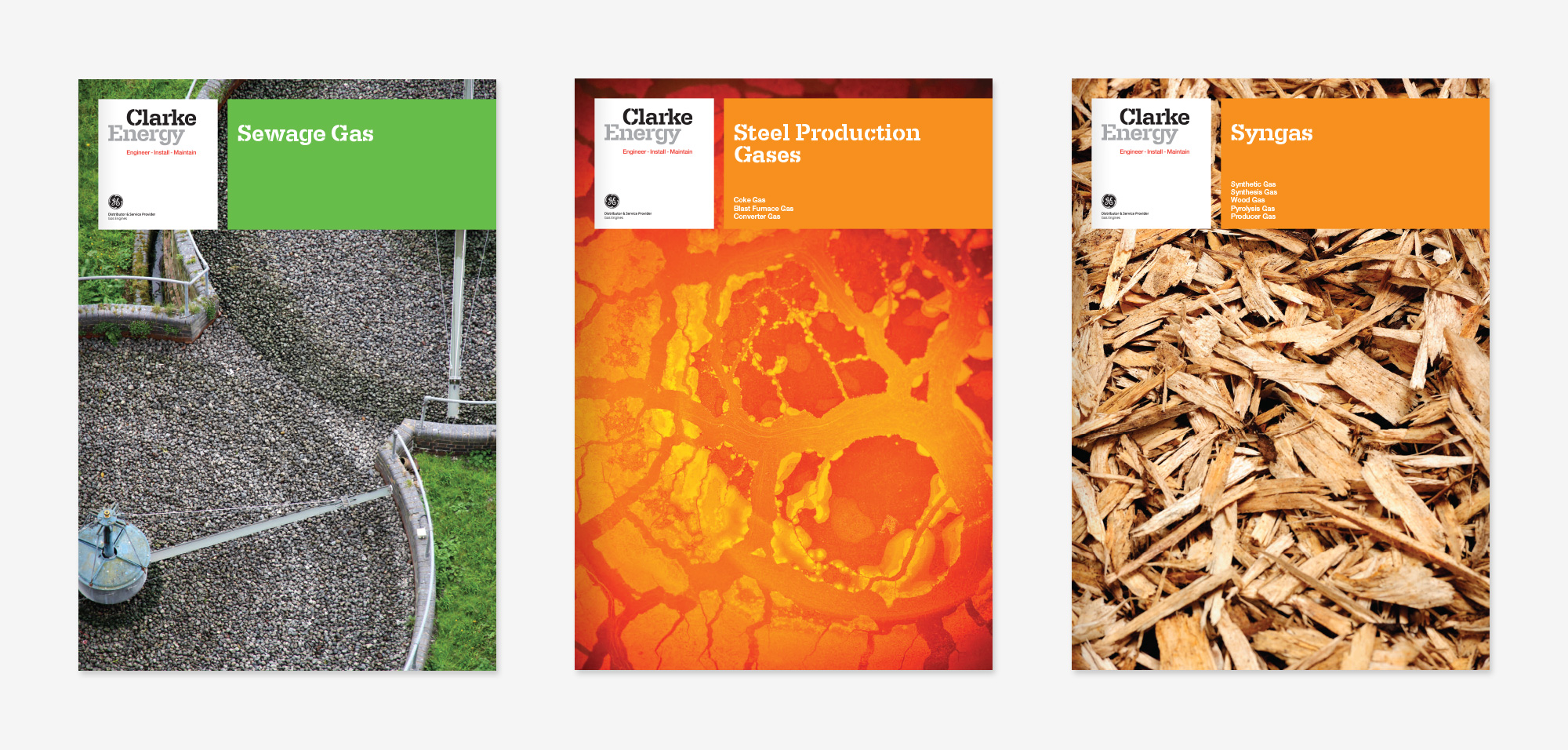
Sector Literature
Corporate Brochure

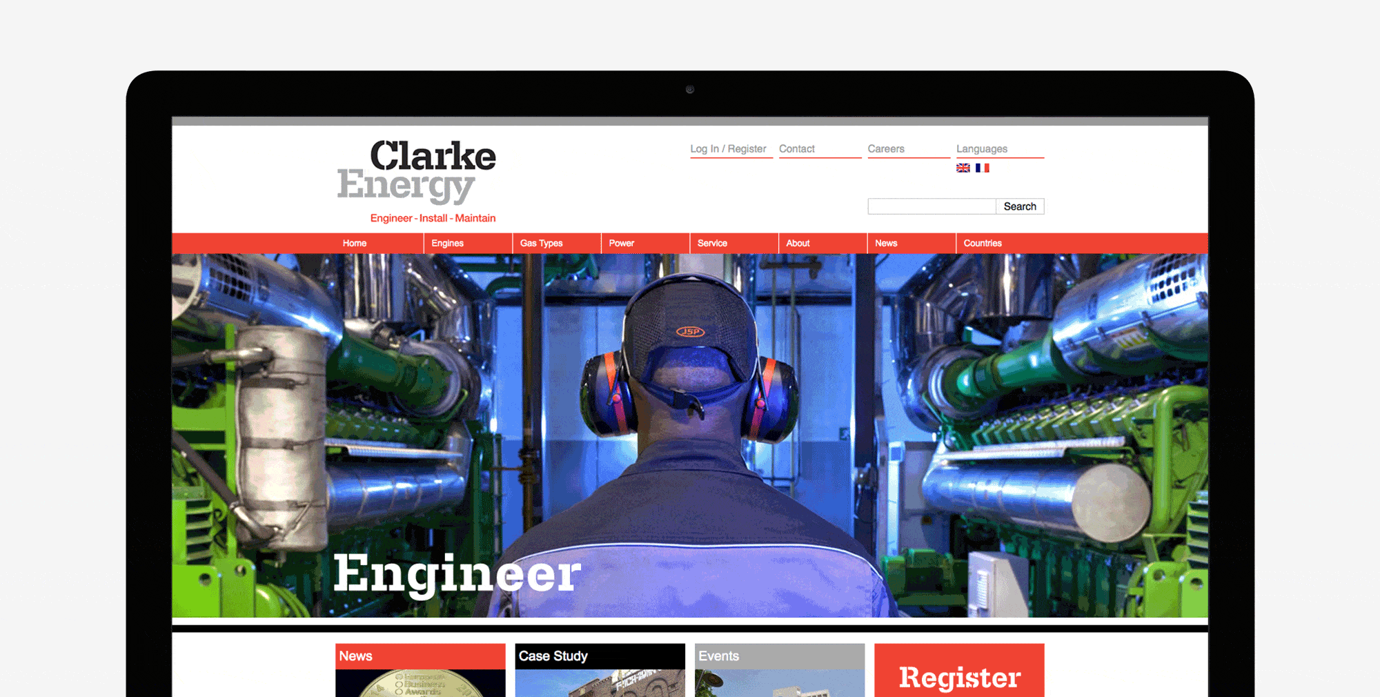
Digital

Press Advertising
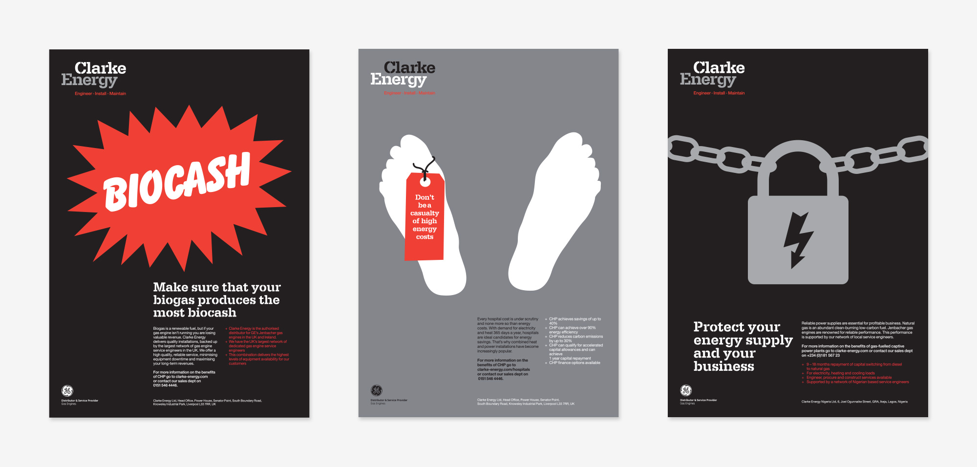
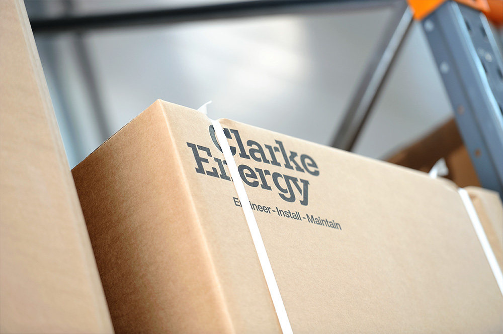
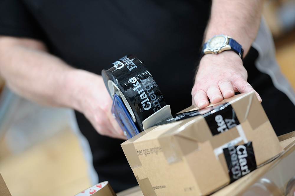
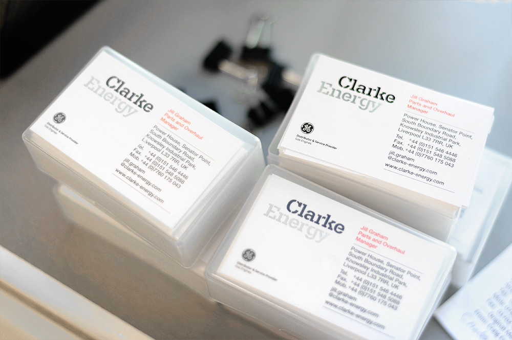
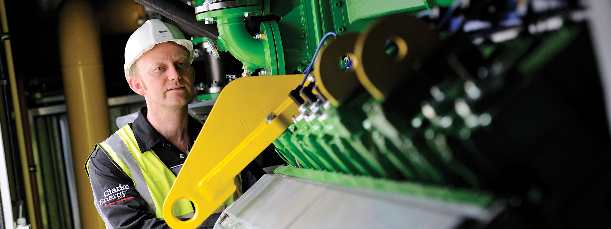
Identity Application
The Outcome
The measure of the rebrand’s success was always going to be the feedback from the UK’s senior management and the operational management from all of the global territories. The response to the new brand identity and its implementation has been extremely positive and universally welcomed.
“We selected Glorious to support us in the rebranding of our multinational operations following a rigorous tender process. They impressed us with their understanding of strategic considerations related to branding and their design concepts. The website, company vans, work wear and signage look great, and we continue to receive compliments about them. I can wholeheartedly recommend the Glorious team as a great set of people to work with.”
Group Marketing Director,
Clarke Energy
Interested in Glorious Thinking?
If you like what we did for the Clarke Energy rebrand maybe we could do something for you.
Mark Ross

Mailing List
Sign up to our mailing list to receive all the latest news.
Check out our privacy policy for the full story on how we protect & manage your submitted data.