American Dry Cleaning Company
How do you bring high interest and stand out to a low interest service?
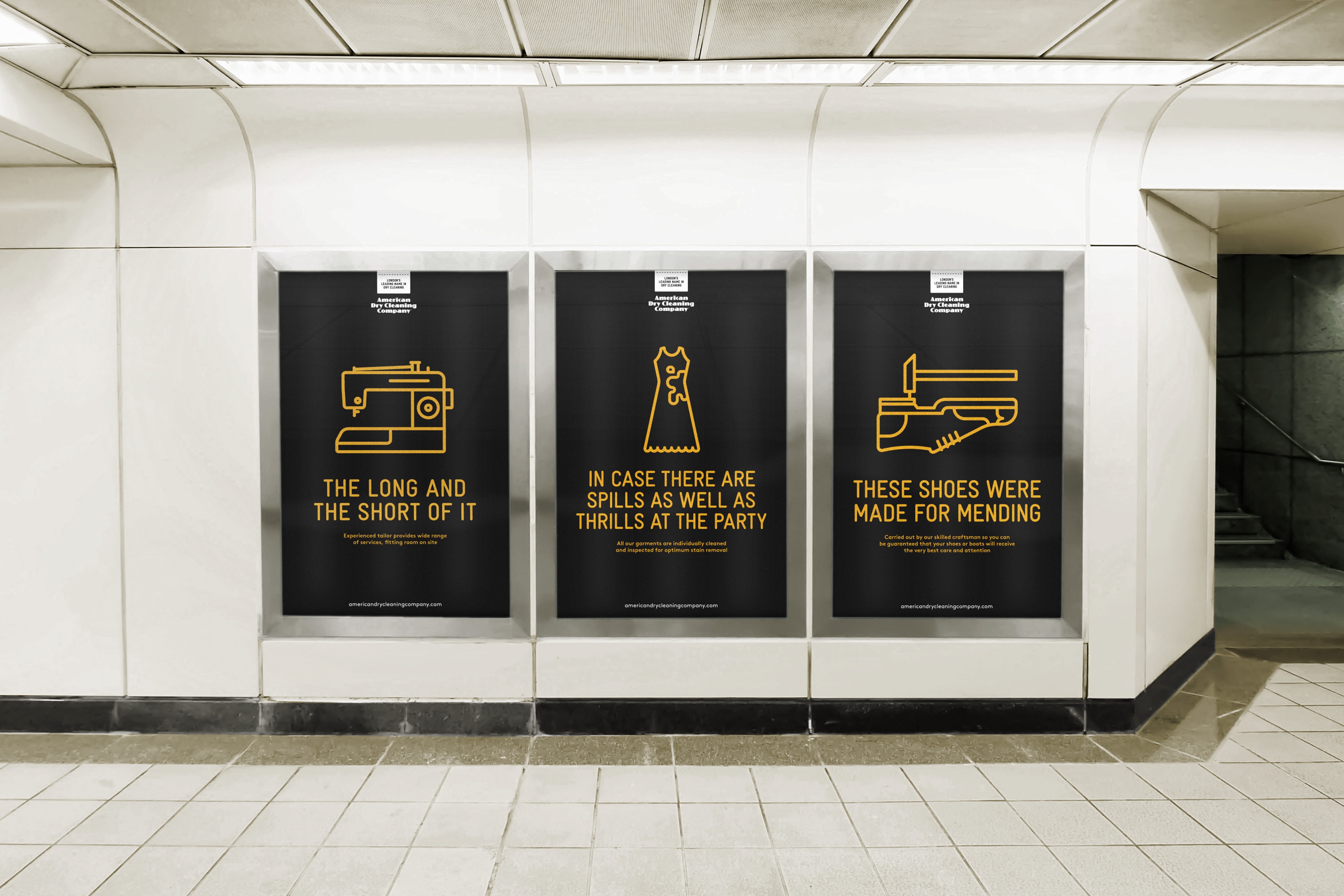
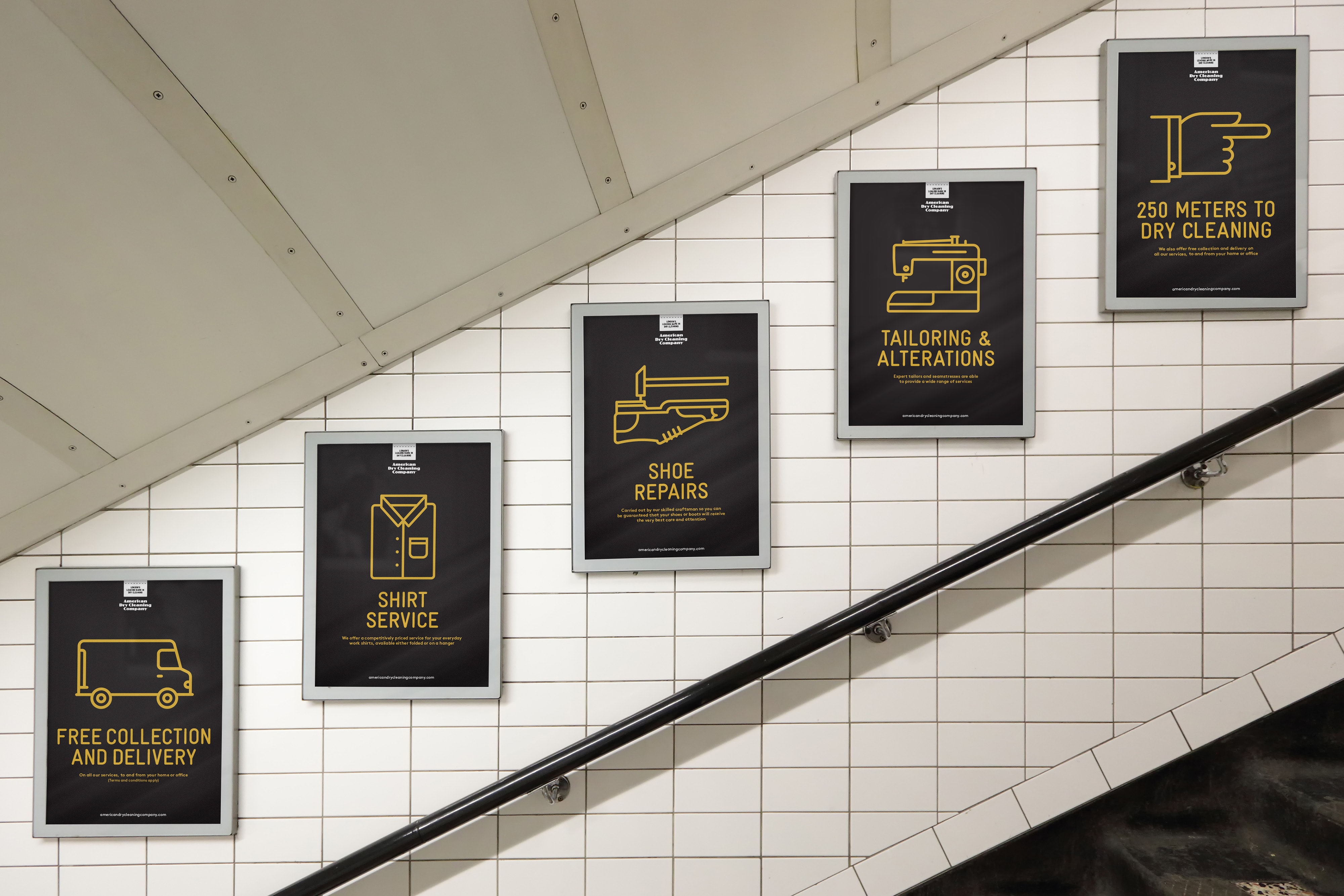
You produce charming, informative symbols and combine them with an engaging copy approach.

The Brief
To rebrand the American Dry Cleaning estate of retail outlets and develop a visual style and tone of voice for all communications materials, that elevates the brand above the standard dry cleaning multiples and independents.

Our Response
We carried out workshops with the management and staff to develop key findings leading to vision, mission and positioning statements. A number of creative concepts were produced and researched amongst customers and staff. The preferred route utilisises a complete suite of elegant, charming and informative symbols which amounted to a complete step change from the predictable dry cleaning visual imagery and copy propositions. They were married to a whimsical, engaging copy approach. This achieved the necessary differentiation to emphasise the company’s brand leader status.
The American Dry Cleaning Company word mark had to be retained, which presented the challenge of creating an identity that had stand out and brought a new sense of ‘friendly accessibility’ to the retail outlets, whilst sitting comfortably with the existing typographical styling of the company name.
Illustration Style


Advertisements
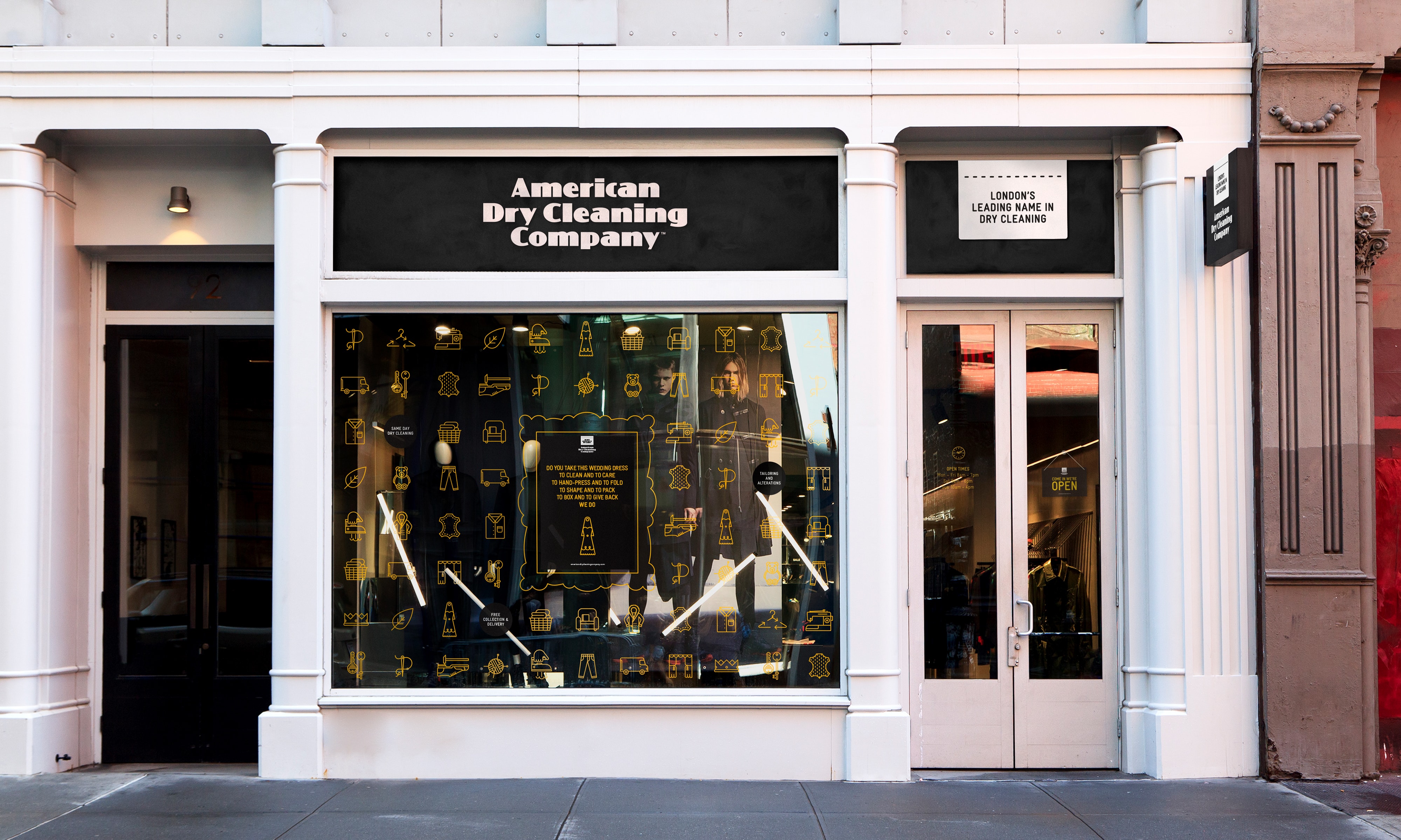
Window Displays
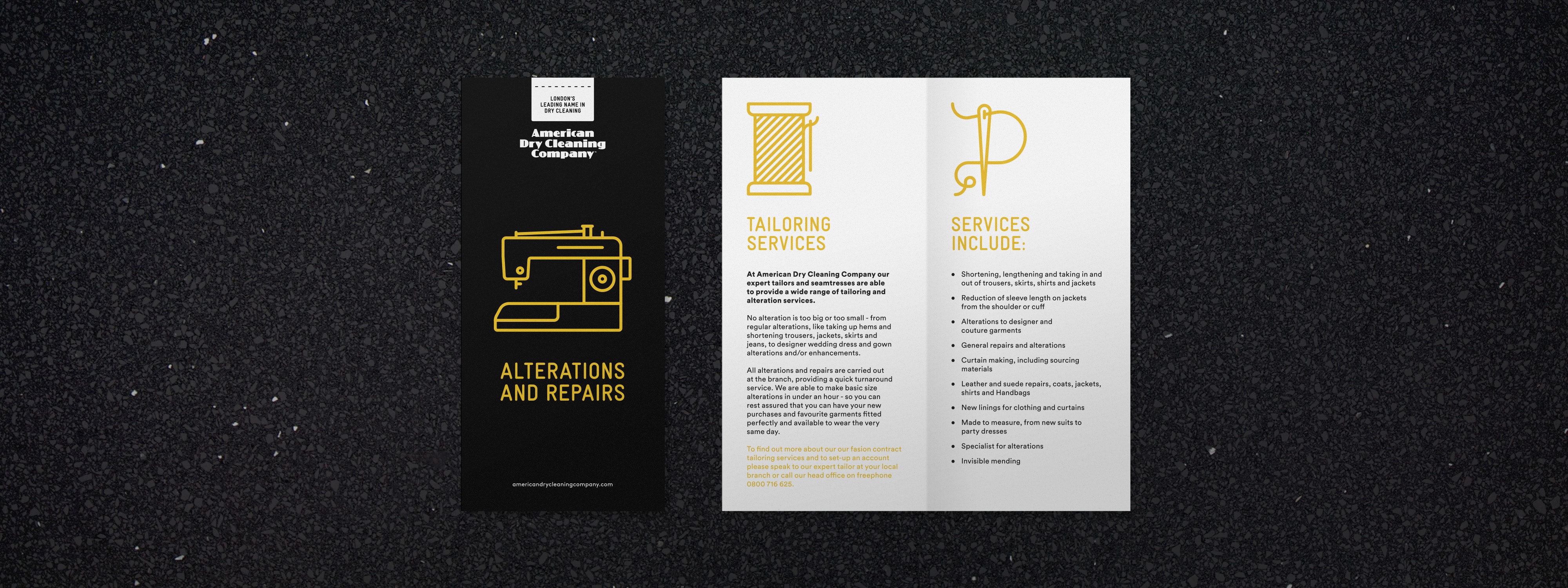
Print Literature

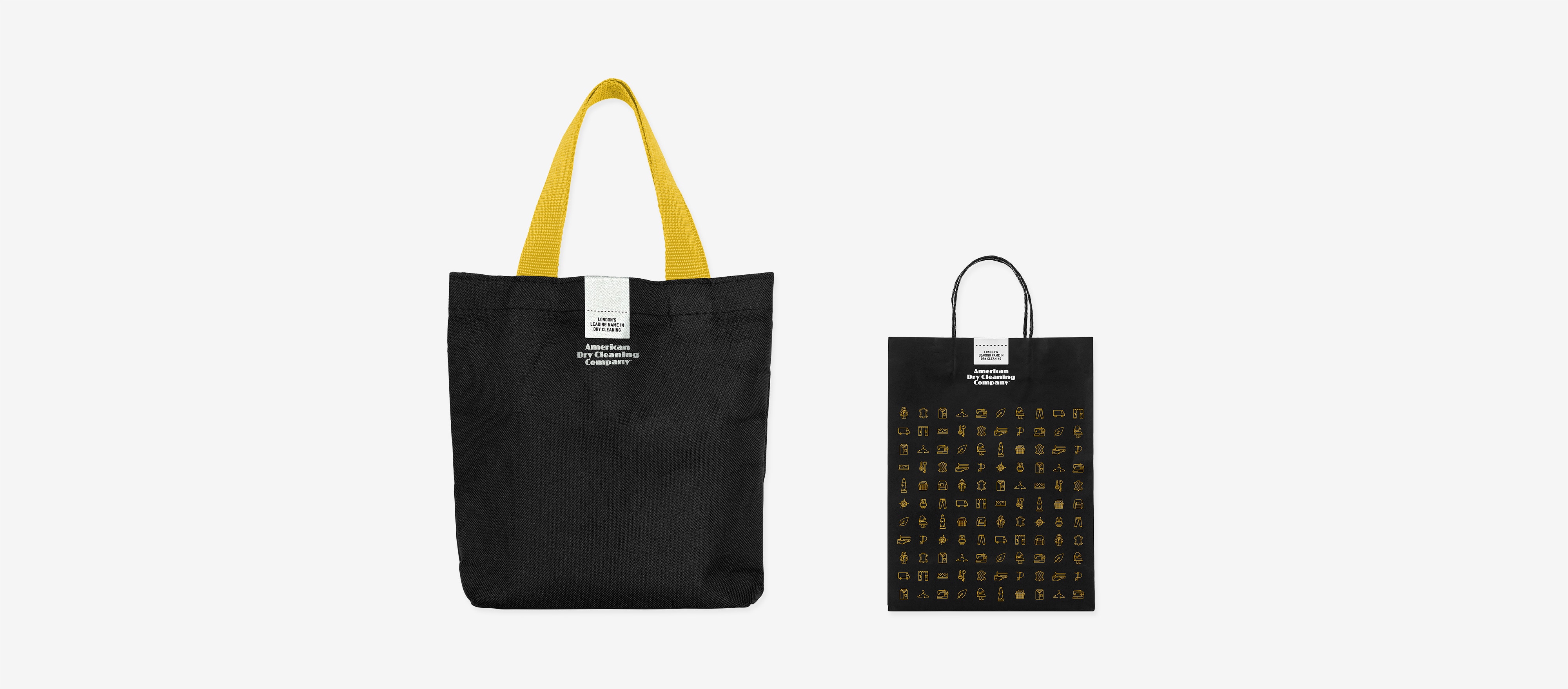
Carrier Bags
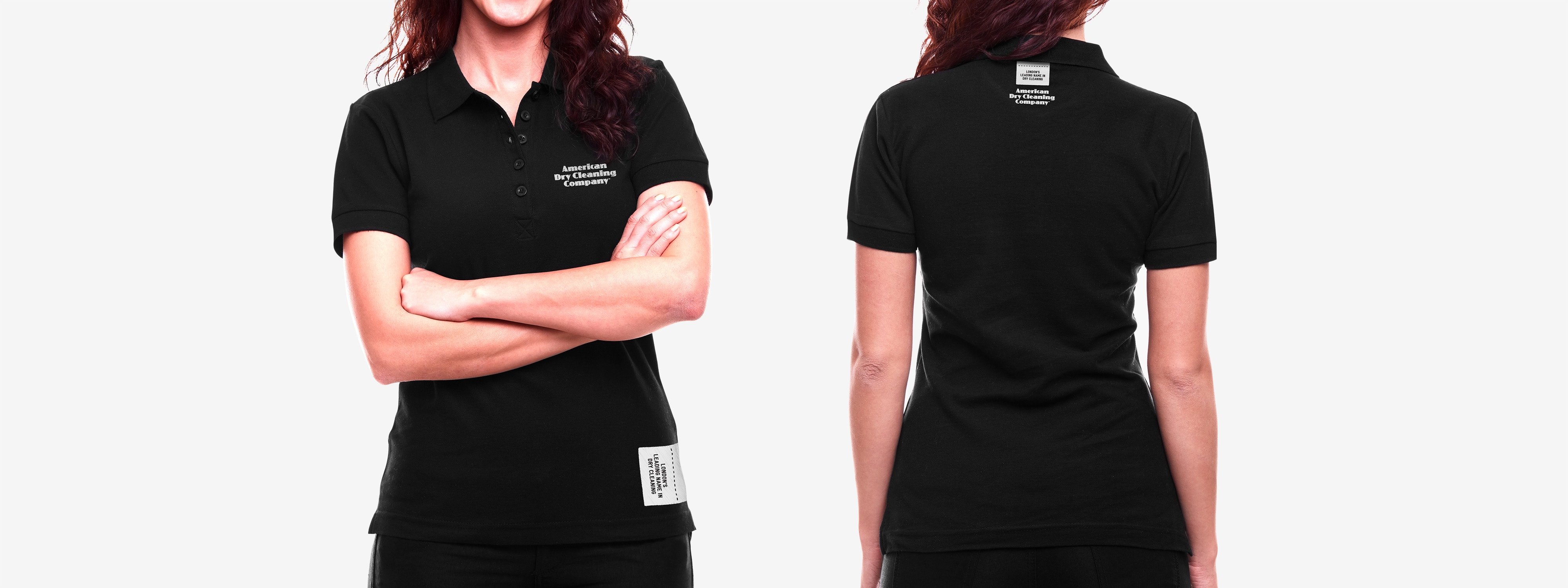
Company Uniform
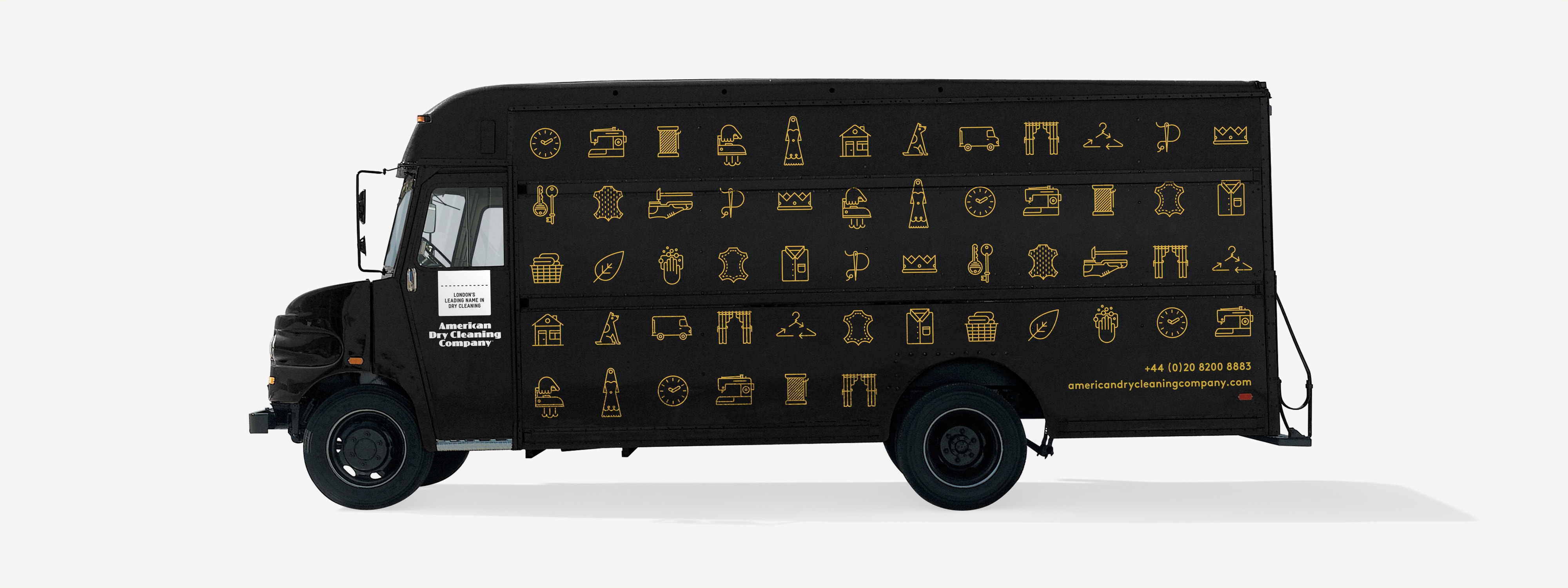
Vehicle Livery
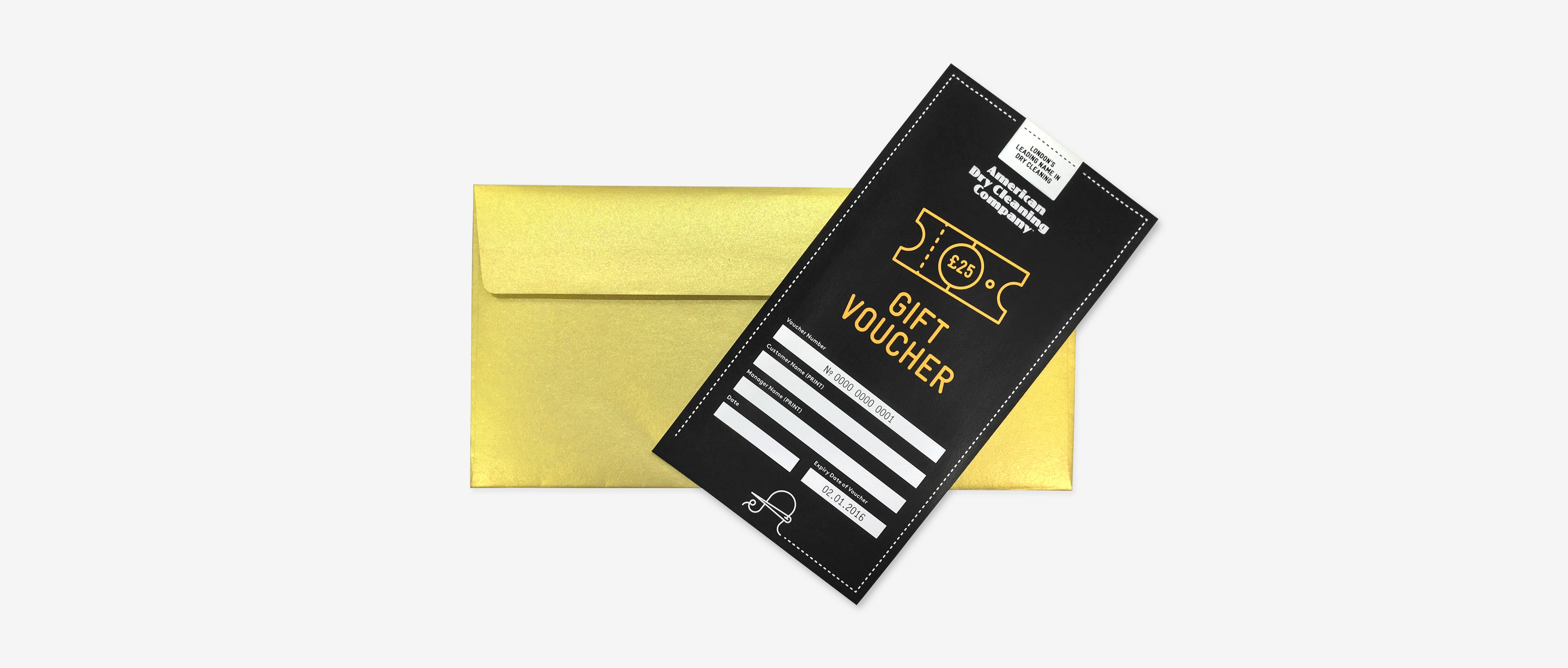
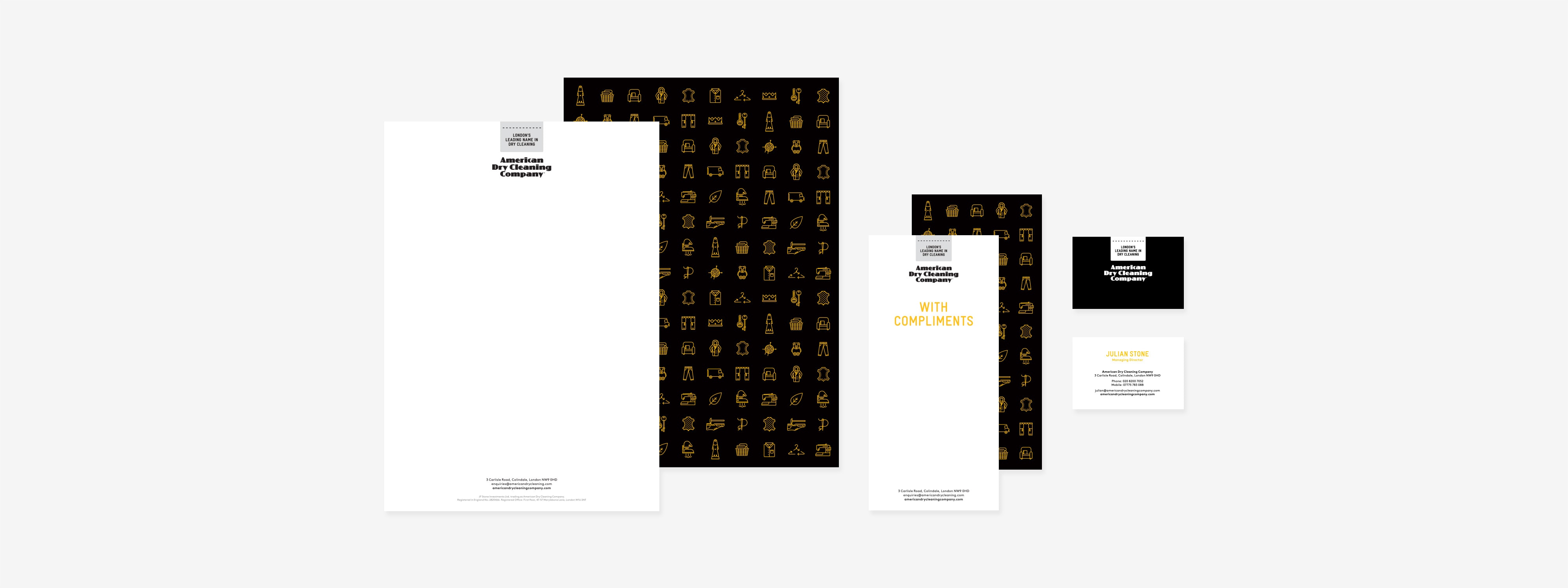
Stationery
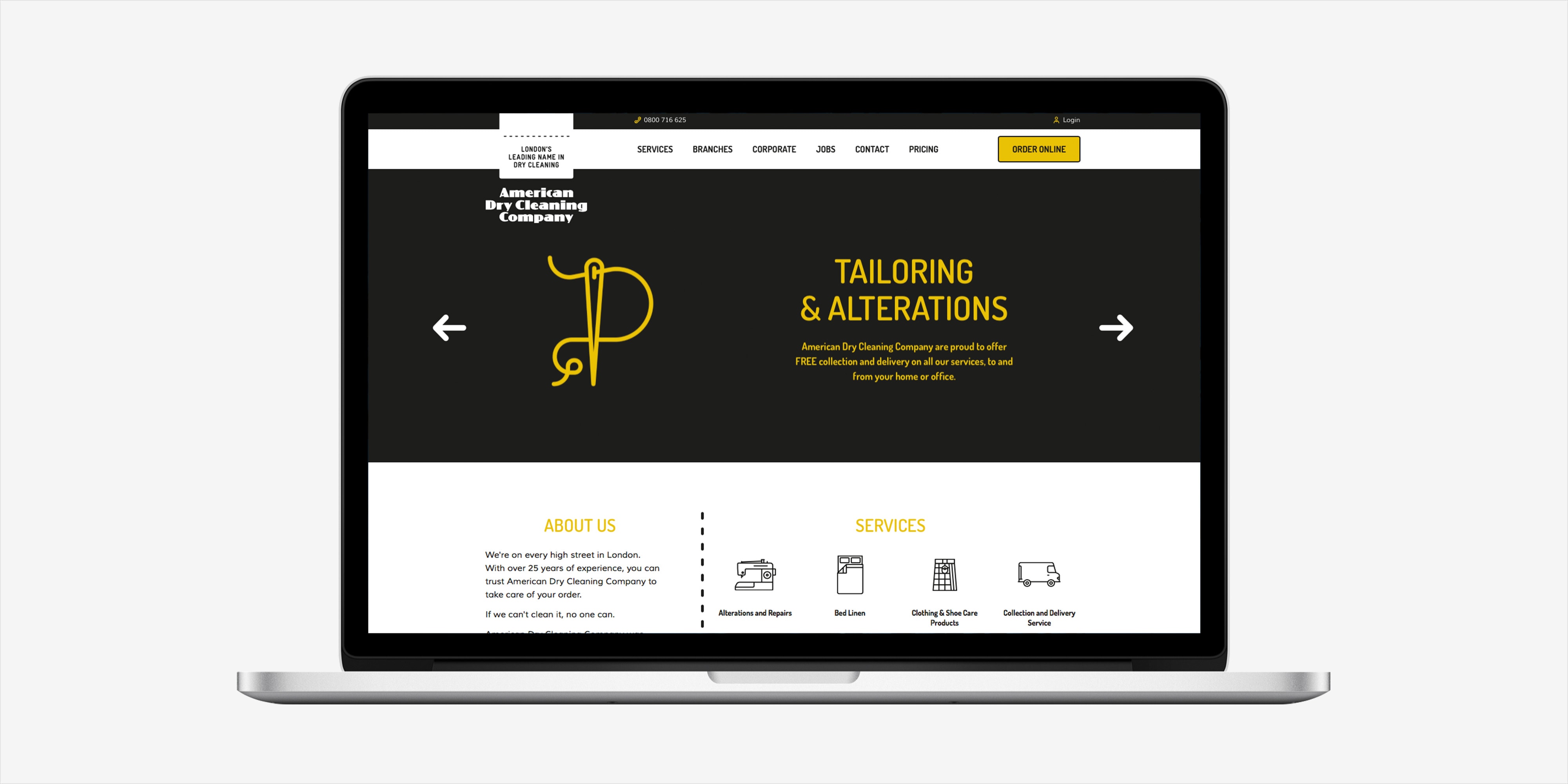
Website
The Outcome
The flexibility and versatility of the rebranding scheme has enabled it to be adopted across the board from delivery vehicles and the company website to point of sale material and window displays.
Interested in Glorious Thinking?
If you like what we did for the American Dry Cleaning Company maybe we could do something for you.
Mailing List
Sign up to our mailing list to receive all the latest news.
Check out our privacy policy for the full story on how we protect & manage your submitted data.

