Around the world in 80 brands: Searching for simplicity in Scandinavia
November 16, 2024Words by Dalia Jaffar
So far this year, we’ve already crossed through three different continents in search of branding styles intrinsic to cultures and countries. We felt the thrum of Tropicalism in Brazil, lived the sweet life of La Dolce Vita in Italy, and traced a playful spirit in the fun frenzy of Japan.
But where to next in our quest to pin down more of the world’s greatest graphic design exports?
Welcome to Scandinavia: where less is always more
Let’s drop our pin in Scandinavia – aptly timed for the start of the cosy season in the UK. Traditionally compromising Denmark, Norway, and Sweden, Scandinavia is a collection of countries. Yet don’t let the lack of a single unified entity fool you into thinking that Scandinavian design is any less potent than the other nations we’ve so far visited. It’s perhaps instead the most instantly recognisable.
With such widespread populism though, comes overuse. Scandi design has become somewhat of a trope – code word for a lack of clutter, any sniff of exposed timber, or simply just – IKEA. So we want to take you beyond ‘Scandi’ as an empty adjective for interiors and show you the depth behind the term when it comes to branding and graphic design.
Its ethos of simplicity, functionality and elegance has seamlessly transitioned into the digital world, with many brands and designers looking to evoke a sense of minimalism and sophistication. At its core, Scandinavian design puts function first without sacrificing style. That is always the foundation. From there it’s about reflecting the physical Nordic environment. Wood grains, with muted and earthy tones all seeping in to create a softness with strength.

Space is always permitted. In Scandi design you needn’t fill the silence. Instead, you let space stay and it becomes not an empty canvas, but a design device in itself – empty on purpose, not by lack of content or ideas. For fonts, the typeface is given just as much kudos as any graphic or imagery. It’s always ultra readable of course, bold, direct and central to the final finish.
The very best Scandinavian brands though aren’t simply prescribed a list of design dos and don’ts. That wouldn’t be convincing to any consumer. Those who speak the Scandi ethos fluently do so in every corner of their company, across every touchpoint. Absorbing the principle of finding beauty in simplicity and never artifice. They never overexplain or bounce from one idea to the next – trust is placed in the consumer to see the vision without direction. To cut through the noise and find the brand saying the least, yet still sounding the loudest.
Scandinavian design in the advertising of homegrown brands
Turning our attention then to the execution of branding and design on home soil, how do they infuse the unmissable Scandi aesthetic into every creative output? From logos to web design? Take the unassuming Norwegian Shipowners’ Association. A group of businesses collectively employing over 55,000 seafarers and offshore workers from more than 50 different nations might not be the most obvious choice for admirable design direction. Yet the association’s new visual identity, created by Oslo-based design agency Neue, captures the open sea and a sense of knowledge and experience – with an ultra-simple two-colour square and traditional serif combination.
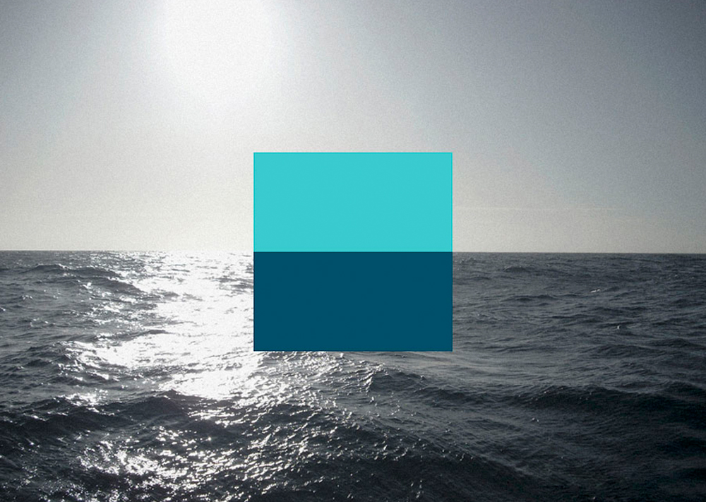

Not only that but with this incredibly minimal solution, Neue evokes a sense of stability (a steady ship) and reliability (community support) through their horizontal union, while visualising the opportunity and freedom that ship owning provides in its representation of an endless horizon.
A light serif logotype, stacked to mirror the structure of the mark and with a good eye for line spacing, introduces contrast to the heavy fill, basic geometry and contemporary sensibilities of the mark, offering a more formal and long-serving traditional quality that conveys professionalism, timeless knowledge and experience. This juxtaposition continues with thin wave-like line work that, like the typography, adds a finer layer to the bold and oversized format of the mark across the collateral. A spark of real Scandinavian brilliance, function first without ever compromising creativity.
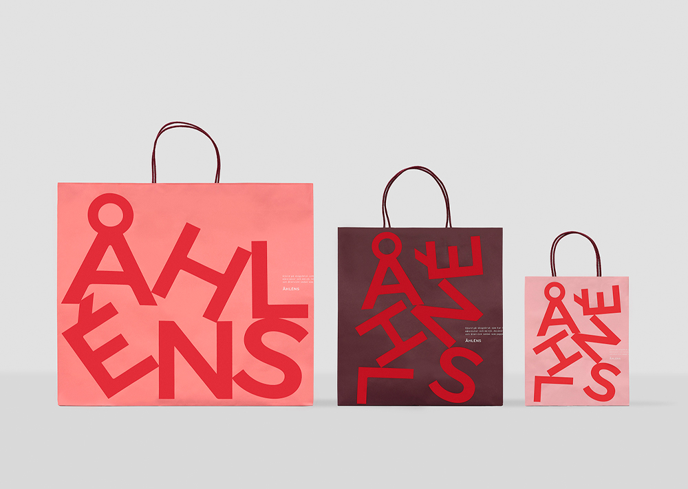
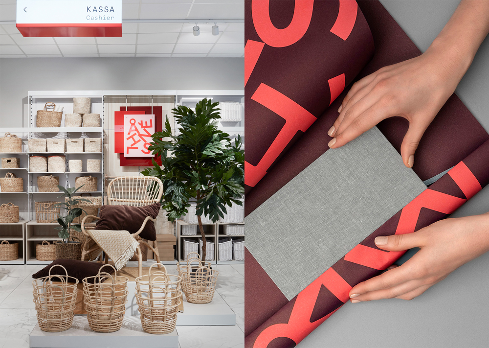
Then there’s Åhléns, Sweden’s oldest department store founded in 1899. What started as a small mail-order business is now one of the largest retail chains in the country – which is why it made sense to F&B Happy, a leading local design agency, to lean into typical Scandinavian design devices when it came to a recent rebrand. The updated visual identity provides the flexibility needed for high impact at every touchpoint – both on and offline – with the typography front and centre. There’s no graphical element, no imagery. Instead, the typeface is given space to sing, to represent the brand just as it was intended.
Meanwhile, in Denmark, the country’s most famous perishable export – Carlsberg – was given a proper Scandi rebrand to commemorate a special brew Black Gold which needed a facelift to revive its relevance. The Danish agency Kontrapunkt was tasked with the creative brief and quickly moved towards a simple design in black and gold with one concise communicative intention. Typically Scandinavian – the new design tells a concise visual story.


The team have made the most of the canvas, giving each asset space to bring out its stylistic qualities and associations. Lettering maintains the continuity of the brand and leverages heritage and a sense of craft, which continues through to a custom slab serif. As ever the ingenuity of the design is to rely on proportion and contrast, arrangement and space, colour and finish to derive an immediate visual disruption, a sense of modernity and at the same time, continuity of legacy and quality.
Which global brands are taking tips from the Scandinavians?
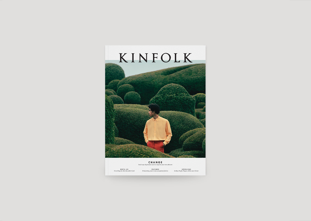
It’s no surprise then that so many global brands have looked to Scandinavia in search of their visual identity. First up, Kinfolk magazine – dedicated to all things home, work, style and culture. The brief to the Berlin and Helsinki-based design agency Schick Toikka, was to create a sharp and refined contemporary-feeling serif family with triangular wedge-shaped serifs – breathing more expression into the pages that would set them apart on the newsstands.
As Kinfolk is so well known for its high-quality editorial content, photography and design, the studio wanted to match that aesthetic, providing typefaces “with a timeless, yet fresh and refined visual look.” It needed to be stylish and sharp but with enough personality to impress discerning readers. As such, “the letters feature small, flared details and varying transitional contrast flow to create a lively texture.” Featuring six different styles, the suite of fonts creates a compact but versatile palette that serves all the typographic needs of the magazine, from impressive headlines to longer articles. Omitting colour, photography and graphics, simply letting text do the talking.
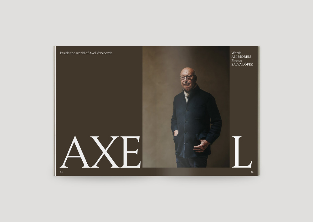

Several of the world’s biggest fashion brands lean towards the north of the continent too when it comes to their ad campaigns and visual aesthetics – selling a piece of Scandinavian lifestyle along with the product. Take COS for example. Although an offshoot of the giant H&M conglomerate, COS has decidedly separated its aesthetic from the parent group. Its logo, short and simple, leaves plenty of white space around the typography wherever the placement, from labels to landing pages. And the brand’s SS24 advertising campaign was a real showcase of Scandinavian style.

Shot against a blue-sky horizon over the ocean, the campaign celebrates simplicity and thoughtful design, balancing modernity and traditional craftsmanship. Infusing the shots not with a manufactured colour pallet but one made by nature, the design direction perfectly encapsulates the Scandi style. As does the collection itself, described as a new vision of everyday luxury that is at once powerful and understated, creating the ultimate “timeless wardrobe.”
Then there’s HAY – a brand founded within the context we’ve been discussing, but which now exports all over the world with its signature Scandi style. The advertising campaigns and digital channels are as sleek and unpretentious as the furniture itself. White space is permitted throughout the creatives, allowing each one to communicate the purpose behind the brand. The font is always capitalised giving way to a directness that is typically Scandi. Even the style direction of the photography, which sees the products themselves positioned without artifice or over-styling, evokes the principle of allowing the audience to do their own thinking. Collaborations too are carefully selected to ensure the brand never deviates from its signature style. Take their recent venture with designer Muller Van Severen, which in their brilliantly on-brand words sees clothes racks described as “simple, sculptural forms, a functional alternative to a wardrobe and can double as a room divider.” Functional, yes – but without beauty? Never.

Infusing Glorious brands with the style and simplicity of Scandinavia
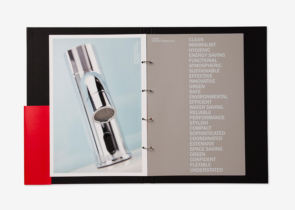
Here at Glorious, we have branded many an ode to Scandinavian style. Take Lovair – a brand who had developed an innovative solution to the age-old bathroom hand dryer. Wanting to develop their relationship with BDP, an international architectural practice – the team approached Glorious looking to ready themselves as an attractive proposition for a viable partnership.
The main deliverable would be a corporate presenter, cataloguing their collaboration on projects up to that point in time. We opted for a quintessential Scandi design for the front cover of this instrumental document, the partnership between the two brands signified by a simple block colour, half black and half red. Typeface took a front seat, using a capitalised font we ensured unhindered readability, leaving plenty of space between the text too to add to the effect. The tone was direct and confident, reading “It may not be your first consideration,” “but it’s the first thing your building will be judged on” – alluding to the installation of Lovair sinks. No fills, just function executed with style.

Next up is Insiris – a specialist consultancy engaged in solving management and manufacturing process problems. The brief was to rebrand the business to differentiate the Insiris offering from the off-the-shelf software solutions available, from large corporations that dominate the market. To do that, we positioned Insiris as the brand that offers effective, data-driven, value-led management solutions by applying human ingenuity that embraces cutting-edge bespoke technology, for those looking to solve complex operational and planning problems. The creative direction was an overlap of three different influences: creative expression, human ingenuity and leading technology.
What we created visually hinged on an understated identity that informed the entire branding. The messaging was simple, providing clarity around the Insiris offering. Strong use of black, with minimum colour, visually differentiated the consultancy from other providers in the market offering off-the-shelf software solutions. Graphical design elements were created, but they were simple and used sparingly. Allowing the strength of Scandinavian design to seep through in all its glory – excuse the pun.


So then – if our guide to Scandi design has left you searching for simplicity and yearning to do away with bolshy designs and intricate graphics, then we’re here to help. From rebrands to website design, to full-scale marketing strategy and delivery – let us connect you to cool in 2025.
But before that – here are our top tips on steering towards Scandinavia to get started:
1. Simplicity speaks volumes. Remember the founding principle of Scandi design is function first. Therefore, ensure your designs always ring true to that – they should serve a purpose before being pretty.
2. Space is not something missing, it means more. Leaving ample white space in your designs is key to executing the Scandi style with conviction when the temptation to add in more content creeps in – resist it.
3. Keep colour to a minimum. Monochrome is always a friend of Scandinavian style but if it doesn’t quite suit your brand identity, then opt for a palette of muted, earthy tones that complement one another, stay well away from big, bold contrast.
4. Typeface ought to be central to your design. Keep in mind the clear capitalised fonts of the brands we have discussed, always without frills, easy to read and with plenty of space between lines and letters.
5. Timelessness is age-old design. Scandinavian branding and graphic design are extremely timeless, it doesn’t follow trends or fads but keep to principles – year in, year out. No matter what seasonal sale may be happening…
What to bring your next branding project to life? Get in touch.
Mailing List
Sign up to our mailing list to receive all the latest news.
Check out our privacy policy for the full story on how we protect & manage your submitted data.
