
Around the world in 80 brands: Living the Luxe Life in France
July 10, 2025Words by Dalia Jaffar
From continent to continent, we’ve explored how design and branding are shaped by the cultures they’re born from. We’ve seen Brazil pulse with the vibrant rhythm of Tropical branding, sampled the sweetness of La Dolce Vita in Italy, traced the playful energy of Japan’s fun-fuelled creativity, and found beauty in the simplicity of Scandinavian design. Most recently, we embraced wit and irreverence with Finding the Fun Down Under, diving into the cheeky charm of Australian and New Zealand branding.
But where to next in our quest to pin down more of the world’s greatest graphic design exports?

Bienvenue en France: Le pays du luxe
Let’s drop our pin in France – the spiritual home of elegance, refinement, and the world’s most iconic luxury brands. This is a country where branding isn’t simply about commerce but cultivating desire. French brands don’t just sell products; they sell heritage, exclusivity, and a certain je ne sais quoi.
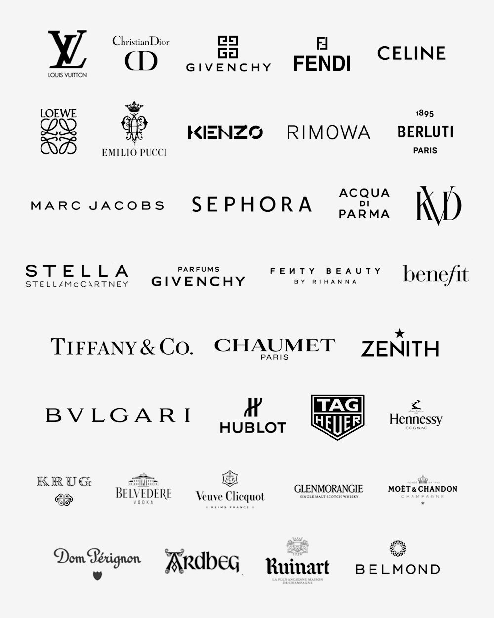
Towering above them all is LVMH – the French multinational empire that has built a luxury dynasty spanning fashion, jewellery, cosmetics, champagne, and more. The sheer number of brands under its stewardship is extraordinary. From heritage houses like Dior and Louis Vuitton to storied maisons like Veuve Clicquot, LVMH doesn’t just define French branding – it exports it to the world.
In France, the art of branding is a high craft. It’s about restraint and opulence held in perfect balance. Every typeface, every curve of packaging, every campaign image whispers luxury. The tone is confident, not loud. Elevated, not extravagant. It’s branding designed to be coveted. Whether in print, film, or store design, French luxury branding doesn’t chase trends – it sets them.
And this isn’t just about looking good. French brands understand that true luxury is experiential. Every interaction, from unboxing to boutique, is considered. In the world of French branding, beauty is built to last – and it shows.
Luxury in the language of French brands
So, how do French brands translate their luxury heritage into creative outputs that feel timeless yet still cut through the modern noise?
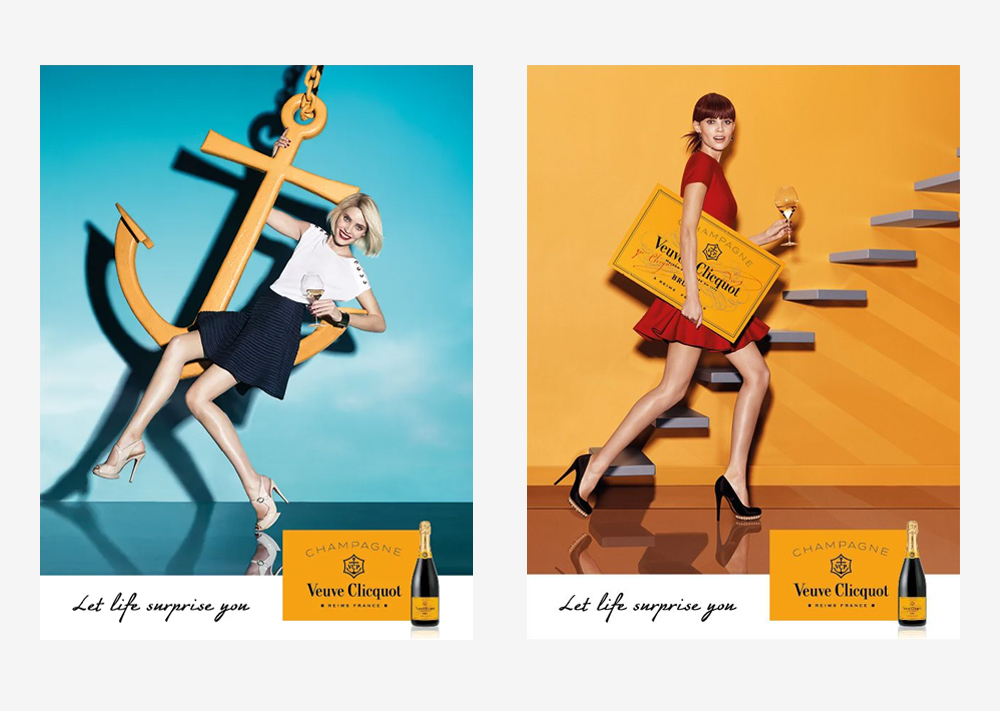
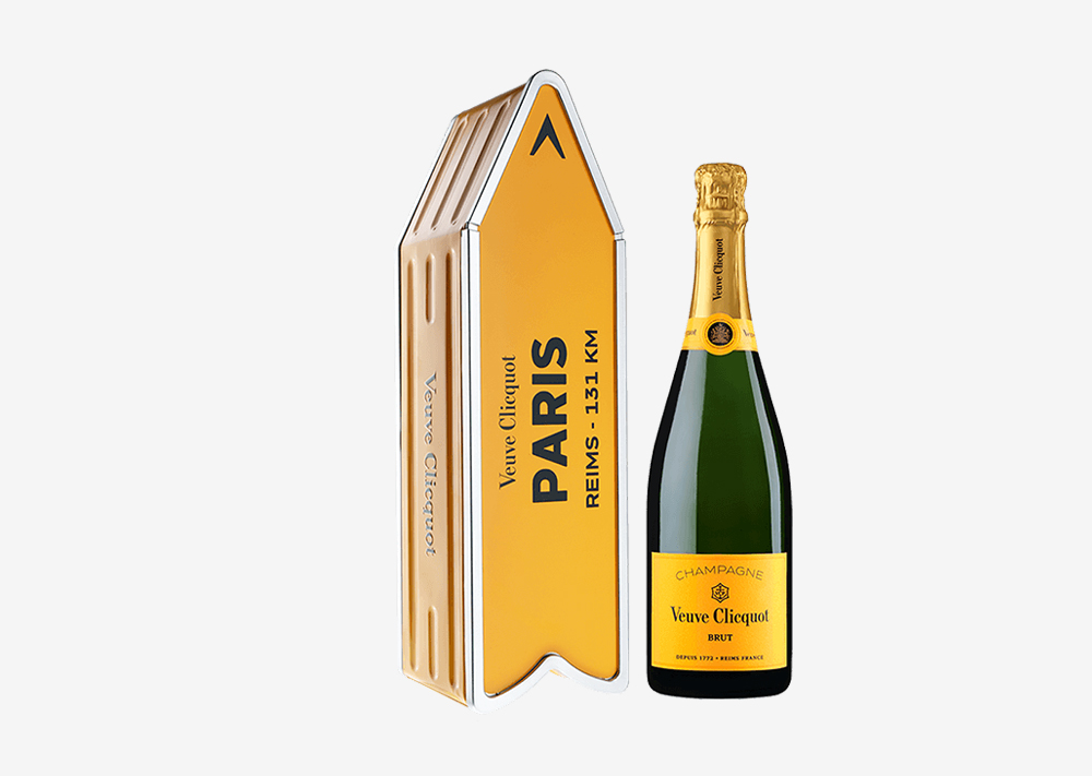
Start with Veuve Clicquot, a brand that has long stood for celebration, but is now evolving how it tells that story. Its Let Life Surprise You campaign refreshes this legacy with a protagonist you might not expect as the custodian of a champagne-filled fridge: a young woman whose pay cheques don’t appear quite to meet the entry requirement once perceived necessary for a bottle of France’s finest. In a series of short episodes, she teaches “lessons” in negotiating, entertaining, and making an impression – not through lecture, but through charm. Whether turning a takeaway into a fine dining moment, befriending an antique seller with a clink of glasses, or as an uninvited guest finding her place at a high-society party, the message is clear: the bottle is a connector. A leveller. It elevates life’s moments with confidence and style, bridging divides with joy and generosity. The visuals are saturated in light, colour and motion – joyful, unexpected, and unmistakably Clicquot. A nod to this playful reinvention can even be seen in their packaging – from the vibrant, sun-yellow bottles to the now, iconic, metal sign boxes, that double as collectables, radiating charm and confidence.
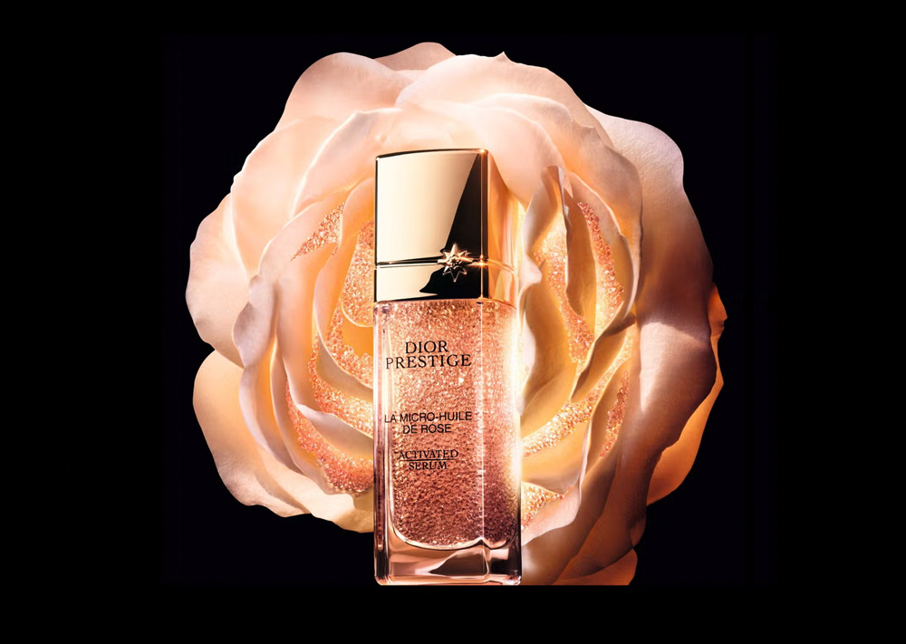
Then there’s Dior, whose recent campaigns are a masterclass in brand consistency and elevated storytelling. From fragrance to fashion, every touchpoint is immaculately considered. For instance, the Dior Prestige skincare films don’t just sell a product – they sell a cinematic universe. Rose petals drifting through golden light, soft-focus cinematography, whisper-soft voiceovers – it’s branding as seduction. The typography is minimalist and assured, always balanced with ample white space. It’s not just beautiful for the sake of it; it reflects the brand’s core value: that true luxury lies in detail. Dior doesn’t shout – it draws you in.
Meanwhile, Louis Vuitton continues to set the standard for modern luxury branding – blending legacy with contemporary spectacle. To mark what would have been the founder’s 200th birthday, the brand invited 200 creatives from across the globe – from architects like Frank Gehry, Sou Fujimoto and Peter Marino to visual artists and designers – to reinterpret the brand’s iconic trunk.
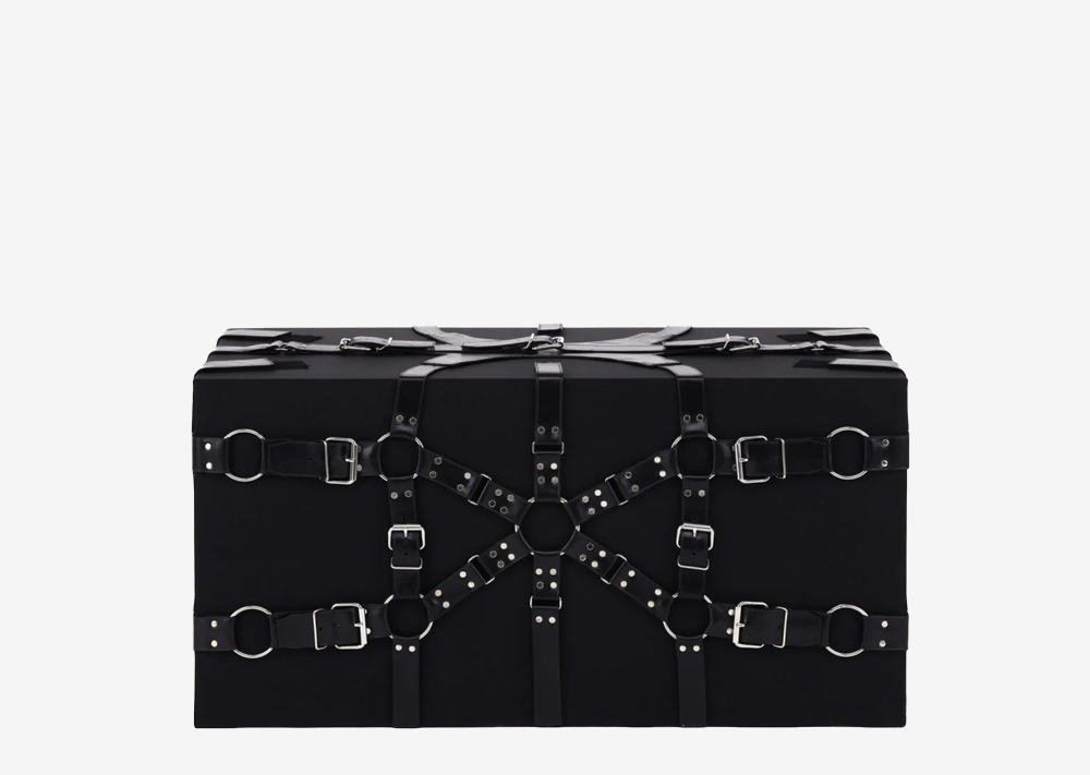
The resulting exhibition, 200 Trunks, 200 Visionaries, travelled the world as a tribute to craftsmanship, imagination, and enduring influence. “Louis’s lasting legacy is the trunk – the flat-top, canvas trunk he designed,” explained visual director Faye McLeod. “From there, the idea progressed to collaborate with 200 visionaries who would design their own – a vast, visual tribute to creativity and to the man behind the Maison.”
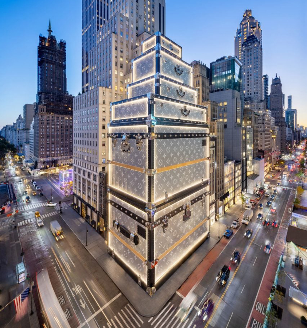
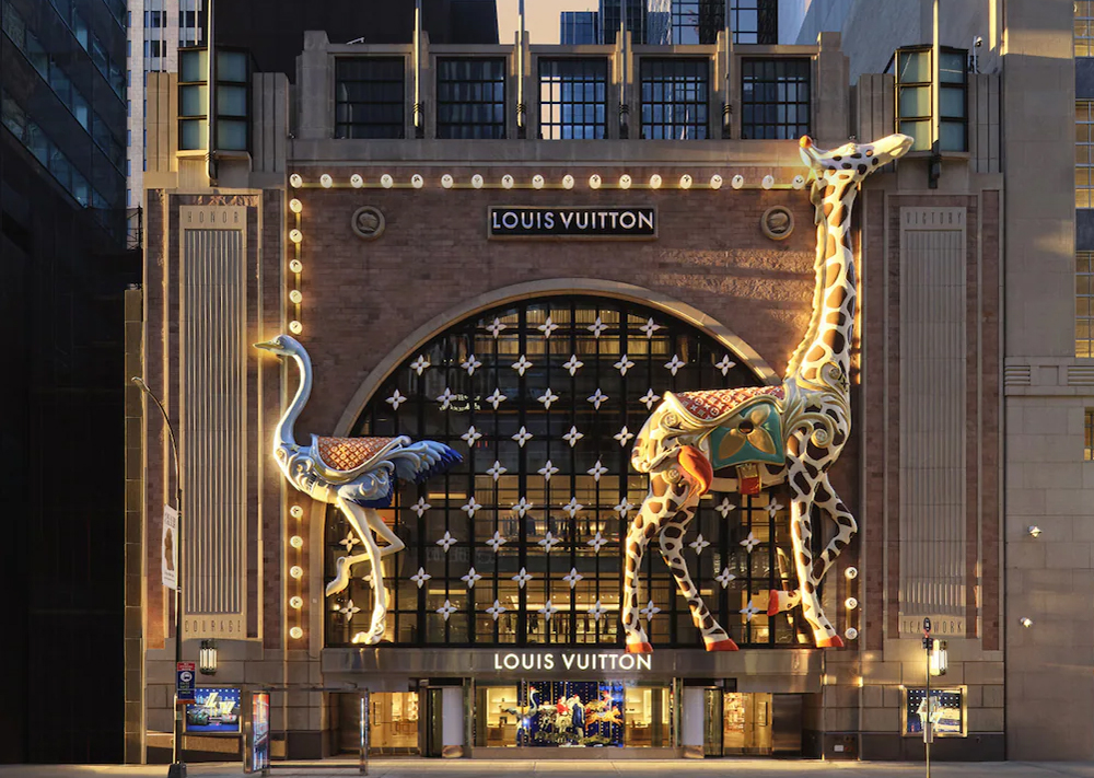
And then there’s the brand’s New York flagship, currently undergoing a multiyear renovation – though this being Louis Vuitton, there’s no scaffolding in sight. Instead, the store is cloaked in a monumental sculptural facade, designed in-house to resemble a stack of oversized LV trunks in the brand’s historic Trianon Grey. Every detail – from the 5,000-pound chrome-plated handle to the riveted hardware – nods to legacy branding. Proving once again that in the world of Louis Vuitton, even a construction site becomes a storytelling opportunity. Nothing – not even renovation – is done by halves.
Balancing Heritage and Imagination
French brands demonstrate an unrivalled ability to balance heritage with imagination, from champagne to couture to trunks reimagined as sculpture. Their campaigns don’t just sell – they seduce. They are always elegant, never overstated, and unmistakably French.
Which global brands are taking tips from the French?
It’s no surprise that the refined elegance and design precision of French luxury branding has captivated creative teams far beyond Paris. From beauty to food to interiors, a growing number of British brands have adopted the visual cues and brand strategies long perfected by the maison of France – clarity, craft, and quiet confidence.
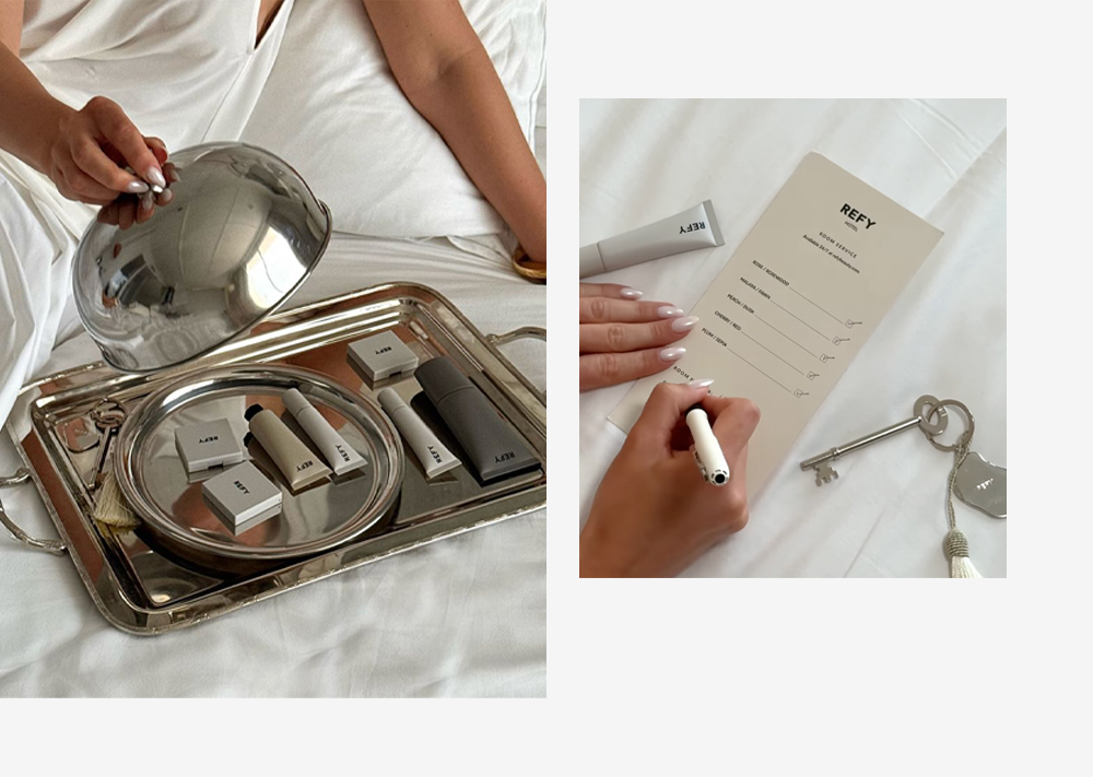
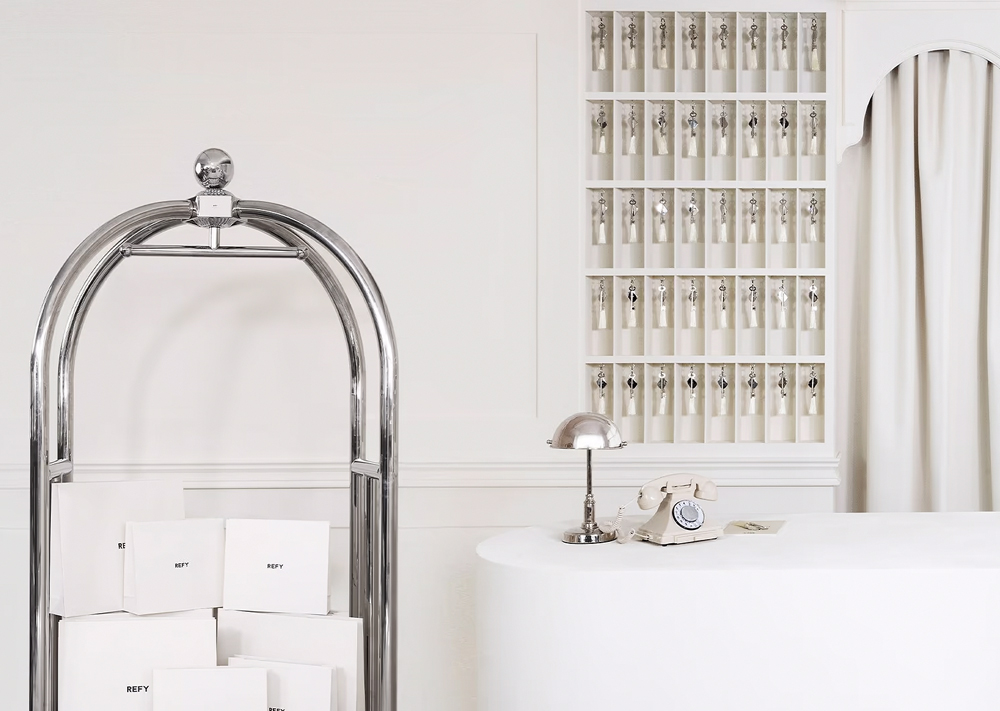
First up is REFY, the modern British makeup brand. It’s all about minimalism – soft greys, generous white space, and clean, clinical packaging. And beneath the surface lies a branding strategy steeped in French influence. Like a younger, more modern cousin to Dior Beauty or Chanel’s Les Beiges range, REFY’s tone is refined and editorial, treating makeup not as transformation but as enhancement. There are no loud product claims, no overblown colour palettes – just sleek confidence. The campaigns, often bathed in soft light and muted palettes, speak the language of elevation rather than exaggeration, just like the best French beauty branding. Their recent ‘Hotel Refy’ campaign, fittingly shot in Cannes, cleverly reinforces this editorial tone – blending aspirational settings with the brand’s signature minimalist aesthetic to evoke a world that feels both elevated and effortlessly chic.
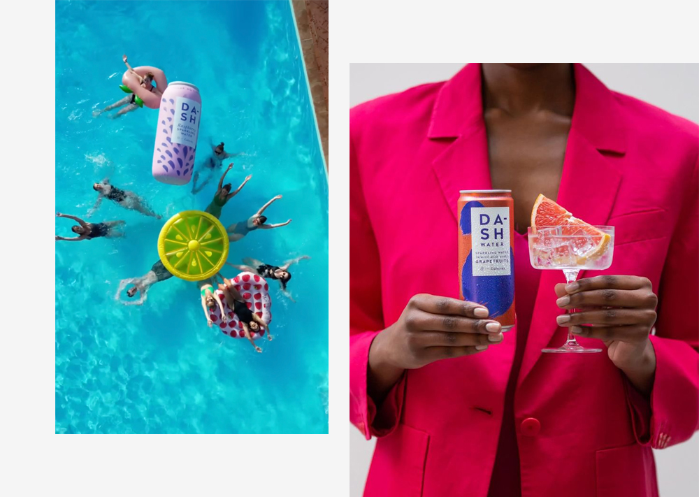
Then there’s DASH, the flavoured water brand infused with “wonky” fruit that might otherwise go to waste. At first glance, it’s playful and contemporary, but its design is deceptively restrained. The cans are wrapped in soft pastel colours, with airy, well-spaced typography that brings a sense of lightness and calm – a deliberate contrast to the busy visuals of most beverage aisles. That same design logic carries through to its digital presence, where the typography retains its generous breathing room across product pages, social content and email campaigns. It’s a visual identity that feels quietly confident. Much like a good French rosé label, it’s more about lifestyle than product. Less functional hydration, more effortless sophistication.
The White Company is another brand that echoes the French philosophy of understated luxury. With its muted palette and serene lifestyle photography, the brand feels more Provence than Paddington. Its homeware, clothing, and body care ranges are always presented with editorial elegance – fluffy towels stacked in marble bathrooms, crisp bed linen backdropped by filtered light. Like French luxury brands, The White Company sells more than just products – it sells a life of soft focus and gentle refinement.
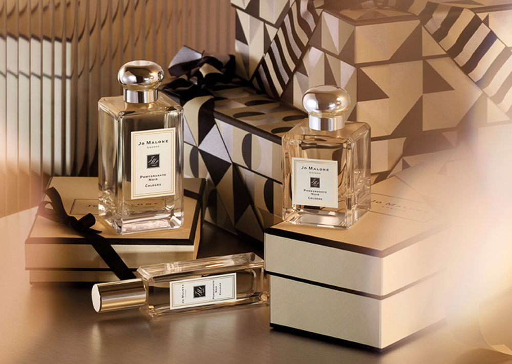
And of course, there’s Jo Malone London. While resolutely British in origin, its presentation and olfactory storytelling borrow heavily from the French tradition of fragrance branding. The cream-and-black packaging, the meticulous typography, the emphasis on ritual – it all echoes the legacy of Parisian perfumers.
Each brand captures something French branding has long understood: that aspiration doesn’t have to shout. Whether in beauty, drinks, fragrance or interiors, they’ve taken the French design lesson to heart – that elegance lies in the edit.
Infusing Glorious brands with the finesse of French luxury
True luxury in branding is never too loud. At Glorious, we craft identities that speak with subtlety and confidence. Inspired by the grace, clarity and experiential richness of French luxury branding, we’ve helped clients elevate their visual and verbal identities to feel more refined, more composed, and more covetable.
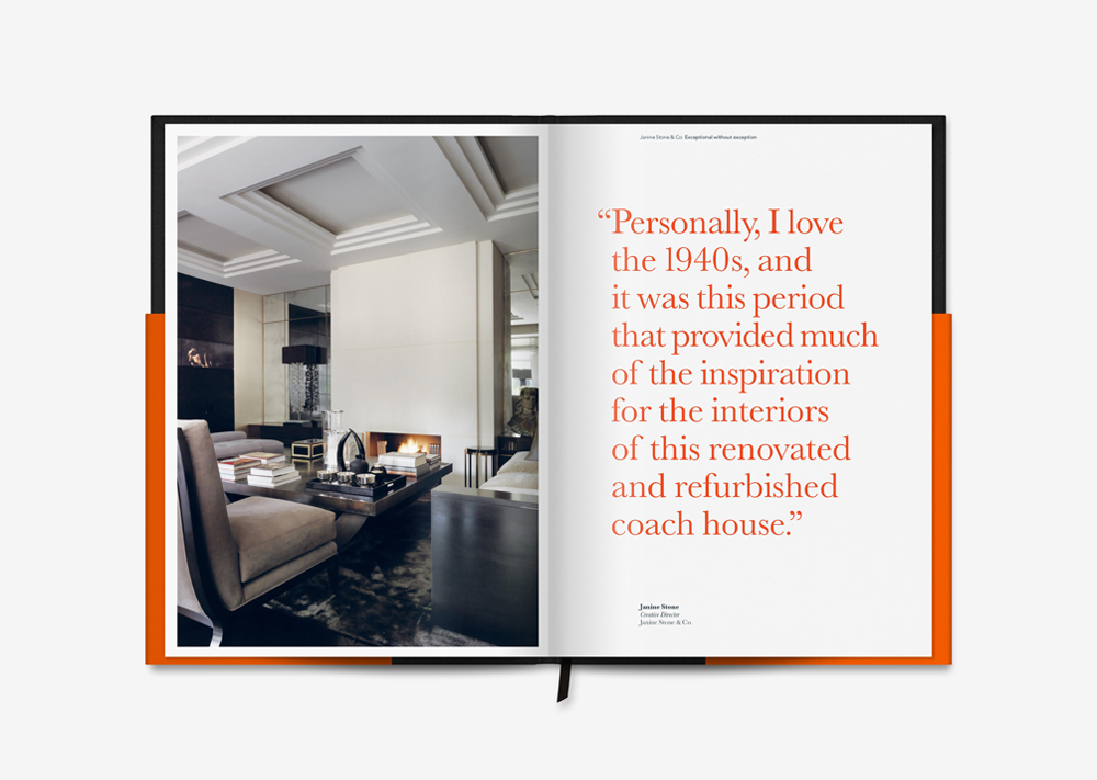
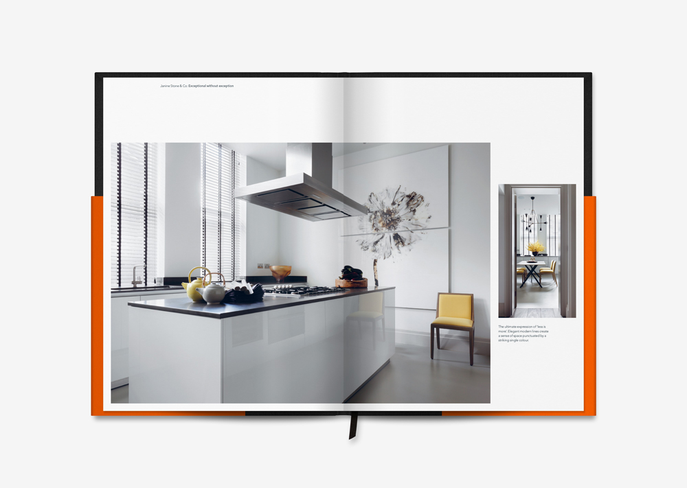
Take Janine Stone & Co., a longstanding client whose name is synonymous with bespoke elegance. When we were tasked with updating the brand identity, the objective was clear: elevate the perception of a singular, celebrated interior designer into a broader, full-service studio. Our solution was subtle but significant – introducing the “& Co.” into the brand mark, supported by the positioning line “exceptional without exception.” To bring this to life, we designed a luxury art book – not just a portfolio, but a curated brand experience. Visual analogies reinforced the craftsmanship, artistry, and discretion at the heart of the business, echoing the kind of restraint and detail you’d find in a Chanel couture lookbook. The result wasn’t just beautiful – it was quietly persuasive.
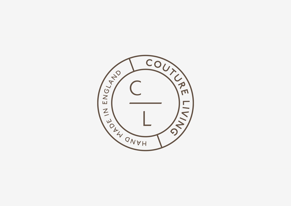
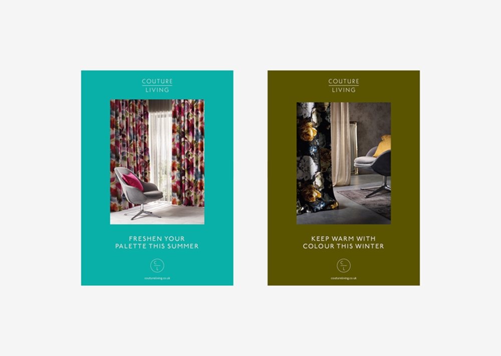
With Couture Living, we faced a different challenge: replicating a high-end retail experience in the digital space. This wasn’t about surface-level sophistication, but true depth – offering customers the same level of attentiveness, quality and calm they’d expect from the furnishings floor of a Parisian department store. From naming through to copy, photography and navigation, every decision served the overarching promise: British-made, handcrafted luxury, delivered with clarity and ease. The brand name alone – ‘Couture Living’ – positions it leagues above the generic.co.uk competition. The typography is confident, the photography is composed, and the user journey smooth and elegant. A masterclass in how luxury can live – and thrive – online.
And finally, StudioHestia, the rebrand of an exclusive London-based interior design studio. The name, drawn from ancient Greek mythology, refers to the hearth – a symbol of home, warmth and origin – but our creative direction was more Maison than museum. We developed an abstract symbol inspired by Hestia’s legacy, rendered in gold foil and paired with a Flame Orange and Burnt Umber palette. This wasn’t design for design’s sake; it was concept-driven, deeply considered, and strategically applied across every touchpoint. From stationery to a tactile, foiled brochure, the identity offers a sensory experience, as any luxury brand should, that’s less about shouting credentials and more about creating intrigue and a lasting impression.
Each of these brands shares one common aim: to create not just visual appeal, but emotional resonance. Inspired by the timeless lessons of French branding – beauty, restraint, narrative – we’ve helped bring their stories to life in ways that feel as crafted as the services they offer.
Five Ways to Channel French Finesse in Your Branding
So then – if our journey through French branding has left you craving a little more elegance, restraint and quiet confidence in your own campaigns, we’re here to help. From brand strategy and naming to visual identity and high-touch digital experiences, Glorious can bring a sense of considered luxury to every corner of your brand in 2025.
To get you started, here are our top tips on steering your branding towards a more French-inflected finesse:
1. Start with telling a story, not shouting. The most compelling French brands build their power through heritage, clarity and confidence. Lead with narrative, not noise.
2. Elevate the everyday. Whether it’s a candle, a suitcase or a skincare product – French branding teaches us that luxury isn’t in what you sell, but how you frame it.
3. Design with discipline. White space, refined typography, and a restrained colour palette can say more than a thousand decorative details. Edit ruthlessly.
4. Consider the whole experience. Every touchpoint – from a foiled brochure to a pop-up shop façade – should reflect your values. In luxury branding, detail isn’t extra. It’s essential.
5. Make it feel effortless. The greatest French brands make complexity simple and aspiration within reach. Think smart. Look seamless.
What to bring your next branding project to life? Get in touch.
Mailing List
Sign up to our mailing list to receive all the latest news.
Check out our privacy policy for the full story on how we protect & manage your submitted data.