Around the world in 80 brands: Finding the Fun Down Under
January 7, 2025Words by Dalia Jaffar
From continent to continent, we’ve explored how design and branding styles are shaped by the cultures they’re born in. We’ve seen Brazil pulse with the vibrant rhythm of Tropicalism, sampled the sweetness of La Dolce Vita in Italy and traced the playful energy of Japan’s fun-fuelled creativity. Most recently, we found beauty in the simplicity of Scandinavia.
But where to next in our quest to pin down more of the world’s greatest graphic design exports?
Welcome to Australia and New Zealand: where humour is the hook
Let’s drop our pin in the lands Down Under – Australia and New Zealand. Known for their breathtaking landscapes, laid-back cultures and a knack for storytelling, these two nations bring something distinct in their advertising campaign style: humour.
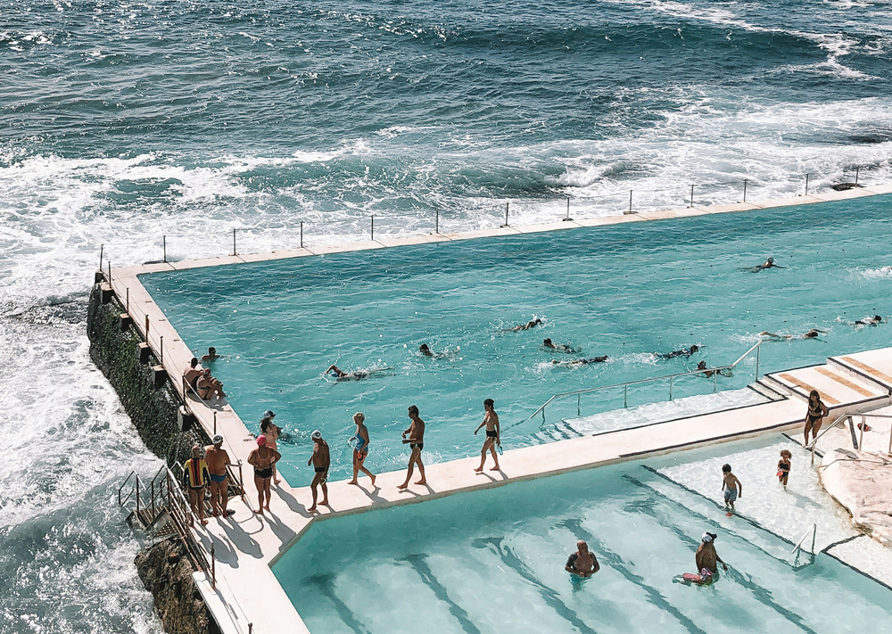
Here, branding doesn’t take itself too seriously, but it’s far from flippant. The humour is sharp, strategic and packed with personality. It taps into cultural pride, celebrates quirks and champions clever simplicity. Australian and Kiwi campaigns work hard to entertain as much as they persuade, leaving audiences laughing, nodding in agreement and – most importantly – remembering the brand.
At the heart of this wit is an ability to embrace imperfection and authenticity. Australian brands in particular, lean into self-deprecating humour, poking fun at their own challenges, quirks and even the products they’re selling. This relatable, everyman tone resonates deeply with audiences who value honesty over hype.
Visually, Down Under brands take a similarly no-nonsense approach. Designs are bold but unfussy, relying on strong typography, vibrant colours and minimal clutter to let the humour take centre stage. Imagery often feels natural and unpolished, featuring real people or exaggerated characters that add personality and relatability. This stripped-back, confident style doesn’t just complement the humour — it amplifies it, ensuring the visuals are just as memorable as the punchlines they support.
Here advertising is unapologetically bold, often surprising audiences with the unexpected to grab attention and deliver a message that sticks. But this isn’t comedy for comedy’s sake. The goal is always clear: to build a stronger emotional connection with consumers that feels genuine and lasting.
Humour and wit in the advertising of homegrown brands
Turning our attention then to the execution of branding and design on home soil, how do Australian and New Zealand brands infuse their unmistakable humour and visual style into creative outputs?
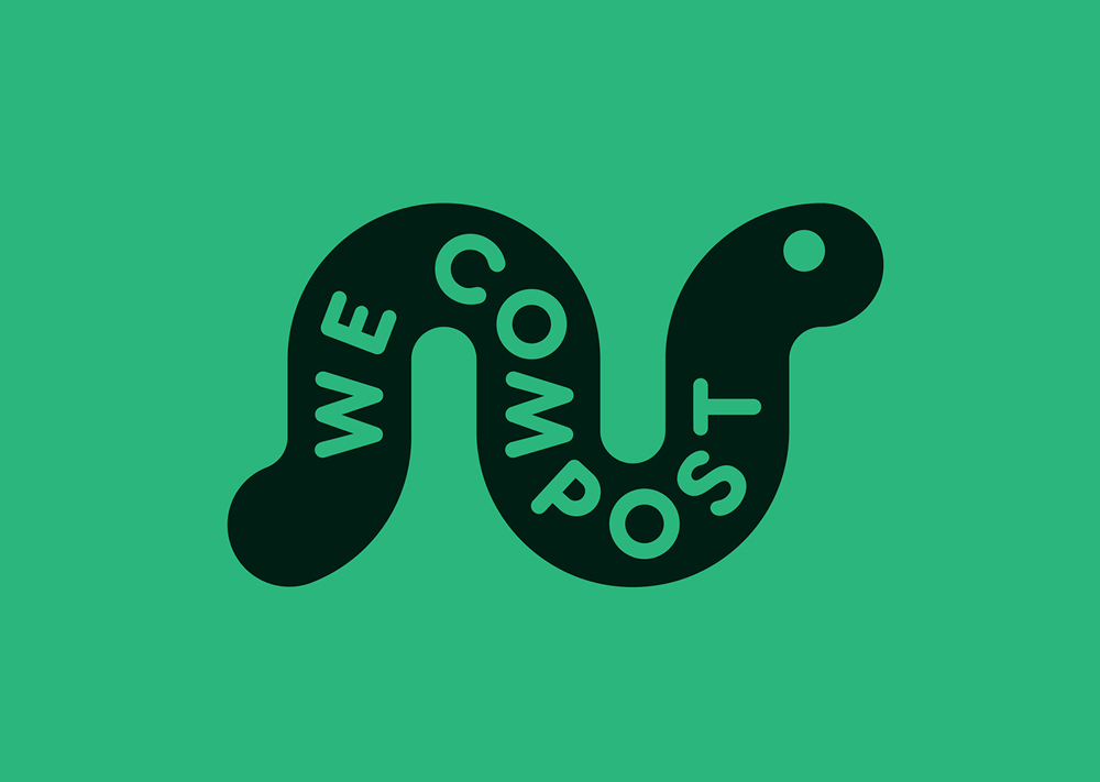
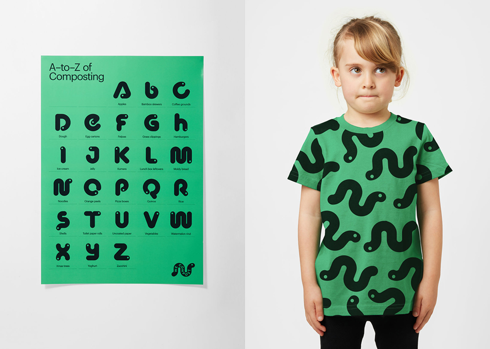
Take We Compost, a New Zealand-based compost collection service tackling the critical issue of organic waste and its impact on climate change. To broaden its reach and appeal beyond eco-conscious niches, We Compost collaborated with design studio Seachange to reimagine its brand identity. The result is a vibrant, approachable visual style built around a custom typeface inspired by the role of worms in composting, complemented by a palette of greens and bold patterns. Applied across touchpoints like bin liners, t-shirts and posters, the design transforms composting into an accessible, modern and engaging concept for every household.
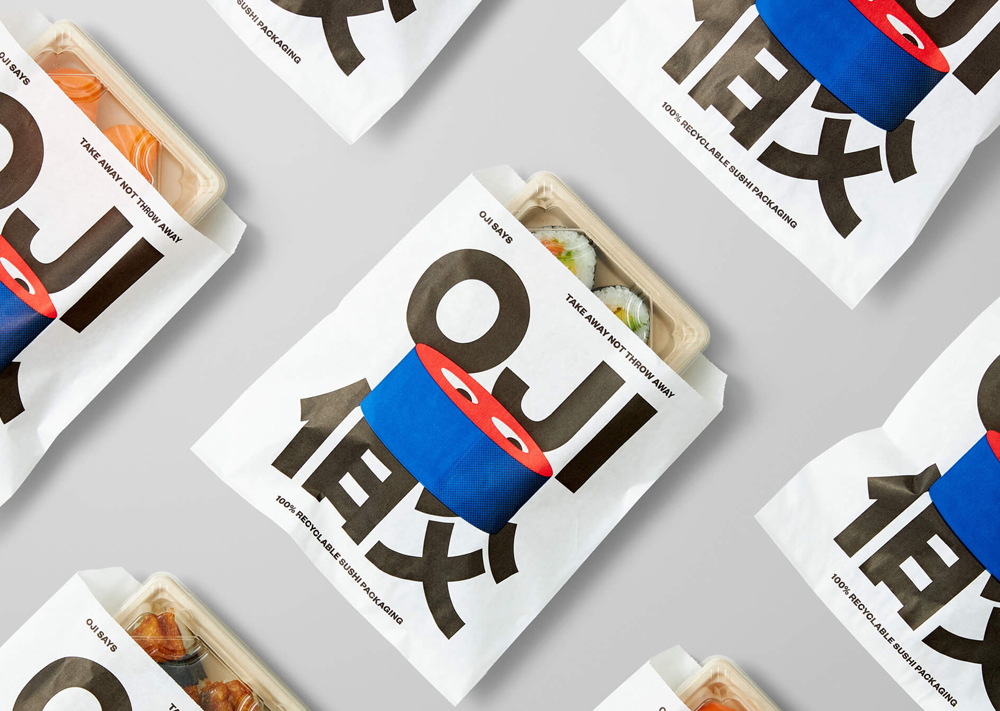
In the food industry, Oji, a New Zealand sushi brand, uses wit and playfulness to stand out in a competitive market while celebrating its commitment to sustainability. Also created by Seachange Studio, the brand’s visual identity features a cheeky anthropomorphic sushi character inspired by the name Oji (Japanese for “Uncle”), paired with a humorous “Oji says” tone of voice that delivers sharp, memorable messages like “Smiles not air miles.” The design cleverly combines traditional Japanese aesthetics with bold, pop-inspired elements, using illustrated and typographic characters, vibrant colour blocking and motion graphics. From packaging to menus and signage, Oji turns sustainability into a fun and engaging narrative, proving that humour can be just as essential as craft and quality in making a lasting impression.
Then there’s Foster’s, the iconic Australian beer brand, whose “Good Call” campaign embodies Aussie humour at its finest. The campaign’s relaxed, sun-soaked aesthetic sets the scene for two beachside mates dispensing hilariously unfiltered advice to callers. The light-hearted tone, combined with the laid-back visuals – bright colours, ocean views and a minimalist beach hut backdrop – mirrors the carefree spirit of the brand. It’s a perfect example of how humour and visuals come together to create a campaign that is effortlessly relatable and memorable, keeping Foster’s as a symbol of camaraderie and easy-going fun.
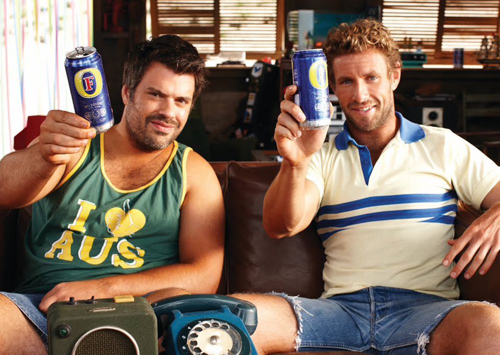
From composting to sushi to beer, Australian and New Zealand brands demonstrate an unparalleled ability to mix humour with strong, culturally resonant visuals. Capturing attention, sparking conversations and fostering (excuse the pun) connections that feel genuinely Down Under.
Which global brands are taking tips from Down Under?
It’s no surprise that the distinct wit and playfulness of Australian and New Zealand advertising has inspired brands across the globe. First up is the UK’s leading high street optician chain Specsavers, which recently launched a brilliantly tongue-in-cheek campaign addressing widely misheard sayings – known as ‘eggcorns.’
The campaign, titled The Misheard Manifesto, combines sharp humour with an important message about hearing health. Featuring beloved British broadcaster Gyles Brandreth, the campaign cleverly plays on common malapropisms, such as “escape goat” instead of “scapegoat” and “tenderhooks” instead of “tenterhooks.” Brandreth, who reveals his own experience with hearing loss in the video, brings warmth and relatability to the campaign.
With its light-hearted tone and content, the campaign brilliantly mirrors the Aussie/Kiwi approach to humour: addressing serious issues without becoming overly serious. Visual elements, like the playful typography of the misheard phrases, amplify the humour while ensuring accessibility. Supported by integrated social and radio platforms, The Misheard Manifesto sets a new standard for ear health campaigns, proving that wit can not only entertain but also foster meaningful change.
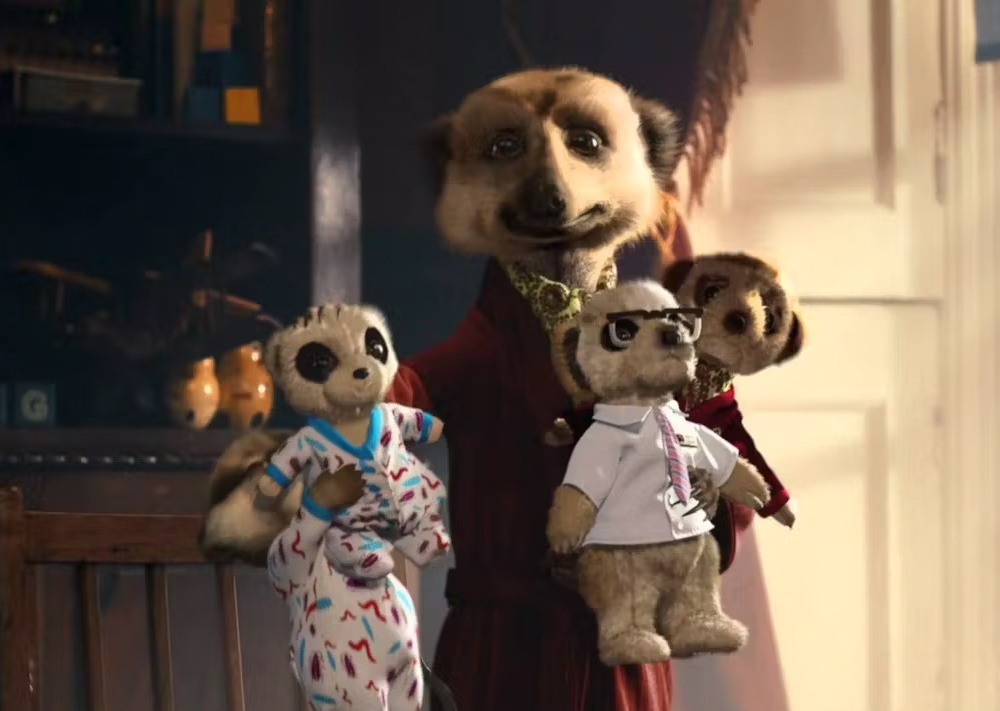
Compare the Market, the UK price comparison website, has also leaned fully into wit and absurdity with its ongoing “Compare the Meerkat” campaign. The campaign pinups, a pair of meerkats, Aleksandr and Sergei, have become cultural icons, embodying the quirky charm and dry humour that feels distinctly Down Under. With a thick Russian accent, Aleksandr’s catchphrase “Simples!” has become synonymous with the brand, adding a layer of playfulness to an otherwise straightforward service.
The visuals lean into character-driven storytelling, with the meerkats appearing in everything from mockumentaries to melodramatic TV spots. Every touchpoint, from website features to social media, reinforces the offbeat humour, creating a world of whimsical absurdity around the act of price comparison. Like the Aussie approach, it’s a masterclass in balancing silliness with strategic messaging, ensuring that the audience is entertained while keeping the brand at the forefront of their minds.
Infusing Glorious brands with Down Under humour and charm
Here at Glorious, we know that humour is a powerful tool for creating memorable, impactful brands. Inspired by the sharp wit and playful irreverence of Australian and New Zealand advertising, we’ve worked with clients to inject personality, charm and a touch of cheek into their campaigns.
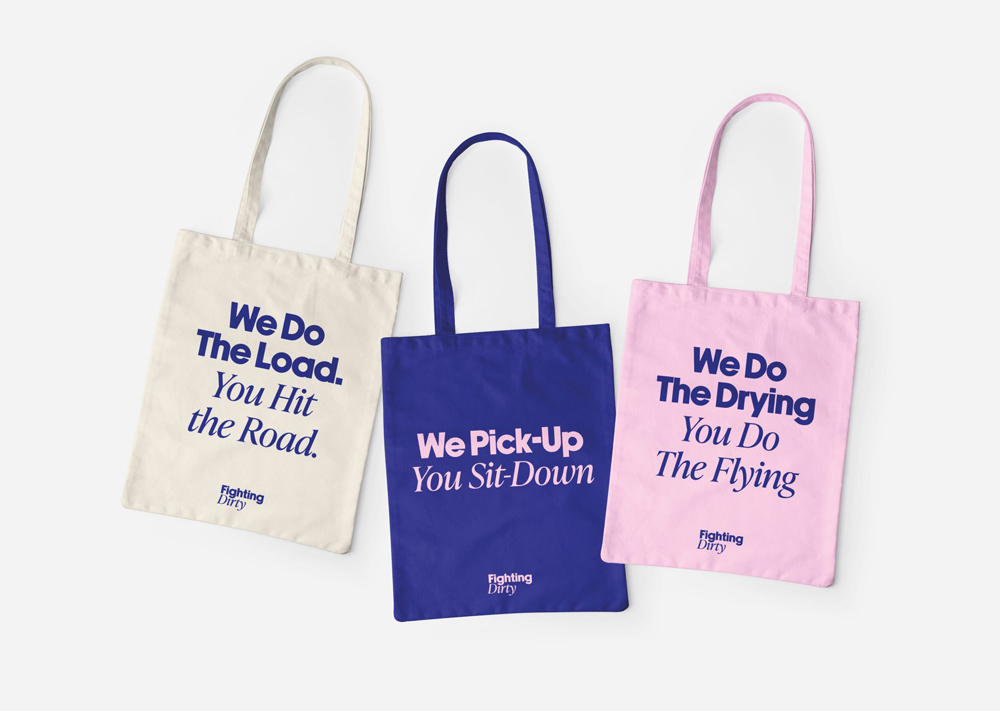
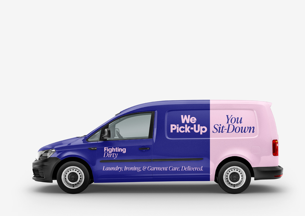
Take Fighting Dirty, a domestic and commercial laundry service that came to us in 2022 looking for a refresh of their brand identity. They wanted to convey not only the quality and efficiency of their service but also the seamlessness and extra time it gives back to their customers. To stand out in a typically dry, faceless sector, we injected energy and humour into the brand’s tone of voice, starting with punchy taglines like “We do the drying, you do the flying” and “We shift the odour, you gulp the soda.”
This playful language carried through to every touchpoint, from welcome instructions like “We can’t wait to pick up your first load!” to more functional messaging, transforming logistics into light-hearted, engaging interactions. Visually, we complemented the cheeky tone with an enthusiastic colour palette and a split visual identity to reflect the conversational “We/You” dynamic. The result was a brand that doesn’t just clean clothes – it makes laundry feel fun and effortless, putting Fighting Dirty head and shoulders above the competition.
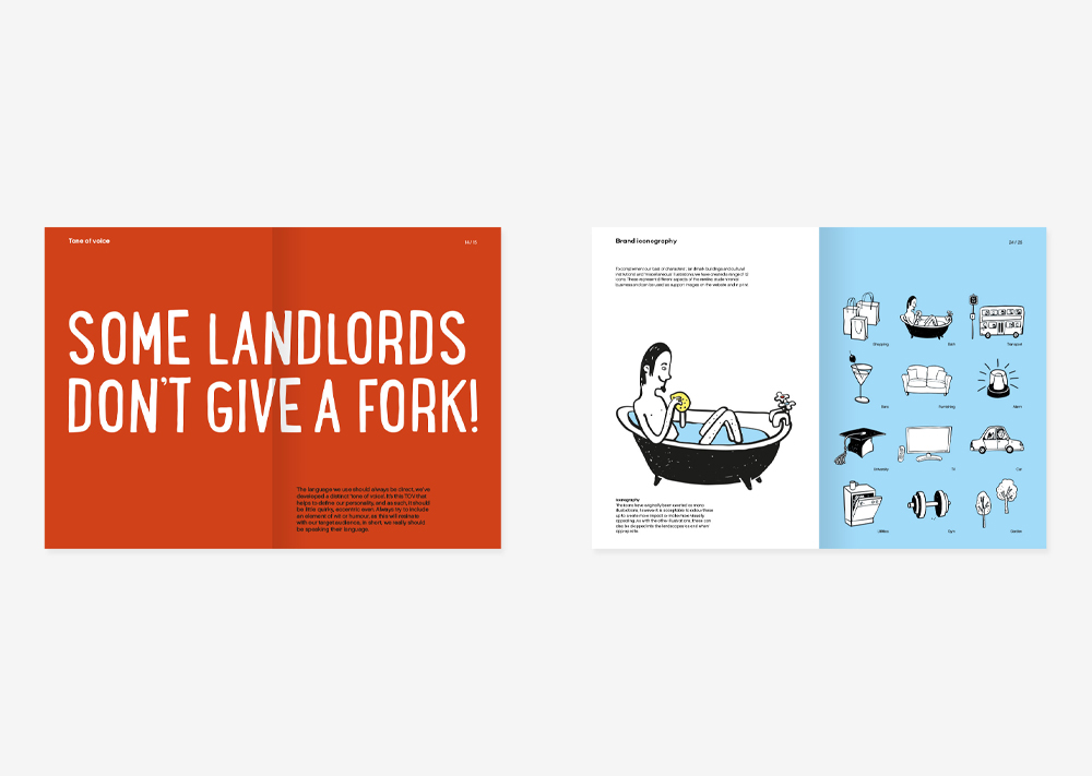
Then there was Rentinc, a student letting company that needed a bold repositioning to stand out in the competitive rental market. To connect with their youthful audience, we leaned into a cheeky, irreverent tone of voice, injecting playful humour that made the brand approachable and memorable. Taglines paired with colourful, tongue-in-cheek messaging brought a light-heartedness to the sometimes-stressful process of finding a home, reflecting the no-nonsense, relatable charm seen in the best Aussie and Kiwi campaigns.
Visually, the brand combined a distinctive illustrative style with vibrant, layered mediums to create a sense of energy and fun. The dynamic student personas and local landmarks added personality and made the brand feel grounded in its community while appealing directly to students. The result was a brand that didn’t just market accommodation but celebrated the quirks of student life with a smile – delivering a distinctly Down Under-style charm to the student rental market.

So then – if our guide to Down Under advertising has left you inspired to inject some cheeky charm into your campaigns and take a bold approach to humour, we’re here to help. From rebrands to website design, to full-scale marketing strategy and delivery – let us connect you to wit and wonder in 2025.
But before that – here are our top tips on steering towards Aussie and Kiwi-style humour to get started:
1. Keep it cheeky, but relatable. Humour works best when it resonates with your audience. Whether it’s self-deprecation or clever wordplay, make sure your tone of voice feels natural and engaging.
2. Simplify, but don’t skimp on personality. Aussie and Kiwi brands know how to strip things back while keeping their designs full of charm. Avoid clutter, but let your visuals and copy shine with individuality.
3. Make your message memorable. A touch of absurdity or an unexpected twist can make your campaigns unforgettable. Don’t be afraid to disrupt expectations with a bold concept or clever turn of phrase.
4. Bring your visuals to life. Bright, bold colours and strong typography are key to capturing attention and amplifying your brand’s humour. Let your visuals work hand-in-hand with your messaging to pack a punch.
5. Stay authentic. Aussie and Kiwi brands thrive because they stay true to their roots. Whatever your message, make sure it feels honest and grounded in your brand’s values.
What to bring your next branding project to life? Get in touch.
Mailing List
Sign up to our mailing list to receive all the latest news.
Check out our privacy policy for the full story on how we protect & manage your submitted data.
