Fighting Dirty
How do you refresh a domestic and commercial laundry services brand to reflect their modern and fun approach to one of adultings necessary evils?
You strengthen both their visual and verbal communications to convey the quality and seamlessness of their services, and the increase in time they free up for their customers.


The Brief
Laundry is one of adulting’s necessary evils. But what if it didn’t have to be? It’s that precise thought that’s the maxim of Fighting Dirty – a domestic and commercial laundry service who approached us in 2022 looking to refresh and modernise their brand identity. Visually and verbally, they wanted to convey not only the quality of their clothes cleaning service but the seamlessness of it all. Putting more time into their customers’ day – as they take care of the laundry to-do list.
Fighting Dirty provide a pick-up and drop-off service for both individual customers and business clients. All they need to do is simply book a time for collection and load the dirties into the provided Fighting Dirty laundry bag – before it’s all delivered back to them, fresh and fragrant, within 48 hours.


Our Approach
The team at Fighting Dirty stressed to us that the speed of service must be a key cornerstone to the brand identity. Hinging not only on the quick turnaround itself but on what those extra hours could give back to the consumer.
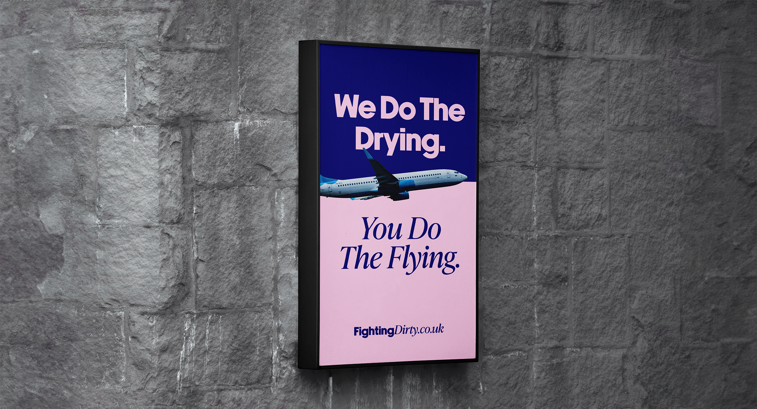
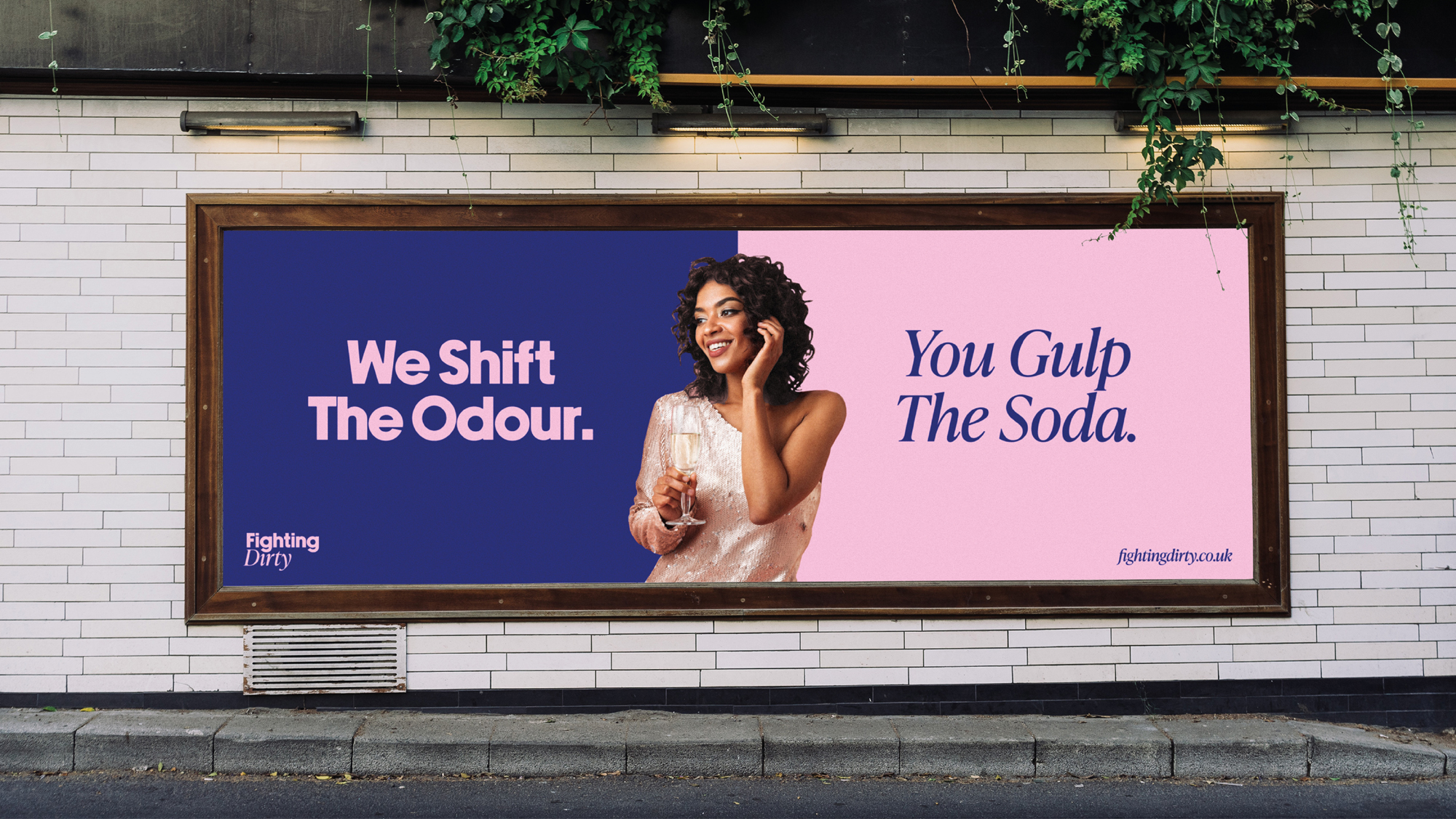
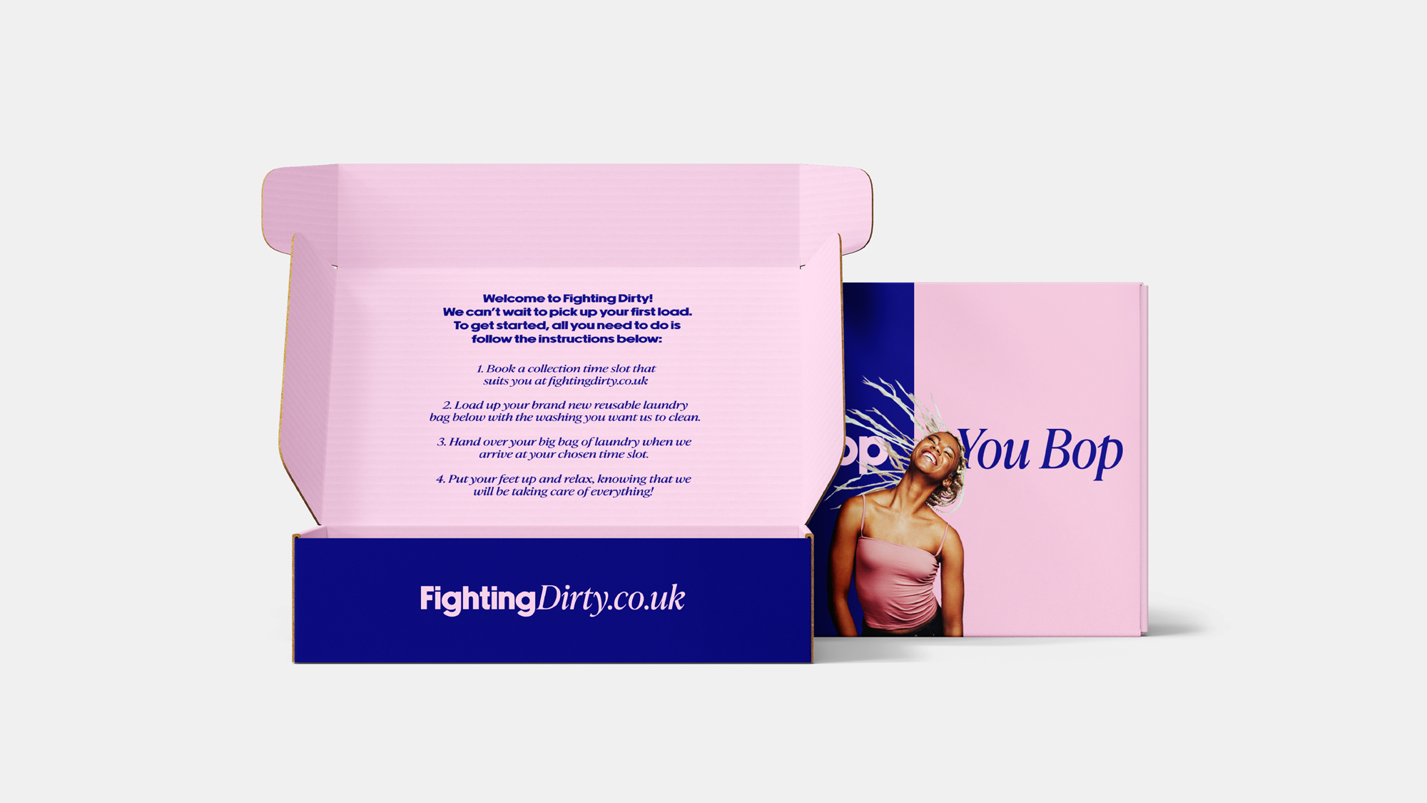
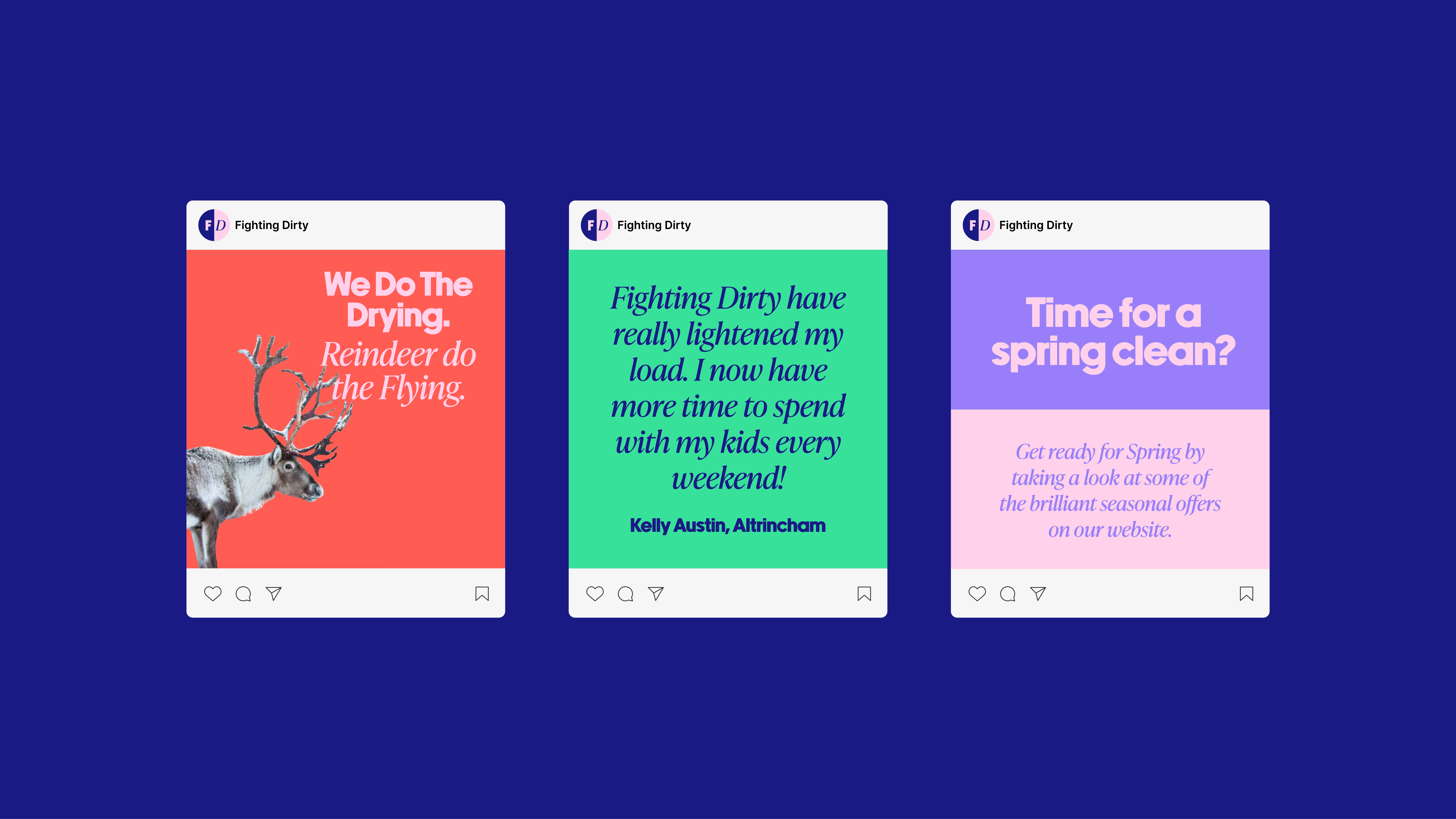
So, pivoting that premise into a series of taglines in a punchy, tongue-in-cheek Tone of Voice was good a place to begin. ‘We do the drying, you do the flying’, ‘we shift the odour, you gulp the soda’ – and so on and so forth. That energetic language was then rolled out into the longer, more informative parts of the copy. In the welcome instructions for instance – we transformed the logistics of collecting laundry into something that felt fun. ‘Welcome to Fighting Dirty – we can’t wait to pick up your first load!’
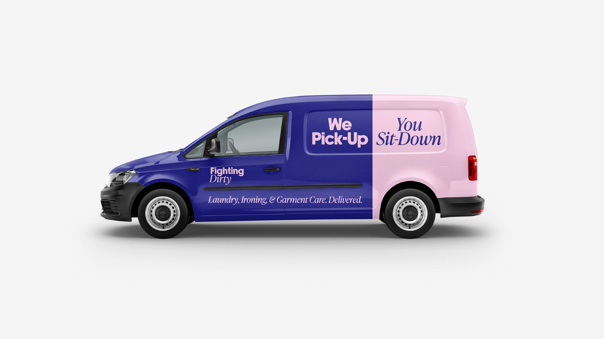
Pairing the copywriting with an equally enthusiastic creative came next. We wanted to ensure that the colour pallet stood out from the competition, whose branding often lacks a human feel, tending to be dry and faceless. Having developed the patter of We/You in the language, we wanted to bolster that by creating a split in the visual identity too.

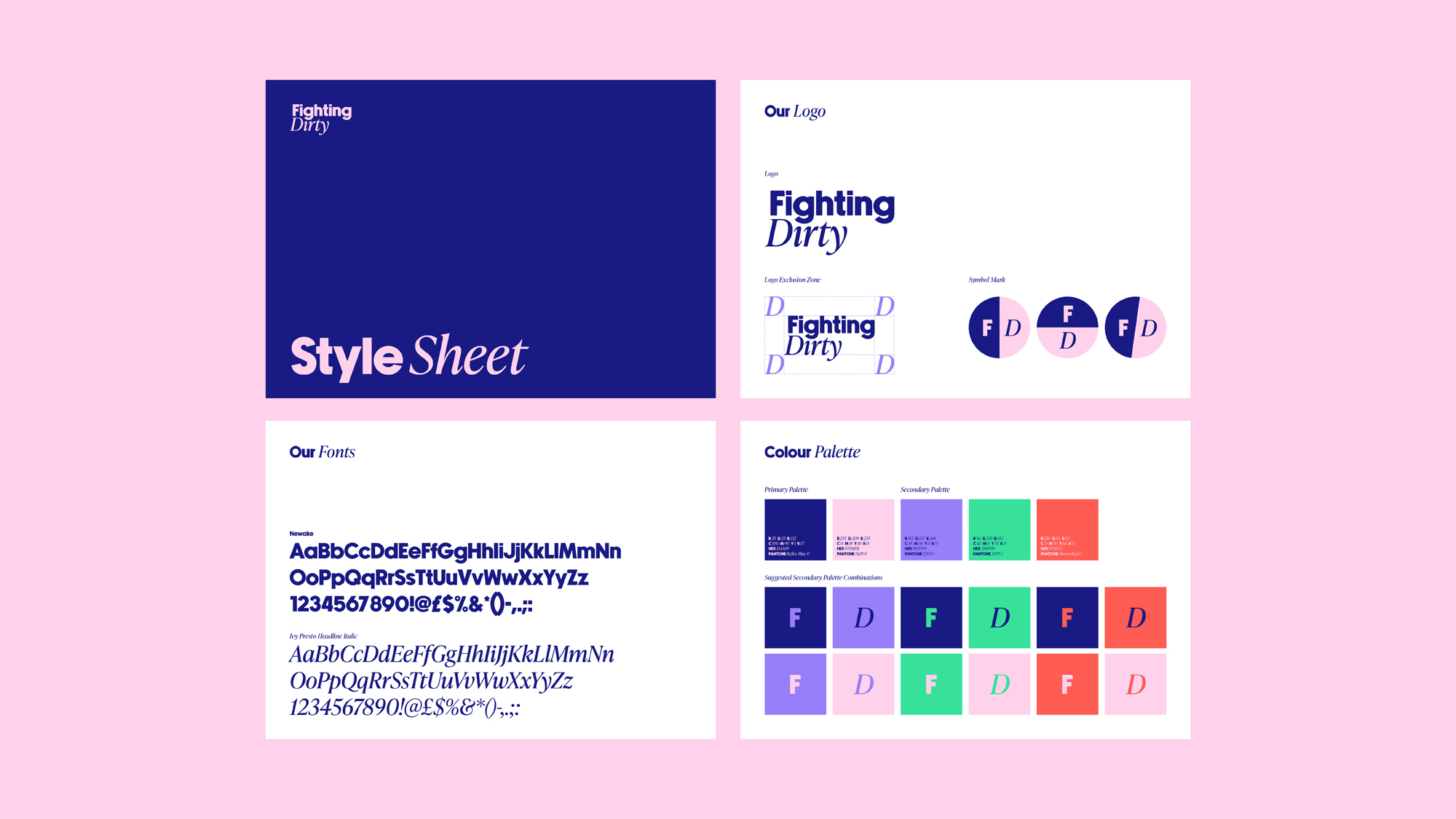


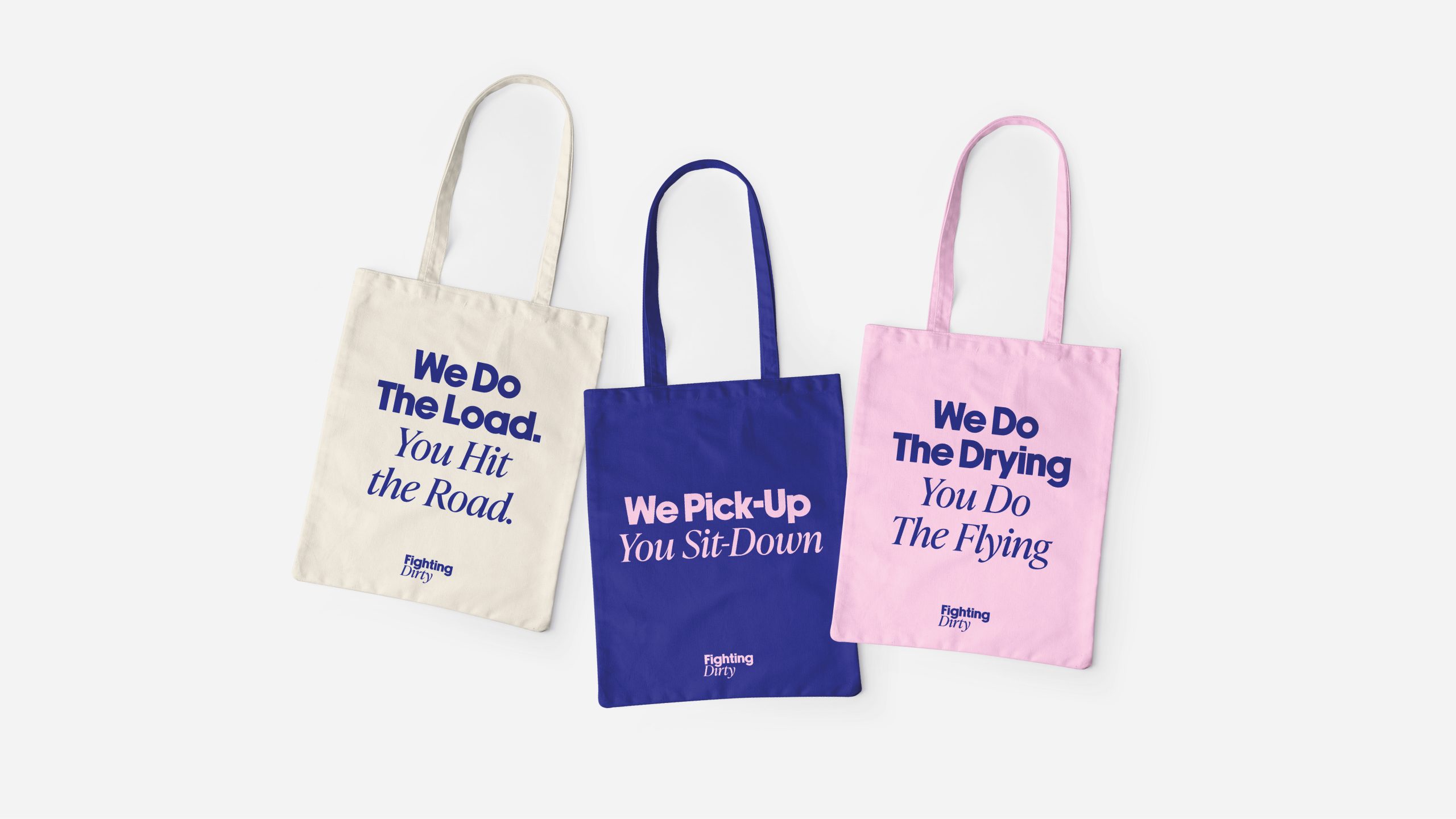

Opting for a primary two-tone colour palette helped to achieve that. Bright and bold, the contrasting colours were inversed across the background and text, strengthening the impact of the headline messaging. Using Newake and Ivy Presto typefaces, we were able to push that contrast even further – which when deployed across the various business touchpoints made for a real winner.
From employee sweatshirts to the sustainable laundry bags to the business vans whizzing around Greater Manchester – now you can see the Fighting Dirty battalion coming. Taking down dirties one load at a time. So that whilst they do laundry – you do life.



Interested in Glorious Thinking?
If you like what we did for Fighting Dirty, we could do something for you.
Mailing List
Sign up to our mailing list to receive all the latest news.
Check out our privacy policy for the full story on how we protect & manage your submitted data.
