Migration Yorkshire
How do you effectively unify hundreds of touchpoints and initiatives under one cohesive brand, for an organisation dedicated to helping Yorkshire and Humber deal with, and benefit from, migration?
You create a strong visual and verbal brand identity with ample scope and scale so that when used across everything – from sub-brands to festival flyers – the message is both a celebration of cultural diversity and of Yorkshireness too.

The Brief
Active across the entirety of Yorkshire and Humber, Migration Yorkshire is a local authority-led partnership leading the region’s ability to deal with, and benefit from, migration. Working with their partners – from local authorities and the Home Office to police, universities and refugee groups – Migration Yorkshire is responsible for building understanding and strategic support for the successful integration of migrants into county communities.
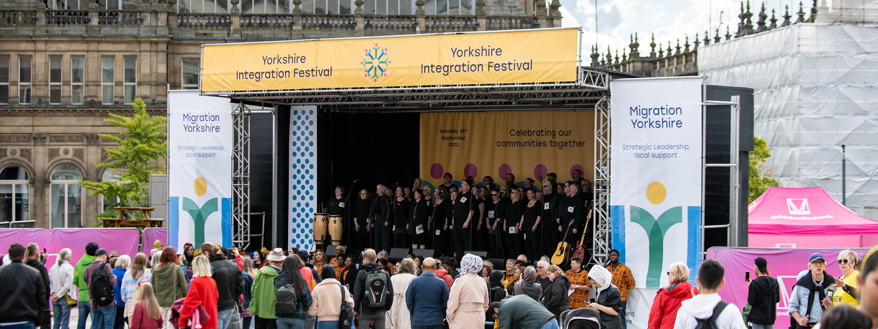
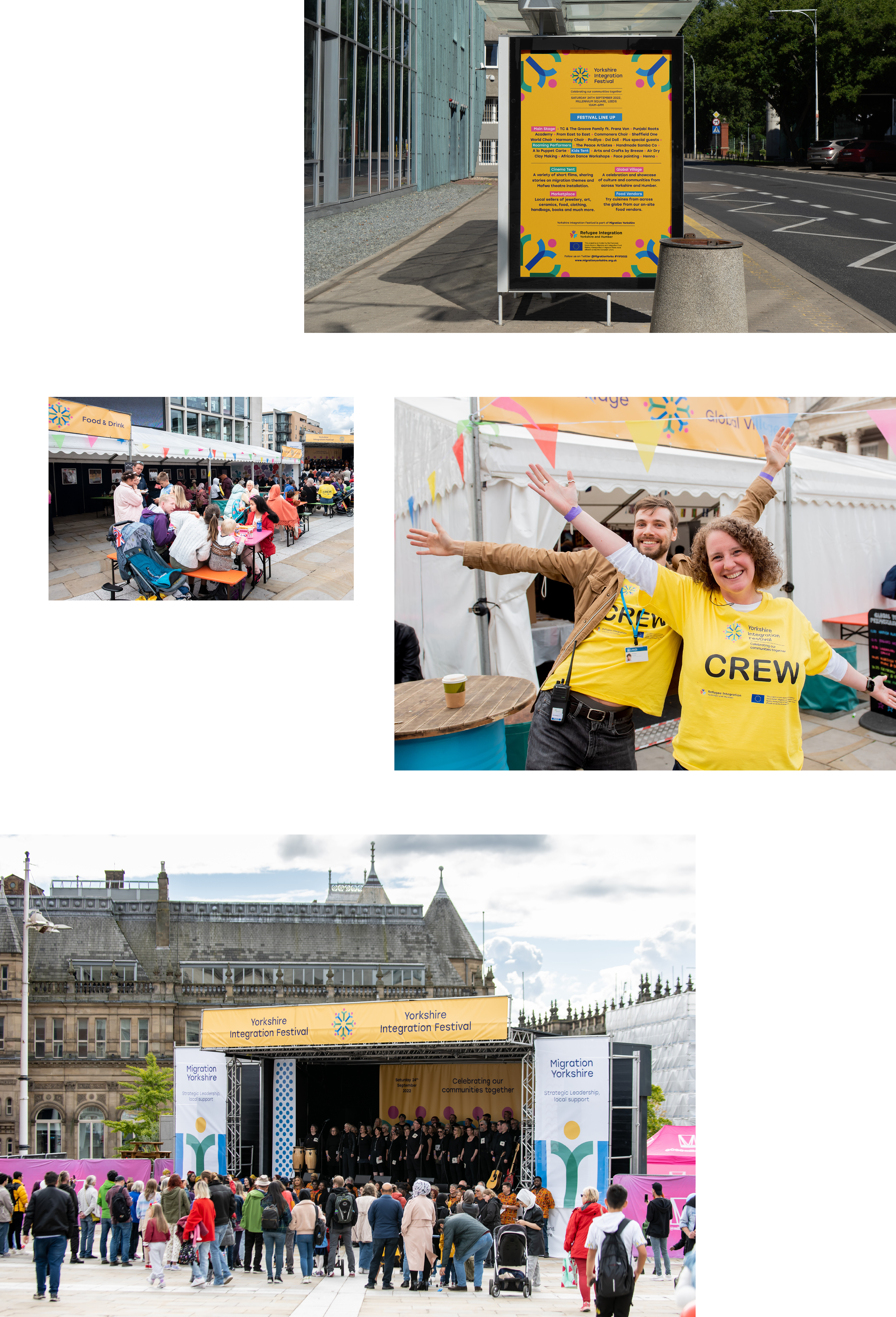
That ambition manifests into many initiatives and campaigns throughout the year – of which one of the most significant is the annual Migration Yorkshire festival. An event that celebrates diversity, culture, and community.
With many different strings to its bow, Migration Yorkshire approached Glorious Creative looking to unite all of its promotional channels and events under one cohesive brand. From a new logo and iconography to festival guides, from the website to social platforms, we were tasked with distilling the human-centric message of Migration Yorkshire into a strong and symbolic visual and verbal identity.


Our Response
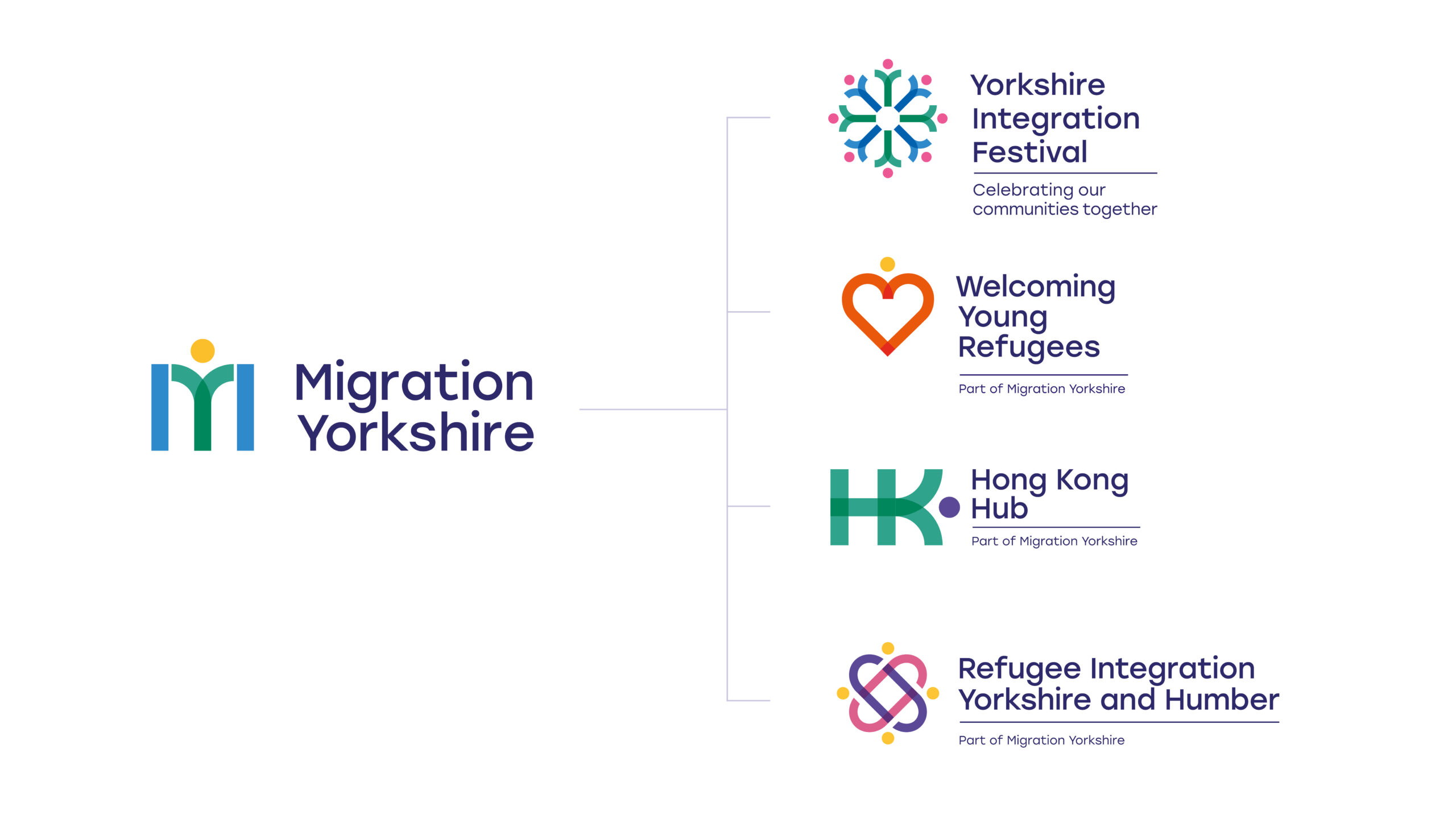
We began our response to the brief by filtering through Migration Yorkshire’s existing digital channels and the various print literature used to promote events. It was clear that the new creative would need to have more longevity and adaptability – as well as a bright and bold colour pallet associated with vibrancy and positivity, both of which felt lacking in the current brand assets. We knew that providing those tools – likely in the form of iconography and illustration – would tie all arms of the brand together much more tightly, future-proofing the creative identity so that it could be transferred fluidly between sub-brands, such as the outpost in Hong Kong.
The workshop with Migration Yorkshire’s internal team also gave us invaluable insight into the non-profit’s overarching proposition. Migration Yorkshire is dedicated to making its region a welcoming home for many of the migrants resettling in the UK. Part of that laudable mission statement includes not only celebrating cultural diversity but also showcasing the brilliance of Yorkshireness too.
From the rolling green dales to the heritage of cities like Leeds and York – we understood that the creative identity, Tone of Voice and subsequent new brand guidelines would need to encompass both a celebration of the home-grown and a welcoming of cultural fusion.

A Graphic Toolkit



Tone of Voice Exploration
As part of the concept presentation, we also provided a series of different existing Migration Yorkshire assets, rewritten in a new Tone of Voice. From social posts to bios to festival flyers, by refocusing the tone and style of the written copy – we were able to demonstrate how the team would be able to strengthen their message across all of their different outputs.
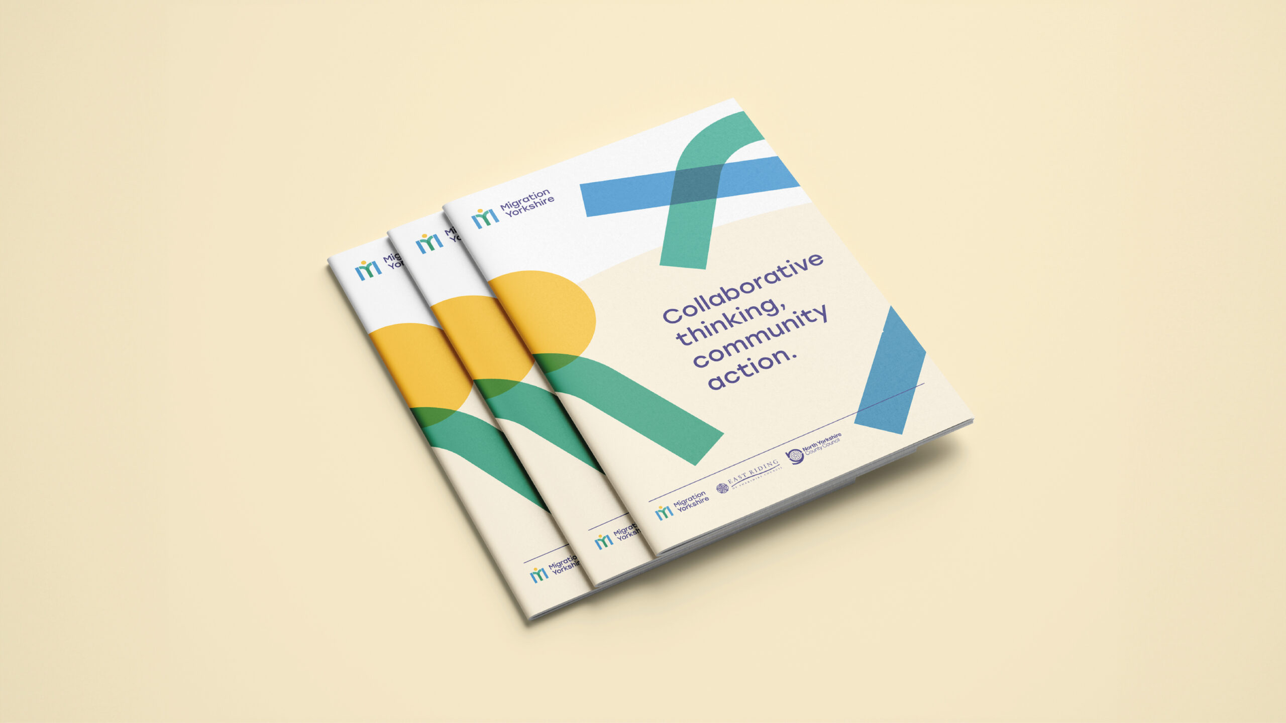
The other essential element was the revised brand strapline. We provided several different iterations – each intended to communicate the proposition within a few words. Whilst one set of straplines focused on an evolutionary theme – ‘Collaborative thinking, community action.’ and ‘Where strategic decisions lead to local action.’ – another set was written in a revolutionary tone – ‘A human touch, a Yorkshire welcome. Supporting migrants to make Yorkshire home.’ Together with the different creative concepts, this provided the client with a strong foundation from which to move forward with the final outputs.


Final Creative Concept
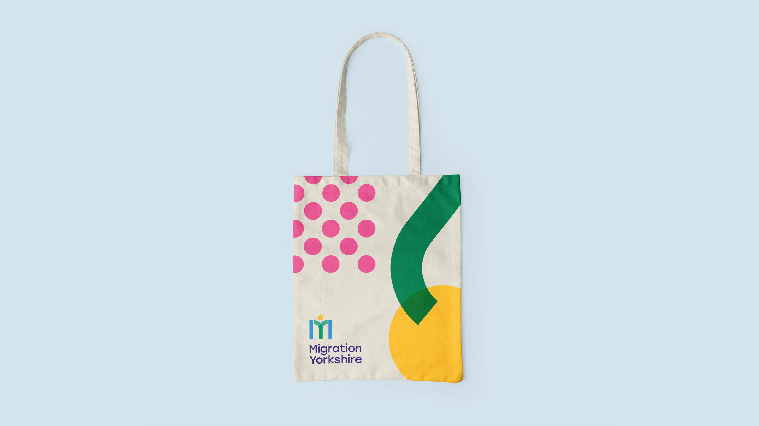
Migration Yorkshire places migrants at the centre of all that they do. By exploiting the serendipity of the letterform (an M and a Y), we are able to create a visual metaphor that represents people being placed at the core. A bright and optimistic colour pallet, inspired by the lush greenery of Yorkshire, was carried by a variety of shape-led iconography providing enough scope for the sub-brands to use too. We were also able to deconstruct the symbol further to inject a dynamic, playful feel to the brand toolkit which we felt was important to appeal to the target audience.
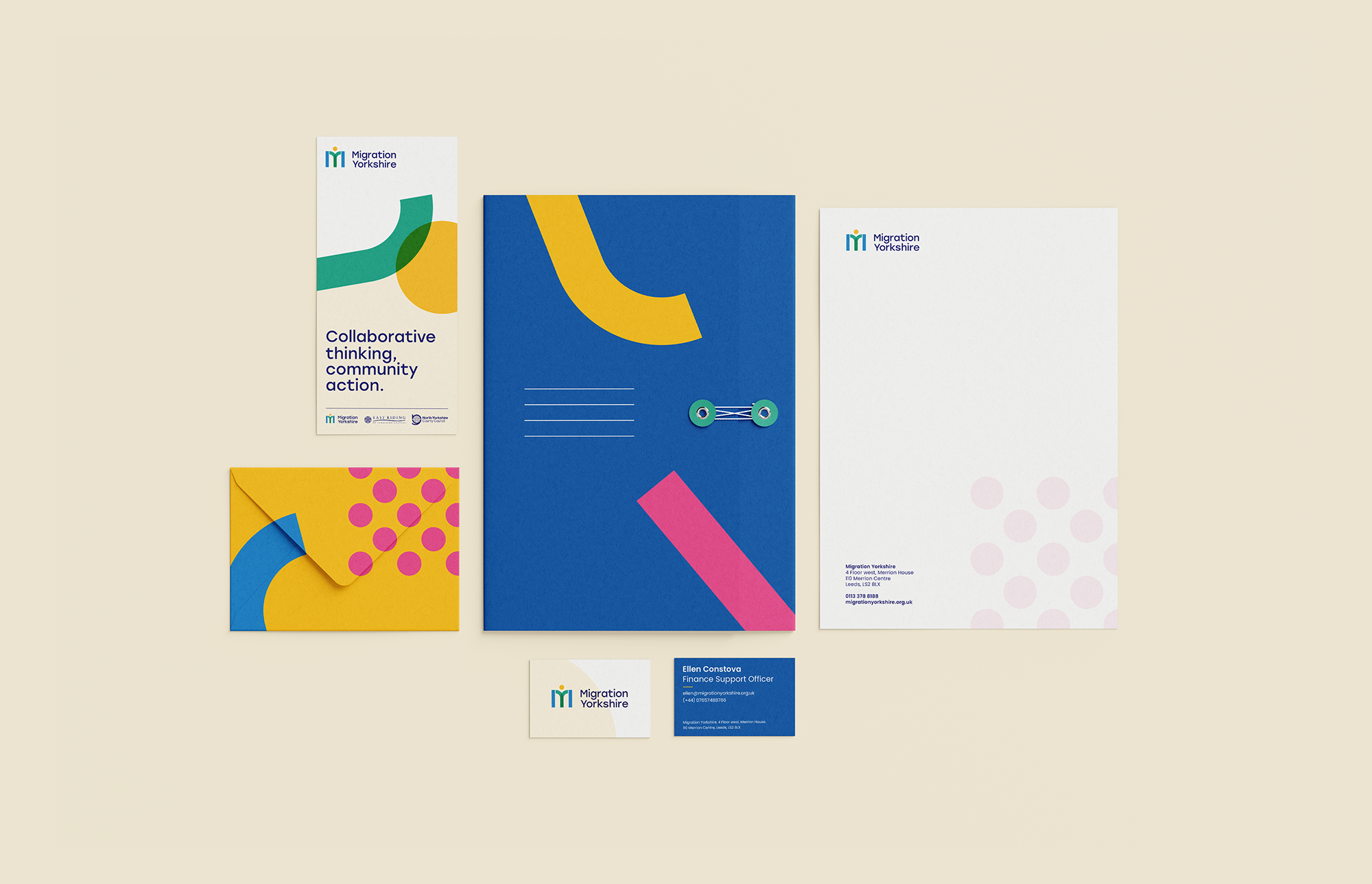
Leading with the strapline ‘Collaborative thinking, community action,’ the new direct encapsulated all the positive attributes of the organisations. And all delivered with a creative infused with positivity and lightness – alongside a colour pallet that felt distinctive in its Yorkshireness too.
Within the final brand toolkit, we set out guidelines on all of the different elements required to execute the new brand identity with conviction and consistency. On the logo, for example, we provided clear direction on where and how the master Migration Yorkshire logo should be implemented, as well as detailed instructions on the sub-brand and partner logos.
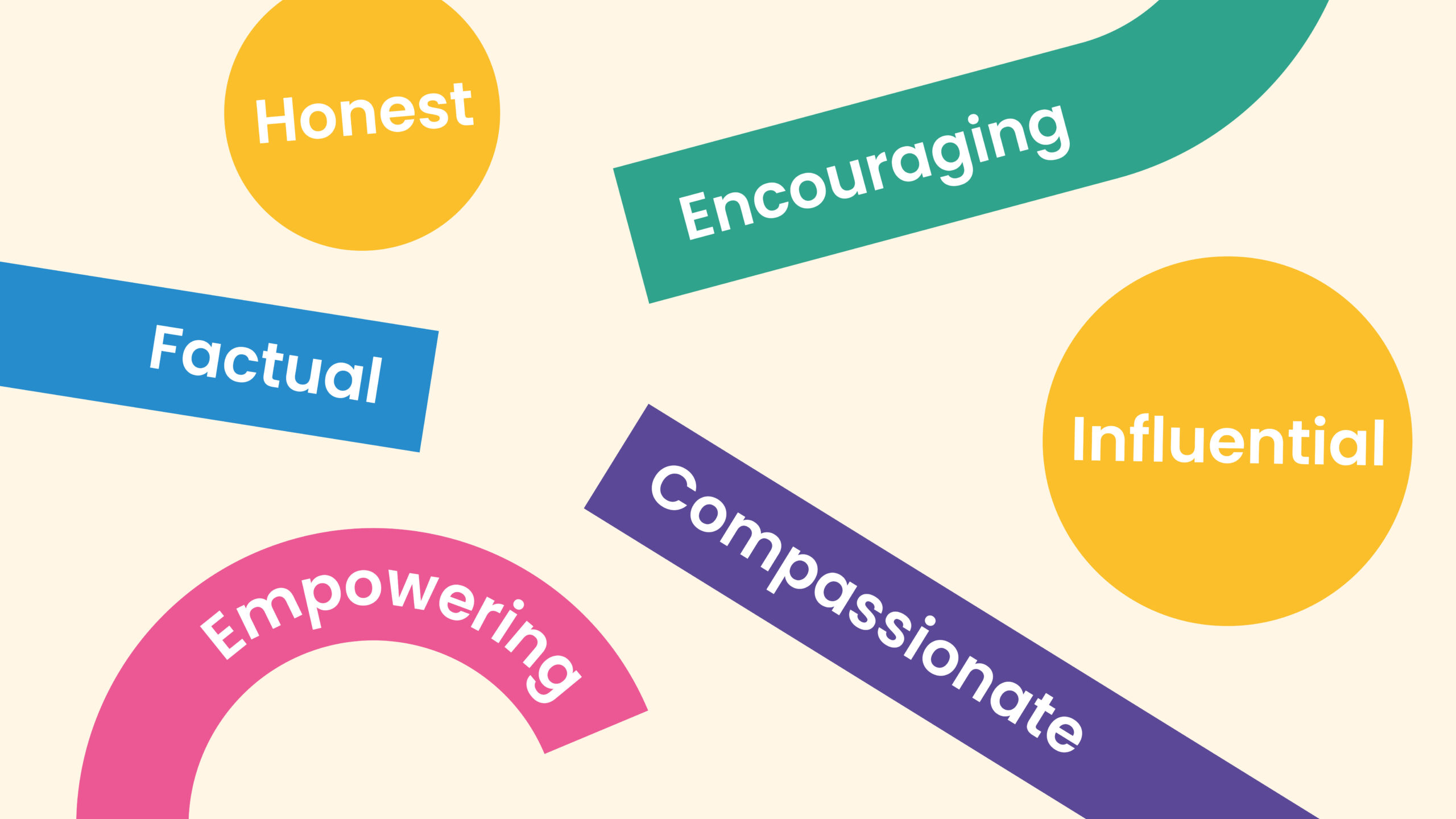
Typography, Tone of Voice, graphics and photography style were also clearly stipulated to ensure collateral across the organisation always adheres to the overarching brand identity, one that is amongst other things: empowering, encouraging, compassionate and honest.
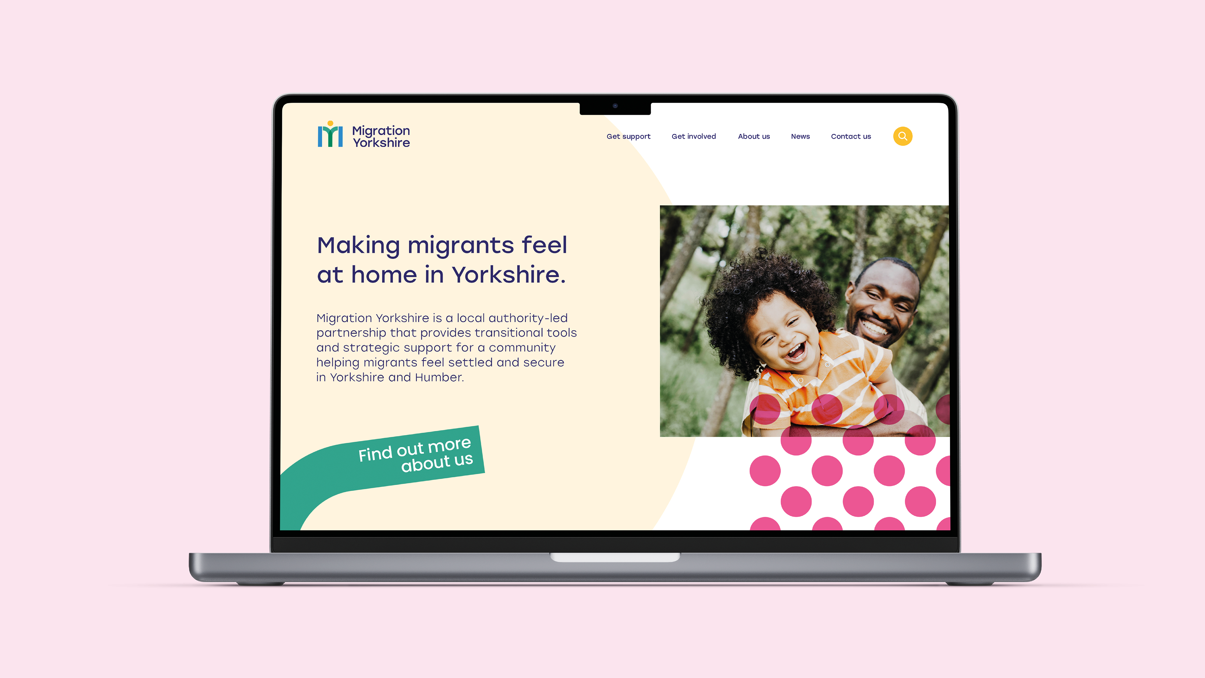
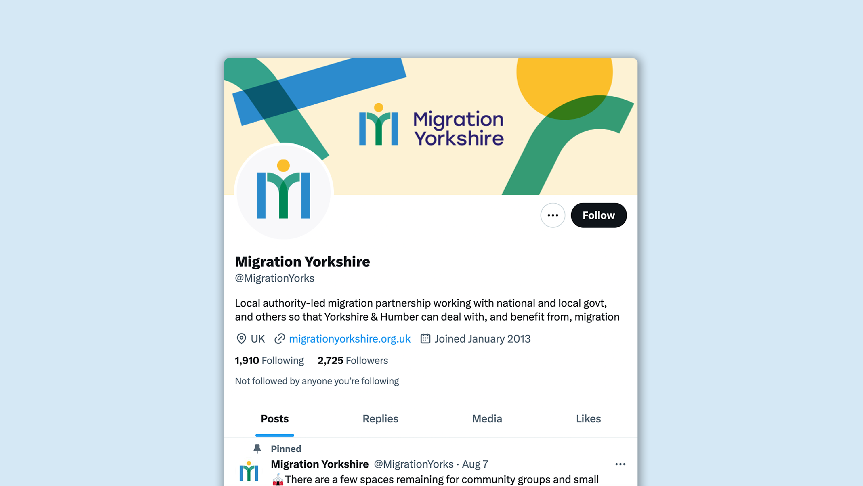
As part of the final deliverables, we sent over one of our most essential branding tools: a comprehensive guide to the brand in action. In demonstrating individual examples of how the brand identity carried across different touchpoints – from the website homepage to the festival flyer, from pull-up event banners to presentation templates – we were able to exemplify the full-scale adaptability of the brand and the power it has to unify all activities. A fitting conclusion for a client whose entire ethos is centred on togetherness and connection.






"We commissioned Glorious Creative to refresh our brand identity and help us bring all of our projects under one unified brand. From the very start, the team showed high professionalism, and we felt that they really listened to and understood our needs. All the staff members were very approachable and stayed on top of their deliverables.
We are very pleased with the end result: a distinctive brand with matching sub-brands that allows us to look more professional and aligned in our communication efforts. We continue to use Glorious Creative's services for additional brand work as we value their skills and expertise."
Employer Engagement Manager at Migration Yorkshire
Interested in Glorious Thinking?
If you like what we did for Migration Yorkshire we could do something for you.

Mailing List
Sign up to our mailing list to receive all the latest news.
Check out our privacy policy for the full story on how we protect & manage your submitted data.
