
Around the world in 80 brands: Evoking La Dolce Vita in Italy
July 31, 2024Words by Dalia Jaffar
Our continual quest for branding inspiration is taking us global in 2024. We’re searching the world over to trace how the brand identities of countries and cultures manifest into great graphic design. So far, we’ve stopped off in Japan – but where to now?
Welcome to Italy: land of the beautiful, home of the Renaissance
Let’s drop our pin in Italy – cue an enviable sigh from readers glancing towards the grey skies of English summertime. From the grandeur of Rome to the alleyways of Naples, garlanded with washing lines and humming with bolshy Neapolitan energy – to the waterways of Venice, a city that has as much magnetic draw now as it did for Lord Byron in the early 1800s – Italy is without doubt, one of the world’s most distinctive and beautiful nations.
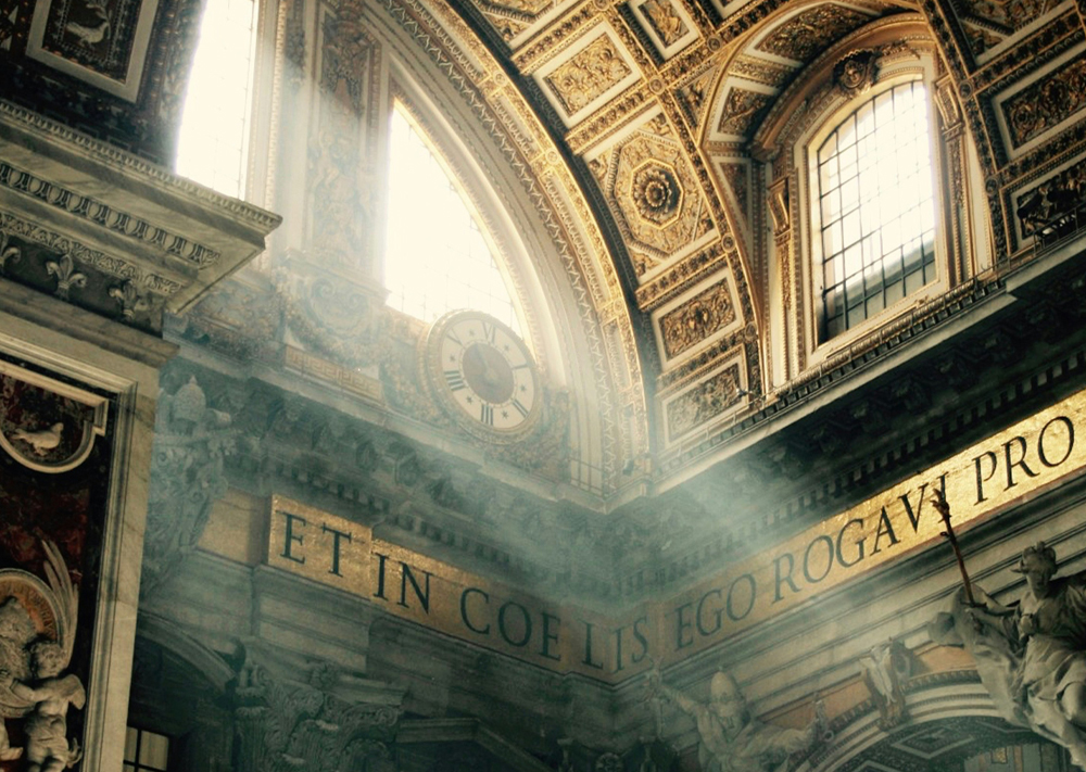
The country’s gorgeous geography is part of the people too. Italians have a fierce love of the beautiful – after all, it’s the birthplace of the Renaissance. With figureheads like Leonardo Da Vinci and Micheal Angelo dedicating their life’s work to the painstaking masterpieces unveiled and upheld in Florence and Rome. They may have lived many moons ago, but their dogma is still very much a part of Italian identity. “La gatta frettolosa ha fatto i gattini ciechi” translates roughly to the “hasty cat had blind kittens” alluding to the importance of patience, patience, patience.
A life without haste is exuded in other everyday Italian proverbs many of us will be familiar with, “La Dolce Vita” – “the sweet life” and “Il dolce far niente” – “the art of doing nothing” all reiterate a cultural mood very different to other nations whose feel much more hamster wheel. Long lunches in Italy can easily span a whole afternoon and most of the population tends to take the entire month of August off. It’s a pace that permits time to enjoy beauty, to work to live, not live to work.
That slowness permeates into the homegrown products here too. And it’s not just perishables, although try to tell an Italian that the food and wine of the French supersedes pasta or gnocchi, and you’ll soon still see the fiery Italian passion surface – but more than that. Italian craftsmanship is not just a noun but a verb. It describes a way of doing things with love and care, with proficiency not always efficiency. A practice that has absorbed not only into culture but commerce too, with so many Italian brands anchoring themselves to the essence of Italian-ness, where art is the life, and life is the art.
How Italian culture spills into creative branding
So how does “la dolce vita” materialise in visual form when it comes to the marketing campaigns of Italy’s biggest brands? One of the most tangible takeaways are typefaces. Cast your mind for a moment to the shopfronts of any Italian city – fonts are nearly always curious and bold. Rarely is there a text without curvature, a certain warp, or lean. In fact, so widespread is the Italian preoccupation with typography in branding, that certain fonts have become entirely synonymous with a brand or business with roots in Italy.
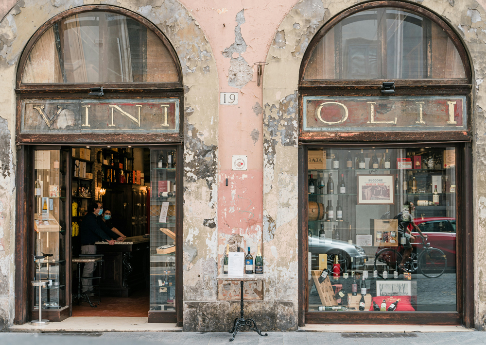
This quintessential ‘Italian’ typeface originates from traditional Woodcut typography. One such famed Italian sculptor, known for some of his unique, woodcut sign installations in central Rome, is Ferdinando Codognotto. His studio and gallery are hidden in plain sight in the middle of the capital, just steps from Piazza Navona, where he is often seen etching fonts of different designs into solid wood. Although Codognotto uses wood and not marble as Michelangelo, the premise of craftmanship remains steadfast. An ode to art that cannot and will not be rushed.
This brings us nicely to the elements of Italian-style branding that are less tangible. The stamp of quality, premium, and high-end – all associates of the made-in-Italy hallmark. According to the New York Times, Italy’s high-end firms are using the business model to secure the thing that sets them apart: homegrown craftsmanship. “The artisan skills make a priceless contribution to the value chain,” said Tomaso Galli, director of communication and external relations for Prada “Vertical integration enhances the whole process because of the dialogue between the different areas such as production and the creative teams.”
Just asserting Italian end-to-end production gives brands the cornerstone of their identity which can then be pivoted into a plethora of designs and messages that hinge on that loaded USP. Does it give the teams behind these campaigns an easy job? Well, not quite. But it gives them a picture to paint, a blueprint for which to follow with all arrows pointing to the motherland.
The brands that best embrace a little La Dolce Vita
Unsurprisingly for a country whose cuisine stretches to all corners of the globe, homegrown brands in the food and drink business have some of the most quintessential Italian branding and advertising campaigns. Take the sparkling drinks brand San Pellegrino, who in their words, have “always sought to communicate authentic Italian values in its advertising.”
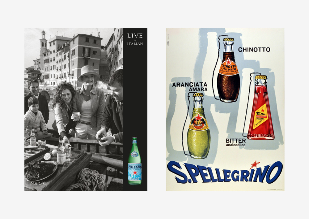
It is perhaps their “Bring your best” advertising campaign that best encapsulates that mission. The campaign had many different creative outputs, but it’s the TV advert that entirely envelops the Italian attitude we were just discussing. Set to a vocal sung in the romantic language, the scene shows the archetype Italian dinner party of many different generations musing over a long meal, with laughter, love, and life. It epitomises the idea of slowness, savouring the moment without distraction. To be your best, you should be your most present self – your most authentic. Then there’s that signature typography on the screen. A medley of slant and structure that wouldn’t look out of place on the front door of a Venetian cicchetteria.
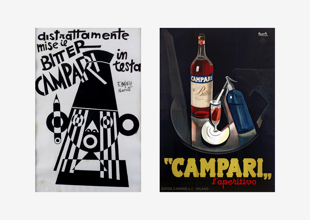
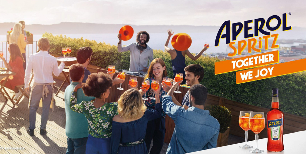
Then sweeps in the alcohol brands. The likes of Aperol and Campari – all made famous by the aperitivo hour. That classic after-work, afternoon lull always deserving of a tipple or two. “Aperol – together we joy” was the 2019 hero campaign that saw revellers sip on glistening tangerine-coloured drinks served in dewy glasses. Again the impression leans totally into the Italian ethos, to slow down – enjoy life, and not take anything too seriously.
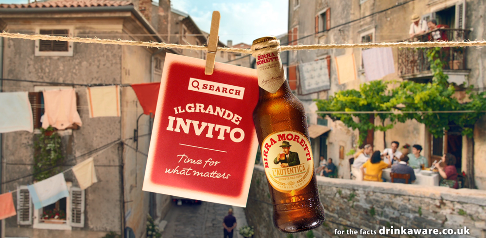
Hot on their heels, Birra Moretti launched its first global brand awareness campaign a few months later. Introducing its new platform ‘Simple Pleasures’ the marketing team behind the beer illustrated how it ties in with the Italian way of life. Birra Moretti’s global brand and marketing director Marcelo Amstalden Möller told Marketing Week the brand has been “very happy” with the results. “Our brand identity and our values are being well communicated and people are understanding what we stand for,” he said. Tie that with an emblem that feels typical of an export from Italy, stamped red text surrounding a suited bloke sipping his beer above “L’AUTENTICA” – the authentic – and you’re soon reminded of that resolute Italian mindset of “our way is best.”
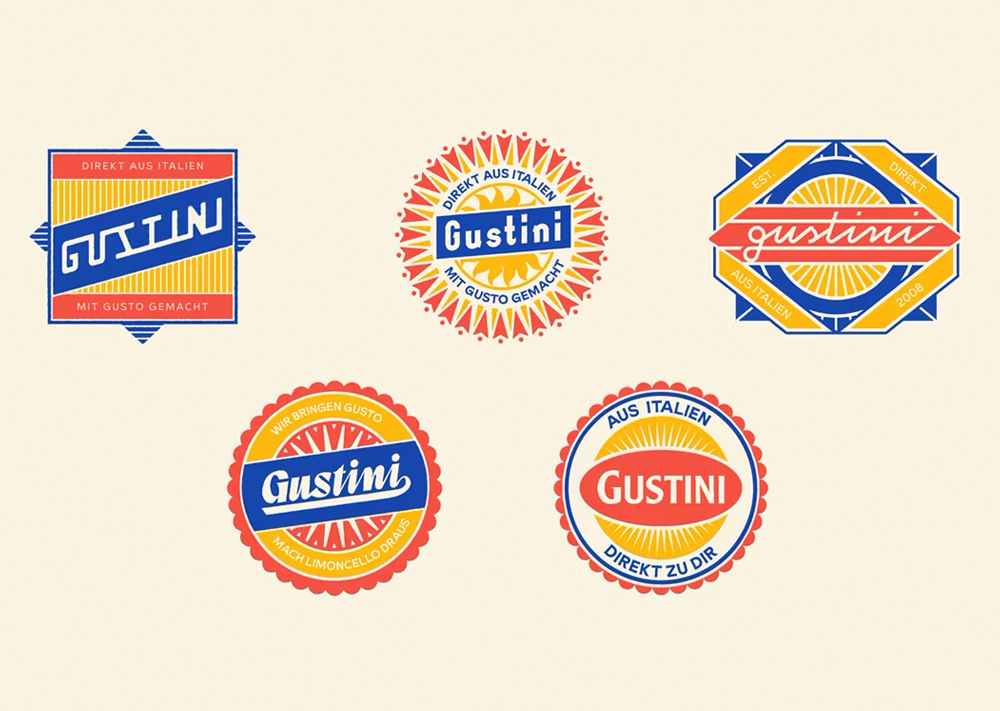
And that’s the point too, global consumers associate Italian produce with a certain kind of branding. Gustini is an online marketplace that delivers Italian foods to people all over Germany which received a rebrand in early 2024. The studio behind the new creative execution knew the direction of travel from the get-go. At the heart of the identity is a new logotype that “pays tribute to classic Italian graphic design” seen on signage and packaging in Italy. The idea was to evoke sun-drenched visions of the country through the visual and verbal identity – so that the German consumers knew they were getting a taste of Italy as soon as the beautiful package landed on their doorsteps.
Away from food and drink, what is more Italian than Vespa? Their recent shoot sees a woman mid-business call in the streets of Rome or Milan who is suddenly drawn through a port key where several brightly dressed dancers are surrounded by equally bright vespas. The sentiment? Feel free. Be yourself. There isn’t time in this world to live anything other than La Dolce Vita.
Glorious branding infused with the Italian lust for life
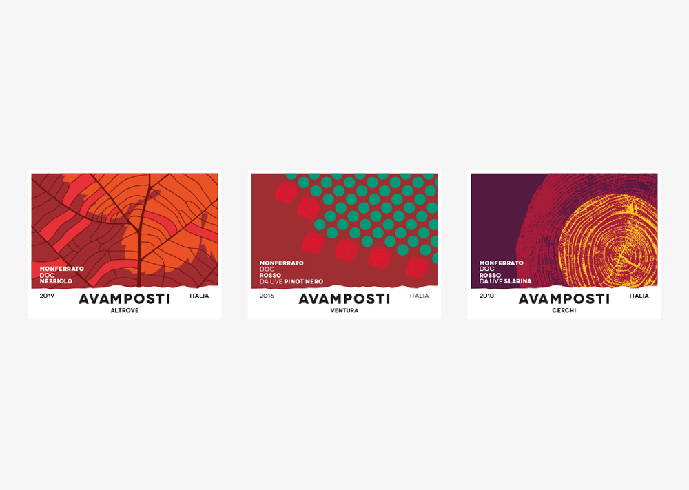
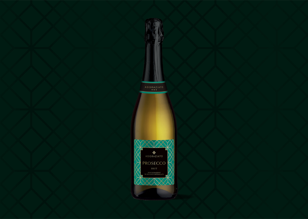
Here at Glorious, we have helped several clients pack Italian spirit to their brand. Sense of Place is described as ‘the wine creatives’ for good reason. They’re in from the very beginning. Visiting vineyards, talking to the producers, understanding the trade customers and consumers, creating the brand names, the stories and providing the creative direction for the design team. Sense of Place then often facilitates the entire production process from print and bottling to the retailer shelf or restaurant. So, you can see why when approached to create the visual labels for the winemakers, our minds immediately sprung to the style of Italy for inspiration.
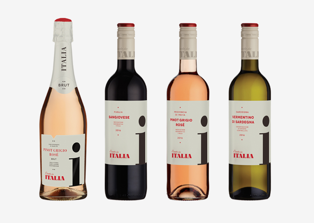
Every wine has a story. And it’s our job to interpret and communicate it visually in the most convincing and engaging way. The name of the game is to bring the individual wine’s story to life, in a space that’s on average 95mm x 105mm. It’s about condensing the visual concept, graphic clues and treatment of the name onto a tiny canvas. Above all to bring a distinctive quality and personality that demands interest, attention and preference – all sounds rather Italian, right?
So then – if all that talk of La Dolce Vita has left you wanting to bring out the beauty of life in your brand, focusing on ‘how’ it can make your consumers feel as opposed to the product itself then we’re here to help. From rebrands to website design, to full-scale marketing strategy and delivery – let us guide you through the most life-celebrating style of graphic design and branding.
But before that – here’s how to implement a little of Italy into your brand…
1. It’s about the moments. Done right, visual branding and marketing campaigns that lean towards the style of Italy don’t dwell entirely on the product itself. Instead, it’s about selling through the moments and aligning your brand to the joy of life in every little moment. Sharing a dinner with friends or a day with our children, how does your product or service enhance the existing beauty of life without detracting from it?
2. Typography is key. As you’ve been hearing typography is a massive part of branding that links to Italy. If anything, it’s rather retro – colourful, interesting shapes that evoke a sense of fun and curiosity. Put it this way, even if you’re not selling or producing perishables, you want your branding to look edible. Whether that’s because it wouldn’t be out of place on a taverna door or because you’ve brought the lemons of Amalfi to your colour palette.
3. Time, care and attention: remember here is the holy grail of doing things properly. If you’re going to make your brand Italian in its visual identity, you’ll need to ensure your brand narrative lives up to expectations. Tell the story of your history, focusing on provenance – why what you do matters and how you invest time and energy into creating something that isn’t just ordinary. Therein lies the magic.
What to bring your next branding project to life? Get in touch.
Mailing List
Sign up to our mailing list to receive all the latest news.
Check out our privacy policy for the full story on how we protect & manage your submitted data.