GMI Construction
How do you enhance the brand identity of an ambitious construction company hoping to change more than just city skylines?
You refine the brand’s strong foundations and create all the tools for a confident, industry-leading business building beyond what you can see.
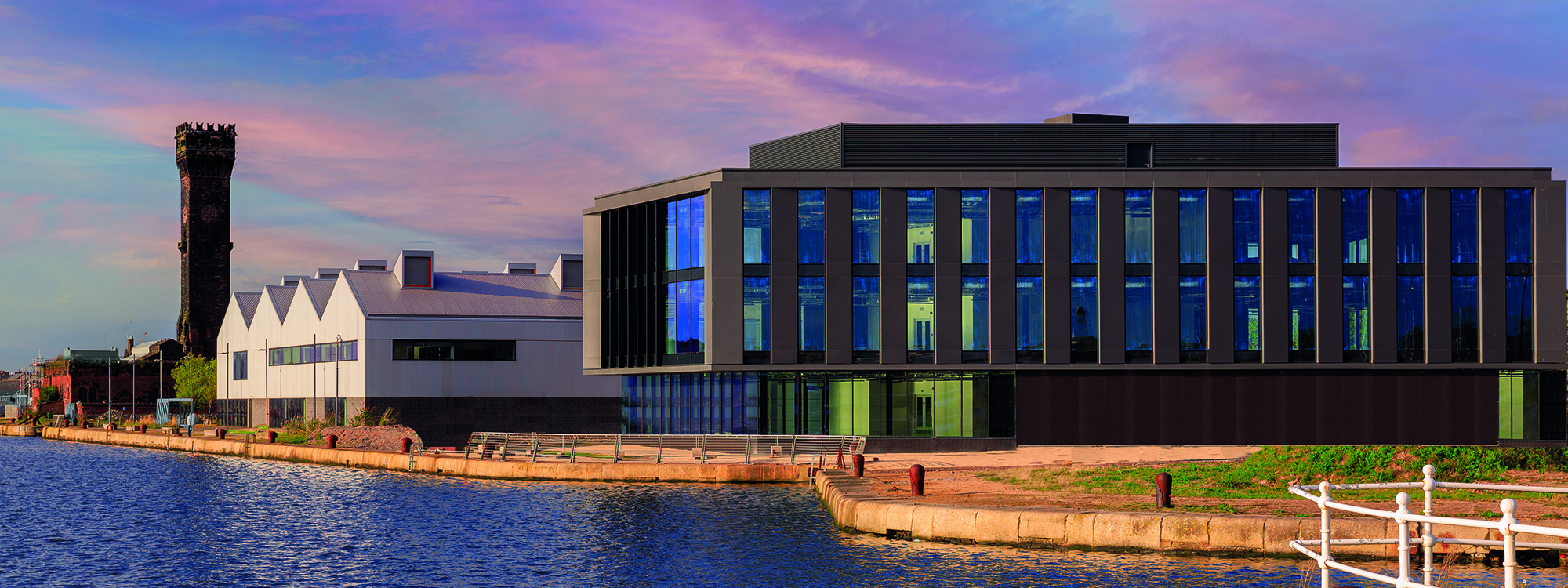

The Brief
GMI Construction Group PLC has been building for over three decades. But unlike many other construction companies, the kind of building that GMI does is twofold. There’s the building in the physical sense – constructing infrastructure to transform commerce and communities across the UK. And then there’s the figurative building of structures you can’t always see. This is the GMI vision of building a better Britain – one where projects power change across a wide range of sectors and most importantly, across communities and their people.
In the context of most Northwest construction companies, that kind of brand narrative is quite different. And when the GMI marketing team approached Glorious Creative, that distinctive sense of disruptive ambition was palpable. All of this was being driven by a laser-focused 10-year strategy that hinged on propelling the business to a £775m yearly turnover. GMI recognised that achieving such monumental revenue targets would require every touchpoint in its extensive portfolio of projects and promotions to be pivoted towards that same goal.
The problem was that much of the current visual brand identity, verbal brand language, and creative outputs didn’t quite hold up to that same rigour. Despite that, the GMI brand had strong foundations we could build on. Our brief would be to create a more dynamic and engaging brand that hinged on existing elements. By strengthening and evolving the brand in a way that vehemently expresses the ambitious 10-year plan, we would ensure that every detail of the GMI brand reinforced its position as a future-focused construction company. Bolstering a business building beyond what you can see.
Our Response
We responded to the brief by first taking stock of what was already in circulation in terms of brand identity and collateral. Whilst the visual creative had some strengths other elements like the tagline, typeface and photography were out of alignment with where the business was heading.
So, we set about bringing each of the different brand components under one distinctive brand identity in line with the ambitious GMI growth targets. We’d have to work fast too, because, in the six months prior GMI had already completed over 100 projects – setting a pace for us to match.

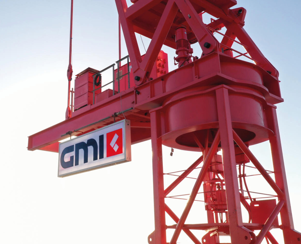
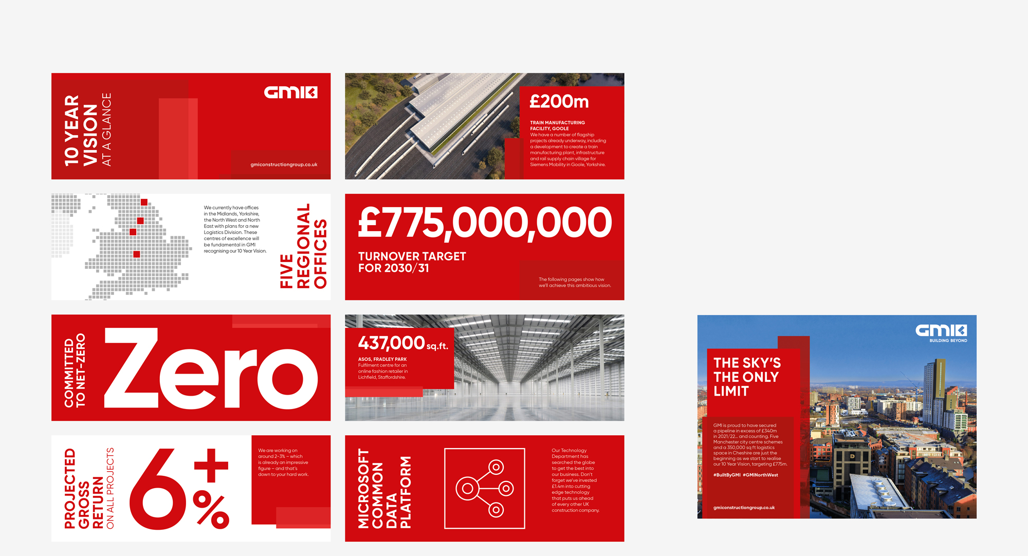
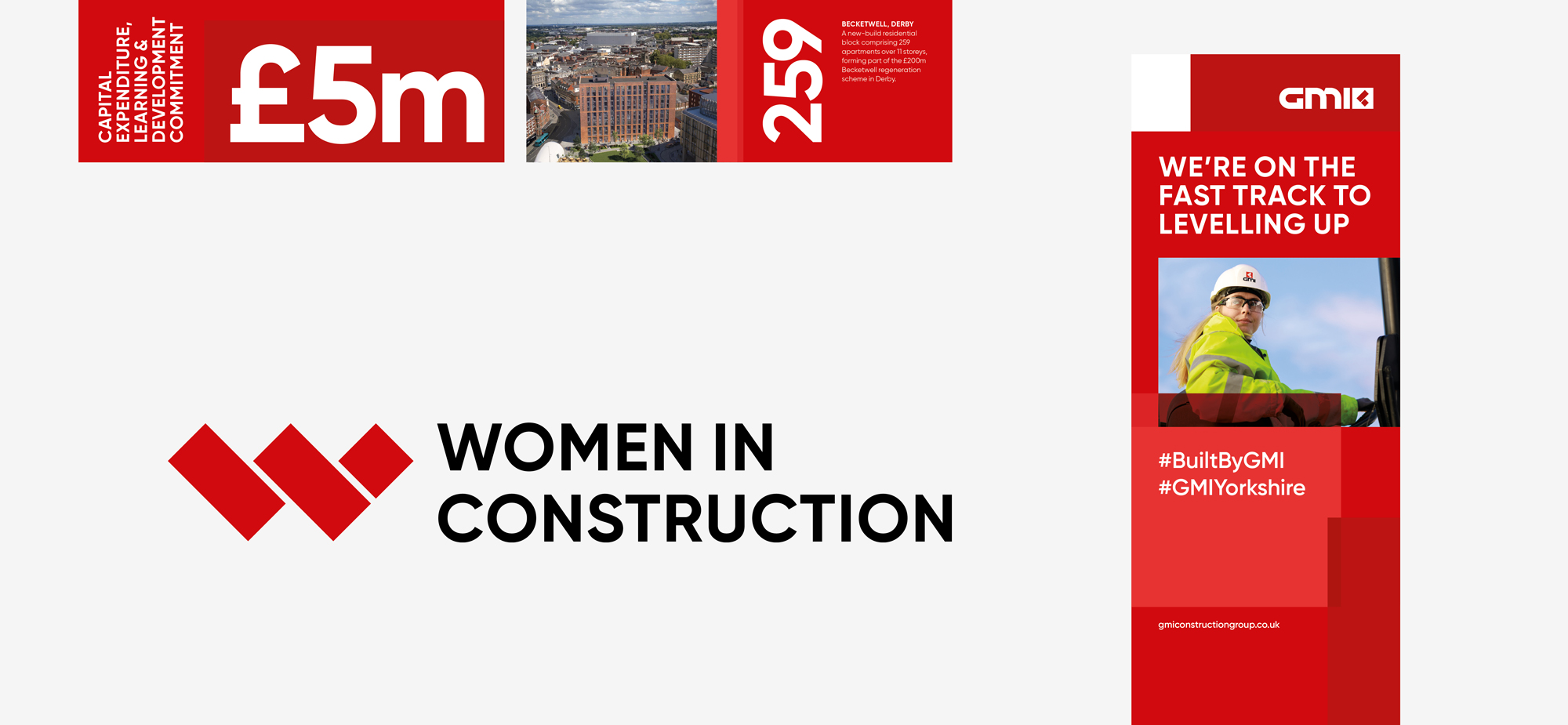

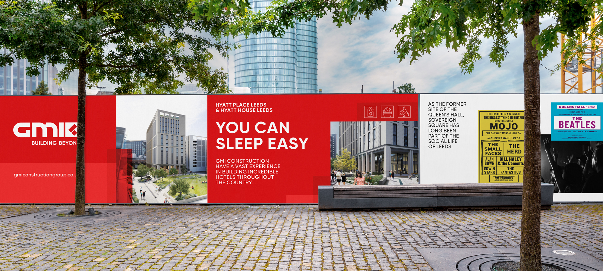

Given the breadth of the company, with a Leeds-based head office and several regional sites, plus the vast array of brand placements, from van doors to online portfolios – we knew that expanding and delivering a brand toolkit would be essential. This way, we could develop the creative and written language of GMI and provide all of the tools for it to be applied successfully across every iteration.
We first refined the GMI logo, making it more geometric which made sense for a construction company. And practically too, we ensured it was digitally friendly and legible on a variety of mediums. Providing rules on how and where the logo should be used, meant it would be versatile and adaptable enough for every eventuality.
We coined a new tagline: ‘Building Beyond’. A single statement aligned with the GMI 10-Year Vision which reiterates the position of the business. Deliberately intended to be thought-provoking, it encapsulates the ambition to build more than just bricks and mortar, alluding to the company’s ongoing commitment to people, the communities, supply chains and associated charities.
The tagline set the scene for a new Tone of Voice too, which would fall in line with the newfound confidence. It would be all centred on the idea of ‘doing things the GMI way’, which would make the language of GMI: straight-talking, proud, bold, honest, empowering, creative, grounded and human’. Within the brand toolkit, we outlined how to ensure that copywriting fits this bold Tone of Voice, along with an easy-to-use sense-check: cut to the chase, have a bit of fun, don’t forget about human connection. This, combined with a clearly articulated brand personality would help ensure that wherever GMI were conveying their message – it would be one of bold confidence.
A new graphic language was designed too. Using the strong red colour as the origin point, we developed a series of red blocks in different tones and transparencies. Spun from the square and rectangle found in the brand symbol, when put together the shapes cleverly resembled a shot of a cityscape taken from a distance.


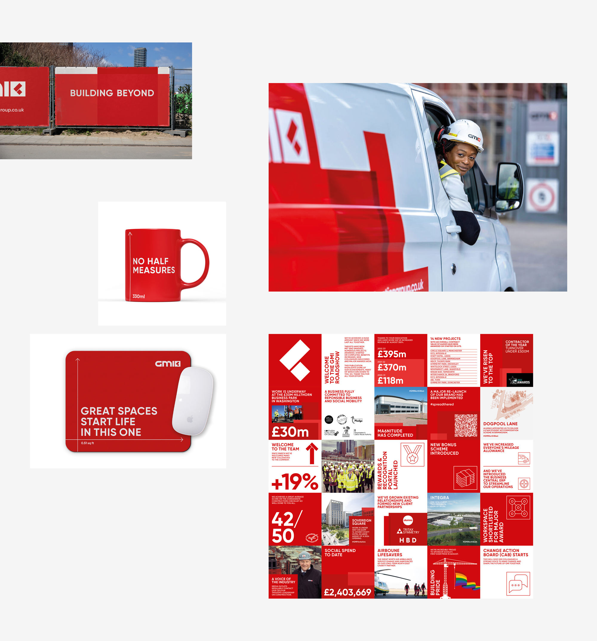
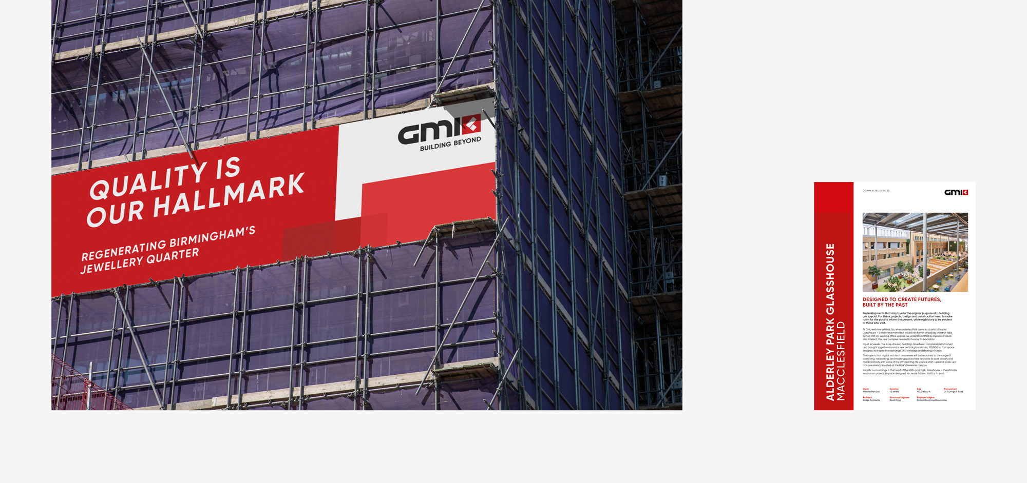
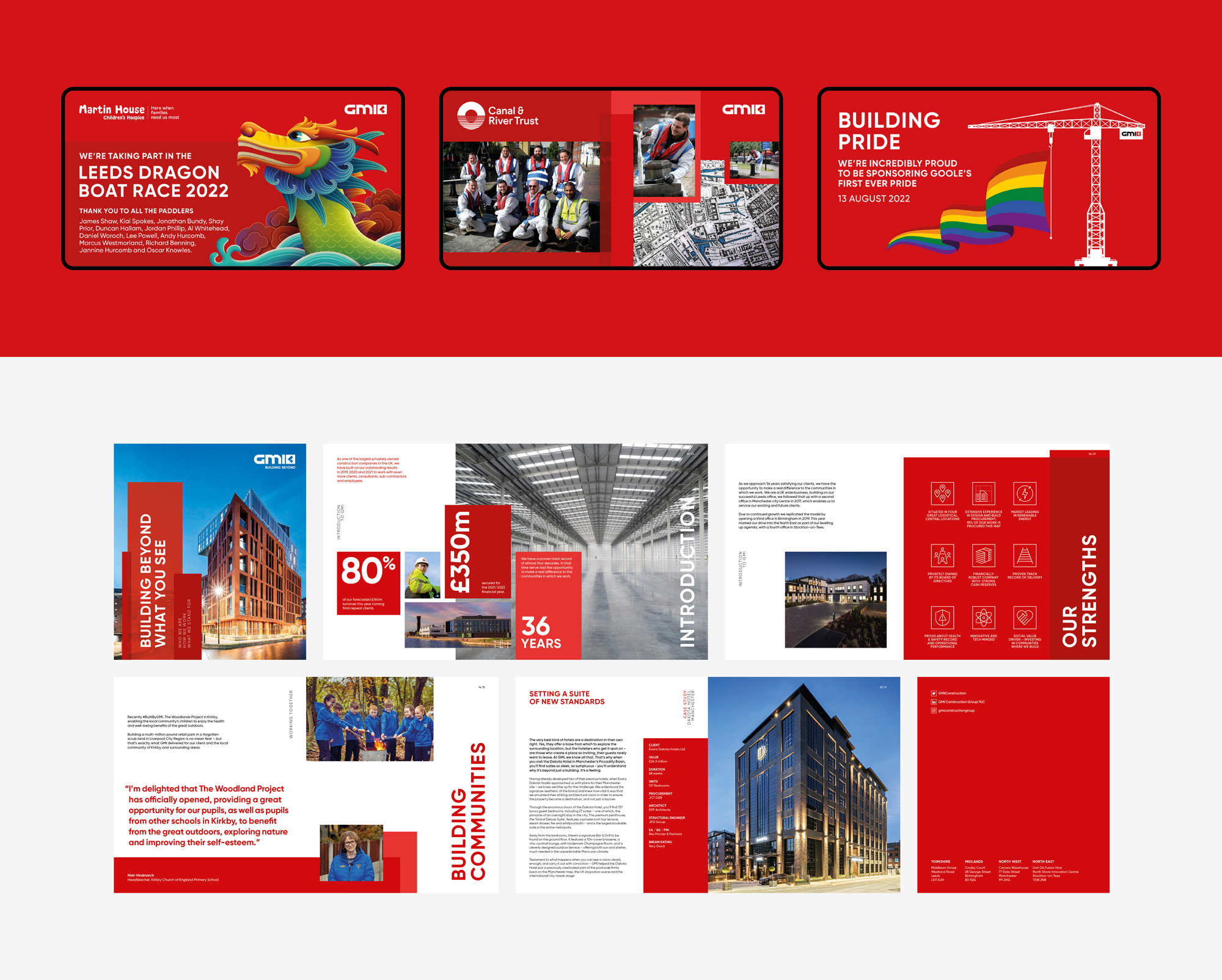

Typography, photography, iconography and video were also dismantled and reassembled in the shape of a new GMI and again, we provided clear instructions for the brand to continue in the direction once we’ve handed over the tools to them. Photography, for instance, should be modern and dynamic, and where possible, tell a story that truly reflects the values and culture. Alongside pointers on the quality of video content, we emphasised how as a counterpoint to the buildings and designs, we must see more of the people behind the scenes to showcase the human face of the company and emphasise the connections with communities.
Once all of the above – plus much more – was distilled into the thirty-eight pages of the extensive brand guidelines, we supported the internal business communications to launch the brand. This meant the team responsible for delivering the project was able to get internal buy-in before the GMI relaunch hit the road from ‘meet the planner’ events, to press and charity events, to ground-breaking ceremonies where local MPs and Mayors would all be in attendance.

“We enjoyed working alongside Glorious Creative to reestablish our brand and bring together some industry leading guidelines that allowed the brand and business to grow. Their professional service to meet the demands of a busy national contractor was always catered for and work delivered to a high standard.”
Associate Marketing Director
Interested in Glorious Thinking?
If you like what we did for GMI Construction we could do something for you.

Mailing List
Sign up to our mailing list to receive all the latest news.
Check out our privacy policy for the full story on how we protect & manage your submitted data.
